


In this web-everywhere where 72% of consumers desire mobile friendly website, we must storm ahead and catch the train to future. By now we all somewhere down the line have started believing in this theory of Darwin: survival of the fittest. And responsive design – though it’s a long way to go – today seems fittest for its adaptive nature and many more things.
Ethan Marcotte, the one who has spearheaded the responsive movement, pens down responsive design as a web design that basically incorporates these three elements: fluid grids, flexible media and CSS3 media queries. Simply put, responsive design is an adaptive design that adapts itself as per the screen size of a device – desktop, laptop, mobile, tablet, phablet, e-reader etc.
Making a great responsive site is not a cakewalk, however. Web designers and developers are facing challenges in performance (loading speed mainly), ads, navigation and more. But challenges, as we all know, are a part of the game and will help in making responsive design truly future friendly and sustainable.
As we come to the fall of 2012 – which witnessed many, many websites turn responsive – let’s celebrate responsive design by showcasing some of the best works we’ve seen so far.
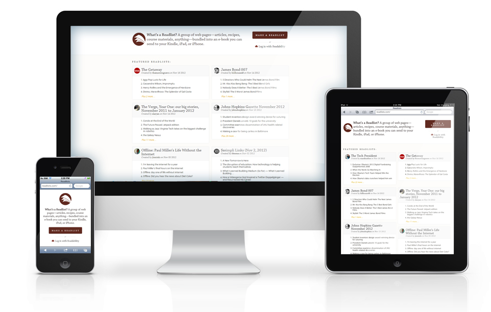
1. Readlists
2. Inbound

3. The Boston Globe

4. Pixel Crayons

5. Abduzeedo

6. Joomla

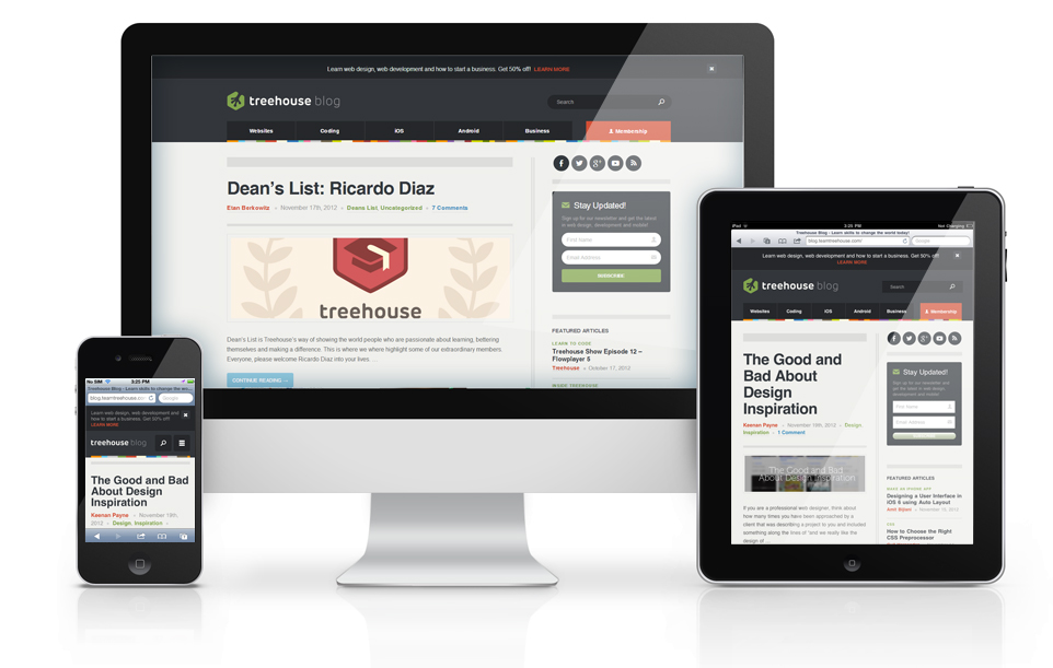
7. Treehouse
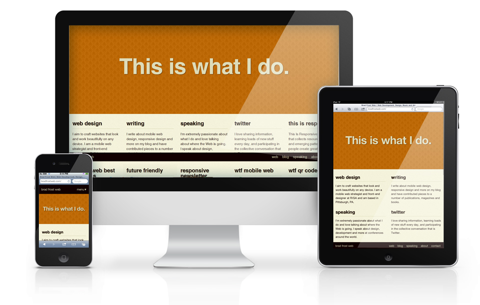
8. Bradfrostweb
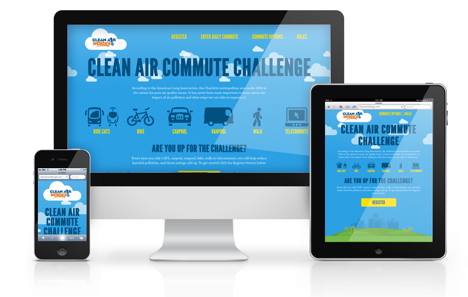
9. Clean air challenge
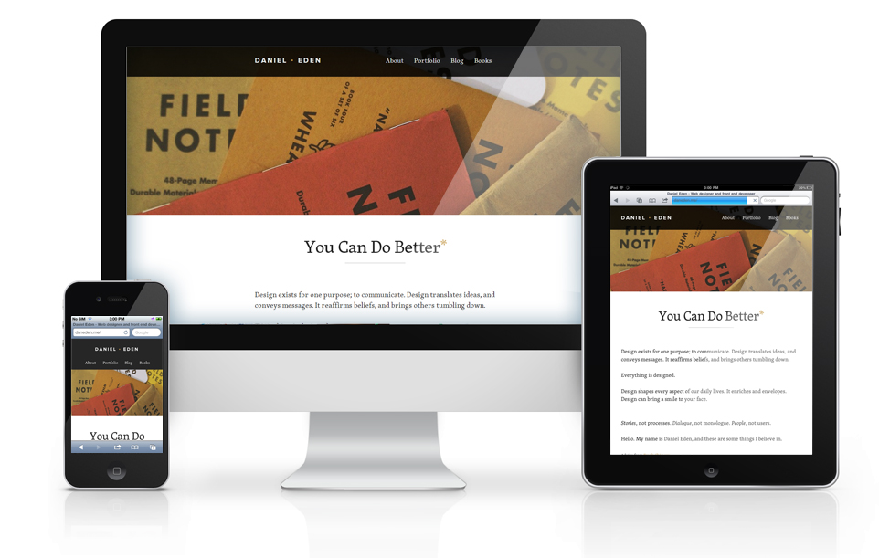
10. Daneden
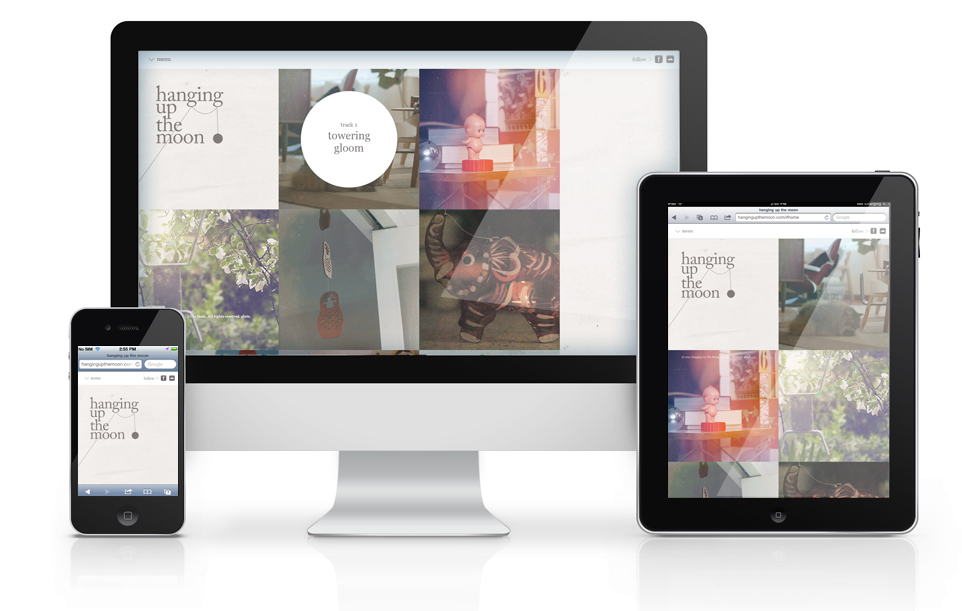
11. Hanging up the moon
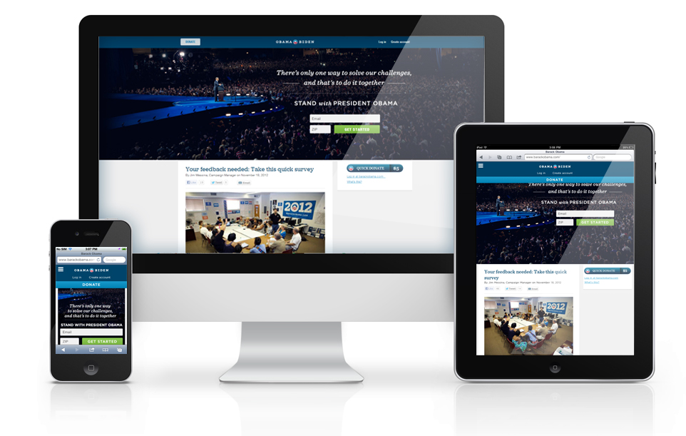
12. Barakobama
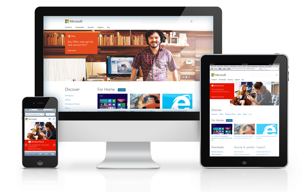
13. Microsoft
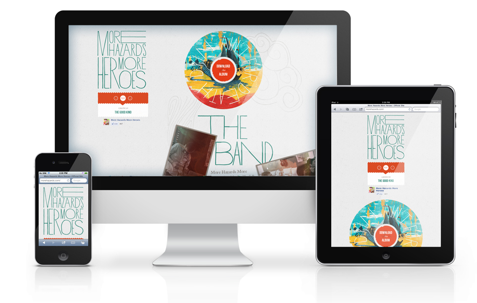
14. Morehazards
15. Nuts

16. Smashing Magazine

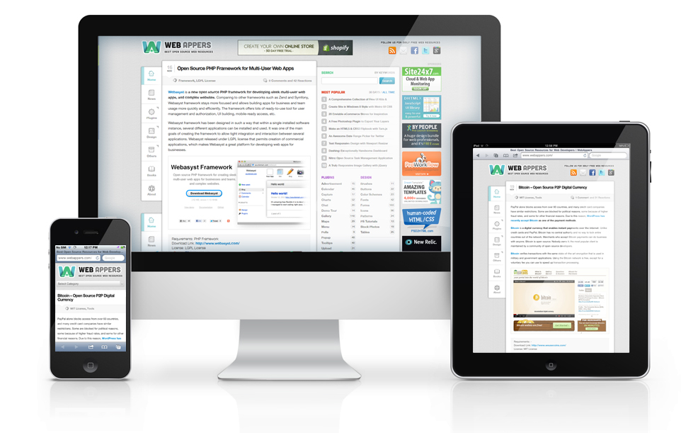
17. WebAppers
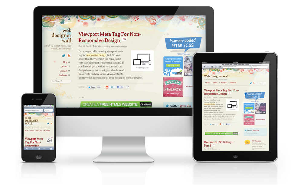
18. Webdesigner Wall
Let’s take responsive web design a step ahead in 2013 and make it even bigger. And do share your favorite responsive site in the comments section below.
About the Author
Richard Kemp is a passionate writer and Drupal developer, working with DrupalJungle, a full-time Drupal firm that thrives on giving its clients the best of Drupal. The firm renders everything that’s there to Drupal; its core services, however, include Drupal mobile website development and custom Drupal development.


