For well-established brands, there are few more risky endeavors than updating a logo. There are important considerations, like nostalgia and goodwill associated with the branding, and the potential for catastrophe is huge. Some brands are able to refresh their look in a way that is consistent with their history and also looks to the future. But all too often, the result is a major fail. That’s what we’re examining here, some of the worst logo redesigns in history.
Reebok
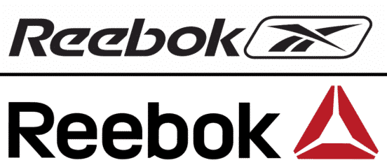
The sneaker world is filled with many great and iconic logos: Nike and Adidas are the most recognizable. It’s also filled with some mediocre efforts. Although Reebok’s original logo doesn’t exactly scream innovation, it was recognizable even without the word Reebok. With that kind of recognition, the company should’ve been reluctant to let go of that image. But Adidas, which owns Reebok, knew the brand was holding its profits back. So they ditched the old logo and switched to the delta symbol. The problems with this symbol are many. First of all, they aren’t the only company which incorporates a delta, like Google drive and Delta faucets. Second, the logo was meant to emphasize overall fitness rather than a specific sport, but it doesn’t really do that. And third, the logo as adopted because Reebok saw the passionate following that accompanied Crossfit and wanted to be associated with that brand. But Crossfit is still a movement that is small, and they need to sell a lot more shoes than they can muster up from Crossfit fanatics.
Yahoo!
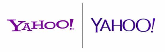
Yahoo was struggling to adapt to the modern internet culture when Marissa Mayer was named CEO. Among her many urgent priorities was a much-needed logo redesign. At the end of the process, Yahoo did a big countdown to the new logo by revealing one new logo design per day for 30 days. While that might seem like overkill, it wouldn’t have been if the final logo turned out to be killer. Instead, some of the featured logos were more well received than the very meh updated new logo. The logo looks a little bit like a slightly fatter arial, now in a deeper purple that hews closer to dark blue than pink. And that was it. There’s nothing about the new logo that seems particularly of the moment. It still looks outdated, rather than retro, and foreshadowed the end of one of the internet’s earliest brands.
Deviantart
![]()
Deviantart has gone through plenty of logos during its life as the premier space for creatives online. However, in 2014 it made major misstep with its new logo, which looks unfinished. The new logo builds upon the old one’s small “d” and capital “A”, and then cuts them off at a 62 degree angle. The company was quickly accused of plagiarizing the logo of a Russian design studio. Although some artists like the new design, the platform is used by so many talented artists, it fe make feels like a missed opportunity to actually hire one of them. Other critics said the new logo didn’t scan properly.
JCPenney
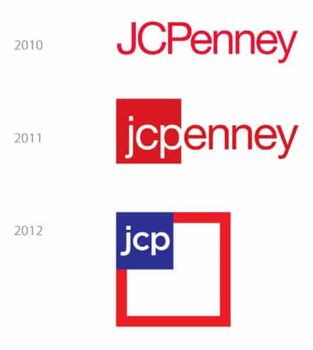
Oh JCPenney. You’ve been through so many CEOs, revamps and rebrands that the iconic American department store is going the way of Sears. It all started back in 2011, when the company announced what it intended to be the most important moment in the company’s than-40 years. After several years of putting its Helvetica-name into an ever-smaller box, the company held a contest and a student won with a design that simply made the JCP lowercase and stuffed it into a red box. This did not land well. Just one year later Ron Johnson took over as CEO. His tenure wound up being one of the worst in retail history. His prior effort was said to have been overseeing the transformation of the Apple logo, so he threw out the 2011-2012 design and came up with an all-lowercase name in red, which then became just “jcp” in a box. Once Johnson was pushed out, the company went through more iterations, finally reverting back to the logo it started with. The company is also called JCPenney again, leaving the failed “jcp” in the dust.
Career Builder
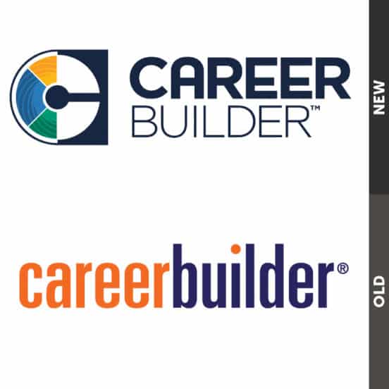
It’s not so much that the original Careerbuilder logo was brilliant, it’s just that its 2015 redesign was ugly and weird. CareerBuilder’s old logo had the value of simplicity, a condensed wordmark with a color that stood out. For some reason, its new logo went for added complexity. Now there are two different fonts, three different colors, a C symbol, a box, and three-dividers. There’s a lot going on here, and no one knows what story it means to tell.
Los Angeles Clippers

Retro is in and it was still in back in 2015, when the LA Clippers ditched their excellent, retro-feeling but not old, logo that featured a basketball on the move. The new logo got way more complex. There is a cubed LAC that looks like the Cubs logo and the Angels logos got taken apart and put back together the wrong way. The C overwhelmed the basketball that surrounds it. Then there’s the CLIPPERS, which is meant to look more like a basketball court. The motion lines are still there, but they surround the word CLIPPERS, giving emphasis to the court rather than the moving ball.
Monster
![]()
Like CareerBuilder, Monster was one of the internet’s first job boards. It never really had a great logo, but it was recognizable. Rather than redoing the logo to somehow have it evoking the search for a job, the company punted, putting the word inside of a purple flag. The flag is weird and barely scannable. Although it is supposed to be waving, this doesn’t come across well in the digital design world. (Also, is the message “waving a flag?” because doesn’t’ that have the implication of “waving the white flag” aka “giving up”? If the design team for monster considered this, it’s surely not evident in the final product.