


Michael Mitchell, an influential typographer, died in November 2017 at age 78. Mitchell came to his calling as a typographer late in life, having spent years as a dentist. In 1992, he began life as a full-time typographer. He was known for mastering every aspect of book design: type and layout, great skill as a printer, and intimate knowledge of the entire design process.
In this article, we have compiled three things by Mitchell which will inspire all designers.
Classic Typography
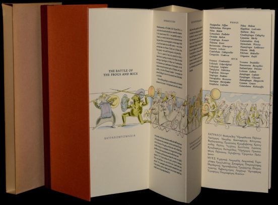
Mitchell founded Libanus Press in 1979. Typography of the kind found in The Battle of the Frogs and Mice is almost obsolete, thanks to digital publishing. However, that only makes books like this one more valuable. The book is a parody of The Iliad, which many have attributed to homer. This single-leaf folded leporello style book includes hand-colored illustrations by Fiona MacVicar. Just 200 copies were printed, each on mold-made cotton that has been bound in paper-covered boards, with brick-colored cloth as a backing.
In 1983, Mitchell’s first significant book was published by Libanus: Messer Pietro Mio, a collection of Lucrezia Borgia’s letters to Cardinal Bembo. The book is illustrated by Shirley Smith.
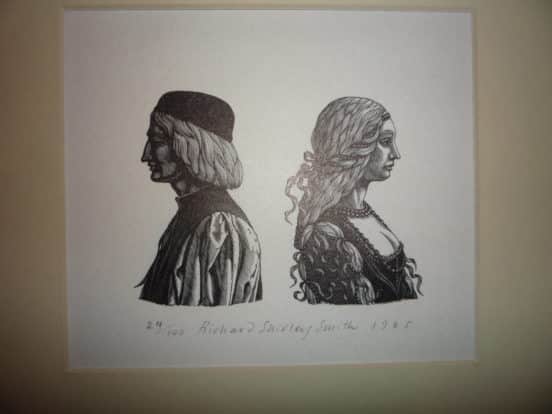
The illustrations are hand-sketched.
Pop Art
Under Milk Wood, Dylan Thomas’s amazing “play for voices” was printed with illustrations by Peter Blake in 2013.
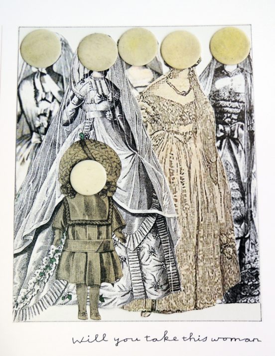 The incredible volume features perfect paintings and illustrations by the father of British Pop Art. The artist, combined with Mitchell’s expertise, created the definitive volume of Thomas’s story, which takes place in the Welsh seaside village of Llareggub. The book reveals their fantasies and realities during a single lovely spring day.
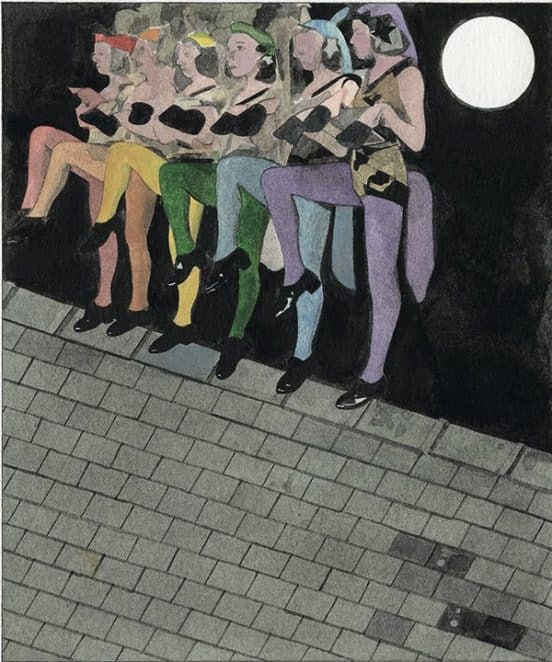
The book features 110 watercolors, pencil portraits and collages. It is considered one of Blake’s most important collections.
Books on Typesetting
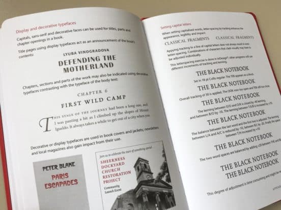
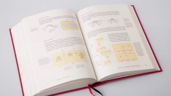
Mitchell’s two books on typesetting are recognized as the leading tomes in the field. In 2005, Mitchell and Susan Wightman created the magnum opus of book design, Book Typography: A Designer’s Manual. The book clocks in at more than 400 pages, explaining how a book is made from type, layout and illustration, to how the book is bound, to how a jacket is chosen. The book is indispensable for designers. It contains more than 1,000 illustrations and images to demonstrate typographic principles. This includes examples ranging from flat plans of whole books to small details in punctuation. The examples are pulled from published works, giving designer’s insight into how the publishing industry works. The book also contains a chapter devoted to understanding “The Basic Terms of the Trade.” There is also a glossary of terms, which means that this book should be a reference guide for anyone who designs for print today.
Mitchell followed up on his Typography: A Designer’s Manual with the Typographic Style Handbook in 2017. This book was focused on typography for publishers and editors. Anyone who works with text could benefit from the book, which explains how to produce clean and consistent typography. It is divided into three sections: general typesetting, corporate style, and books and journals. The book is a guide for anyone who wants to integrate style into various settings.


