Graphic designers have always been hip to the power of infographics for conveying information. But now that there are new programs that let you create infographics quickly, they are becoming more common. That means graphic designers need to up their game. Here are eight tips for keeping your infographics sharp, engaging and to the point.
-
Remember Your Audience
Never lose sight of who your audience is when creating an infographic. Visualizing the person you want to see the infographic will help ensure you are on the right track. If your audience is realtors, think about what they want to see, rather than choosing a generic format.
-
Tell a Story
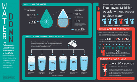
It’s tempting to use an infographic as a dumping ground for several unrelated facts and stats. However, an infographic should tell a story. This is where creating a flowchart can be helpful. For example, the graphic above points the reader to a conclusion.
-
Proofread

Look at the pie chart above. Notice anything? That’s right – the percentages add up to 188%!
The internet and print publications are rife with grammar, spelling, syntax and statistical errors, particularly as more organizations are axing their editing departments. That means the onus is on you to make sure your infographic is accurate. Are you statistics accurate? Are they drawn from acceptable sources? Do the graphic representation of the data lines line up correctly with the numbers? Did you use spell-check? Over-focusing on detail now will prevent embarrassment later.
-
Get the Size Right
You can expect your infographic to be resized several times. This often happens after the designer has already done their work. This damages the readability and guess who gets blamed? That’s right, it’s the graphic designer. Focus on making the font size readable even if it gets resized.
-
White Space Rocks
White space is one of a designers best assets. Don’t abandon the importance of white space for creating sharp visuals just because infographics tend to have more text.
-
A Catchy Title
Your title or headline should be eye-catching. Unless you’re under strict directions to be as dry and boring as possible, think about what would catch you eye. Ask other people in the office if they have any ideas, especially those in marketing or copywriting.
-
Citations to Sources
One of the biggest mistakes infographics make is failing to cite sources.
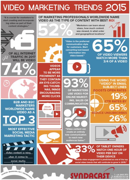
This example has great statistics on the use of video in digital marketing, but the viewer has no idea where these numbers are pulled from, since there is no source listed, nor does it link to any survey.
Remember, the purpose of an infographic is to condense information from longer sources.
-
Don’t Get Too Busy
This is a related point to using whitespace – try to simplify the concept you are illustrating. A busy graphic that doesn’t flow will be hard to read. This infographic has a fine layout, but it’s got too much text and goes in too many directions.
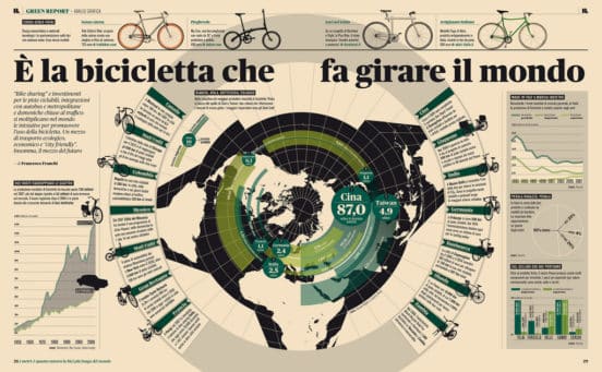
If this means separating the infographic into several smaller ones, that’s okay. Don’t try to do too much, or the graphic will be too busy to make sense.