All across the world, large companies are making investments in logo redesigns. At first blush, this may seem like nothing more than simple housekeeping. Every brand should update its identity with time. However, there is more at play than meets the eye. Brands like Airbnb, Spotify, Google and Pinterest have greatly simplified their logos in recent years. Houzz is now doing the same thing, taking its old logo in a very simple and choppy direction. Houzz is following the same path as other large brands who found it better to simplify the logo rather than turn off the mass market with too much quirkiness.
Keep in mind that in today’s atmosphere, logos need to look just as good on a large flat screen television as they do on a 2.5 inch smartwatch.
Learning from Spotify
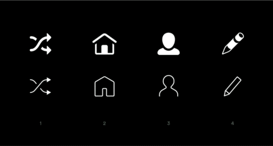
Like Houzz, Spotify was grappling with how to change its presentation on the many new platforms and screen sizes that users interfaced with. They thought their old icons were too complex, with visual metaphors that weren’t always easy to understand.
The Spotify icon suite was updated in 2016. The goal was to make them more bold, clean and simplified. To emphasize pure functionality, the new icon shapes were designed to mirror the company’s Circular typeface. This created a sharper icon format.
Learning from Google
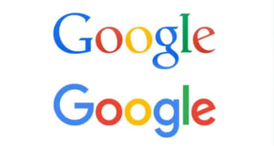
In 2015, Google updated its logo for the first time in 16 years. In-house designers led the charge by removing the serif from the wordmark. The company added a sans-serif typeface, Product Sans. The logo gives a more modern look. Its streamline glyphs are also easier to shrink to smaller sizes, making it ideal for any size screen.
The Houzz Logo
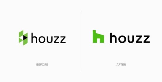
Houzz, a home decor website, hired designer Paula Scher to redo the logo. The former logo was an H made of triangles in black, white and green. This fun logo was thought to be difficult to grasp on mobile platforms. The new design is a bright green “h” (lowercase). The stem of the “h” is meant to resemble the chimney of a house. Although it might seem a bit incongruent to longtime Houzz users, it is also more recognizable in smaller spaces. Scher said “It’s hard to recognize [the old logo] especially when it’s small. You really need to make these things that work as favicons, that are legible at a 16th of an inch. It was indistinct anywhere they seemed to put it. They were very frustrated with it.”
Scher’s design is deceptively simple. In reality, many companies use a block “H” for products related to the home, so to stand out simply, Scher slanted the part of the letter that represents the roof.
The Sans Serif
Houzz also followed the lead of other brands by moving to a sans-serif font. The logo now sits beside the word “Houzz” in the sans-serif font. The orientation of logo to brand name changes to vertical on mobile platforms. The font is bigger and should be easier for the brand to scale on any screen.
All graphic designers should keep these examples in mind, whether it’s creating a new logo from scratch or updating an old one.