Ever notice that you can name the TV show just by looking at a font? Can you close your eyes and see the name and logo for The X Files? The Friends font is so ubiquitous in its credits that if you’ve watched a lot of episodes, you can totally picture the popular NBC show’s font. Now there is a way for you to track down these pop culture relics and use them in your designs.
On the Ceros website, you can find the fonts of the most popular 1990’s show, thanks to Alexander Tochilovsky, an expert in typography who works at the Herb Lubalin Study Center of Design and Typography in New York City.
Here are his comments about some of the most popular shows:
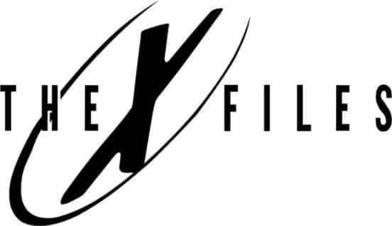
X-files – X-files font
“The X-Files is perhaps one of the more seriously-designed logos of the 1990s. It just connects so well with what you imagine to be sci-fi; it has this Twin Peaks-like understated mystique to it. It’s got a high-tech sexy feel to it but also very much official. It perfectly embodies the idea behind the show.”
Friends — Gabriel Weiss’ Friends Font
“The hand-drawn aesthetic started to become really popular in the 90s and the Friends logo is a perfect example—but perhaps what’s more interesting is the logic behind it. Each of the colored dots between the seven letters can each be thought of as the different ‘friends’ within the show.”
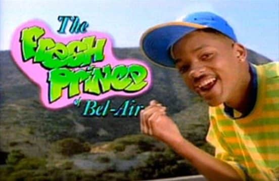
Fresh Prince of Bel-Air — Handmade graffiti effect
“From both an aesthetic and a logical point of view, the Fresh Prince of Bel-Air logo is very well done. Of course, you get that urban kid graffiti vibe from Will Smith’s character, but what makes it interesting is that the rest of the type looks like it came from a Bel-Air country club. So while the classic Bel-Air type is conservative and classy, ‘Fresh Prince’ comes into this community big, loud, and with a colorful personality—just like the premise of the show.”
.”
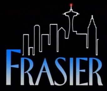
Frasier — Florentine Regular
“In my opinion, the Frasier logo is probably one of the best to come out of 90s television. Like Seinfeld, it balances this seriousness and playfulness—a mood that perfectly embodies the premise of the show.”
Dawson’s Creek — Fontageous Rendition
“Like the Friends logo, Dawson’s Creek really rides that 90s handwritten type trend. In the case of Dawson’s Creek, however, it almost feels more like a handwritten love letter or a note getting passed between people in a high school classroom. The mood and tone perfectly fits the overall feel of the show and target audience.”
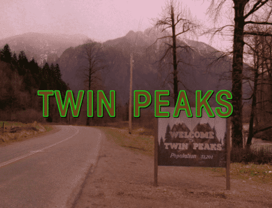
Twin Peaks– ICT Avant Garde Gothic Demi Condensed STD
“As a TV show, Twin Peaks is anything but normal—and this logotype is the perfect fit for it. Particularly, it’s understated and has a mysterious strange glow to it—just like the show and the characters. Ultimately, it’s very David Lynch. You almost can’t imagine it being anything else—it wouldn’t work in a box or as a decorative. It’s just unexpected and perfectly gives off the vibe of the show.”


