Packaging design has long ago established itself as a separate field of graphic and industrial design, and with good reason: the average consumer has more choices than ever, and he or she makes a choice in a matter of seconds. This makes it crucial for products to stand out, whether consumers encounter them online or on the supermarket shelves.
Major product design companies have emerged to help companies create dynamic brands with packaging. Whether you are launching a product or are a designer whose task is bringing new products to market, these essential rules of package design will ensure you’re bringing the heat.
Clarity
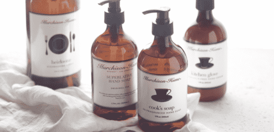
The first rule of package design is to communicate the name of the product and what it is. Although that sounds simple, many products flunk this basic test. For example, organic cleaning products company Murchison-Hume appeared on CNBC’s The Profit in order to get help with branding and financing. Marcus Lemonis quickly identified a huge problem: the name “murchison-hume” had no identification with cleaning. Even worse, some products featured a simple picture, like the image of a lady with a bun on a bathroom cleaner product, which seemed to allude to a hair-care product. In reality, the product was a bathroom cleaner. This was a huge packaging fail. Other packaging was also confusing. A bottle labeled “Cook’s Soap” featured a teacup. The owner wanted to avoid regular words like Dish Soap, but this made the branding overly complicated. Keep it simple.
Simplicity
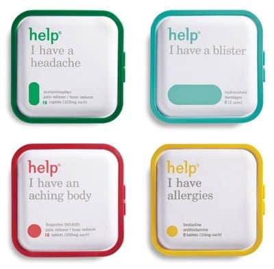
Related to clarity is simplicity. When the company Help Remedies wanted to revolutionize over-the-counter medication, they chose designer ChappsMalina to revolutionize packaging as well. Since consumers were already overwhelmed by too many choices, Chapps came up with a brilliant idea: why not communicate the content by identifying the problem? The resulting product design captures buyers at the moment of crisis – I have a headache, I have a blister, I have allergies, I can’t sleep – and instantly offers the solution. This simple, minimal design won numerous awards in 2010.
Be Honest
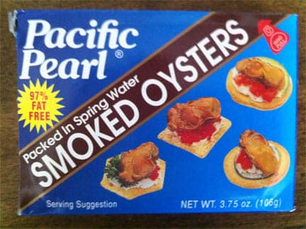
Honesty in packaging design is about more than just accurate labeling. For designers, it’s important to make sure the product depicted looks like the one inside the package. For example, these oysters will not resemble the small oysters inside the pack. Moreover, there are four different pictures on a very small package. This is a jumbled mess that won’t convince consumers they need the product.
Test for Shelf Impact
Too many designers focus only on what the final product will look like in isolation, when in reality, the product will be in a large store on a shelf next to competitors. That’s why it’s essential to do some testing with the product as it will be displayed. This will help your eye catch familiar patterns. Breaking up the standard pattern, as Help Remedies did with its medicine, is essential if a product is to attract any attention.
Focus on Sustainability
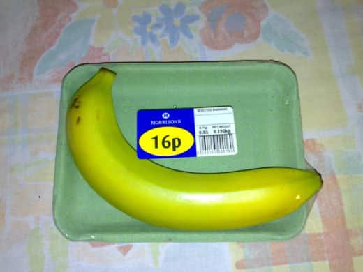
Consumers want products to be sustainable and less harmful to the environment. This includes the packaging. Too much packaging and too much plastic is actually a turnoff to consumers, and in some instances can actually cost more. This banana, for instance, is pointlessly encased in a foam and plastic container.
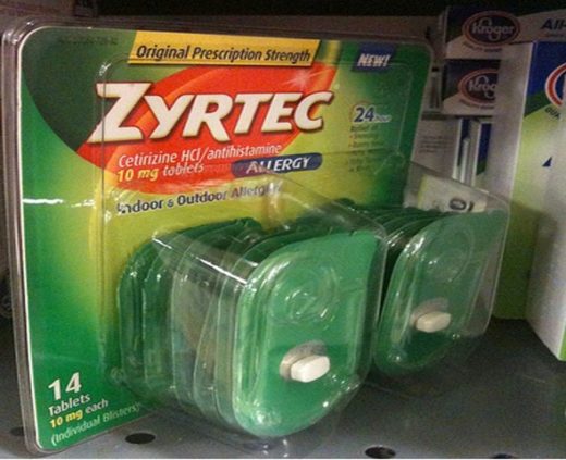
This allergy medication is comprised of a single pill inside a giant plastic and cardboard container.
Both are examples of over-packaging that costs money and are hard to recycle.


