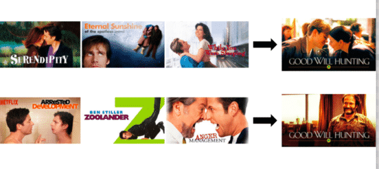
Netflix remains the most popular and successful streaming platform, outpacing its rivals like Amazon and Hulu. In 2018, the streaming pioneer will spend over $7 billion on content, including a generous helping of its own originals, which have become both critical and commercial successes. If you’re a subscriber, you know that Netflix tailors its offerings to the viewer, which means they recommend a bevy of titles that are fine-tuned to your specific tastes. Now Netflix is taking its habit-tracking to another level, by personalizing the graphic design to your tastes.
Netflix wrote an article on Medium which explains that it personalizes the artwork it offers to its customers. This means it considers which shows and movies you click and looks for patterns in the design, then offers you similar fare.
Netflix describes its self-concept as “we don’t have one product but over a 100 million different products with one for each of our members with personalized recommendations and personalized visuals.”
This means that there are dozens of different artwork choices for a show like Luke Cage, and Netflix shows you the one which corresponds most closely with your prior choices. Netflix discusses its original concept for artwork – which was to find the most perfect artwork for each title that would work for all their members. Over time, however, the network decided that it made more sense to cater to diversity in art tastes the same way it caters to diversity in film and TV faves.
The result is a revolutionary new way of targeting consumers. Netflix explains its process using the movie Good Will Hunting. A person who watches a lot of romantic comedies will see covers emphasizing that there are two people in love in the movie. People who watch lots of comedies would more likely see cover art showing Robin Williams.
Netflix’s other example, Pulp Fiction, is usually depicted with its movie theater cover, showing Uma Thurman smoking a cigarette. But Netflix has added options: if a person is a John Travolta superfan, they would see a cover featuring Travolta.
Netflix offers extreme detail about how its algorithms work, and for those looking to understand more about analytics, this section of the paper is a must-read. For the rest of us, it basically boils down to this:
After experimenting with many different models offline and finding ones that had a substantial increase in replay, we ultimately ran an A/B test to compare the most promising personalized contextual bandits against unpersonalized bandits. As we suspected, the personalization worked and generated a significant lift in our core metrics. We also saw a reasonable correlation between what we measured offline in replay and what we saw online with the models.
Critics have knocked this approach for adding completely different meanings and intentions to the movies and TV shows than their creators intended. Other critics suggest that Netflix’s most basic customization is still to serve up as many Netflix-produced titles as possible, making it more difficult for viewers to find other content. This is certainly not the result of user-led customization.
Still, Netflix’s decision is in conformity with the design trends over the last decade: the use of algorithms to micro-target consumers. Designers are already familiar with this dynamic. How many graphic designers have given their clients dozens of different options, all for the same product?
The lesson for designers is to incorporate micro-targeting whenever possible in an online environment. Many businesses have robust analytical data available, but aren’t sure how to make the best use of it on a daily basis. Sharing this data with design teams could produce surprisingly effective results.


