Risa Rodil is a designer, illustrator, and letterer who works for publishers (Harper Collins, Penguin Random House, Hachette), toy companies (Hasbro) and publishing groups (Fullscreen, Hallmark). Rodill uses striking color palettes to create a striking visual style that make stories come alive.
Rodill describes her unusual journey into professional letterer on her website:
Upon discovering my love for art at age 14, I found myself bouncing from one creative field to the next—trying out Photography, Video Production, and Web Design, until I finally landed on Illustration and Lettering. It took me a couple more years to find my own art style that has now attracted clients around the world; a vibrant mixture of striking colors with a touch of whimsy and modern retro. On my days off, I like to visit new cities, read books, and go full nerd by binge-watching television shows.
Rodil has collaborated with John Green, Brizzy Voices, Rainbow Rowell, Hank Green, and others to create memorable projects. Rodil has a love for television shows like Dr. Who and Supernatural, as well as Pixar movies and Marvel movies. She has done poster series for each of the aforementioned characters. However, it is her work in young adult literature that has arguably put her on the map. These examples of Rodil’s work show how an old favorite can be transformed into something new.
Harry Potter and the Sorcerer’s Stone
In this poster, Rodill reimagines JK Rowling’s first Harry Potter novel.
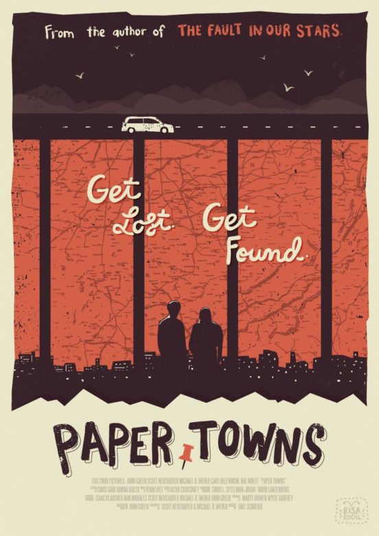
Paper Towns
Rodill has collaborated with author John Green, whose book Paper Towns was also a movie.
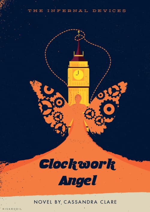
A Clockwork Angel
Cassandra Clare’s novel A Clockwork Angel is given a makeover by Rodill which emphasizes the book’s inspiration, A Clockwork Orange, by incorporating the color orange into the design.
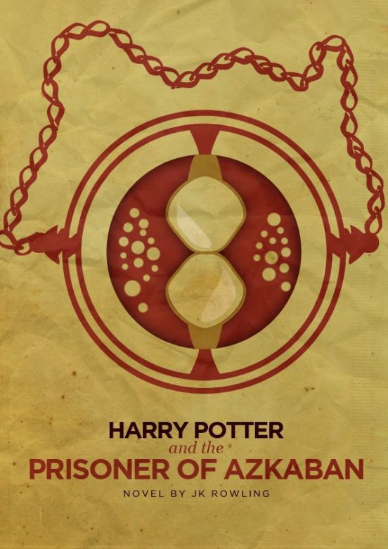
Harry Potter and the Prisoner of Azkaban
Rowling’s darkest novel, Harry Potter and the Prisoner of Azkaban, is given a mysterious cover.
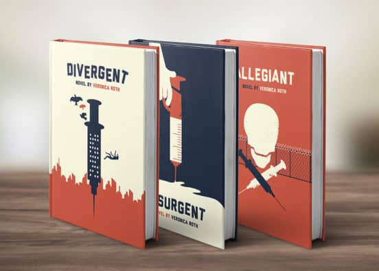
Divergent / Insurgent / Allegiant
Veronica Roth’s Divergent series is given personal book covers in this set by Rodill. It gives the popular novel a retro feel, making it look like a modern classic. In 2014, Rodil’s fan art was one chosen to to be included on special editions of the trilogy.
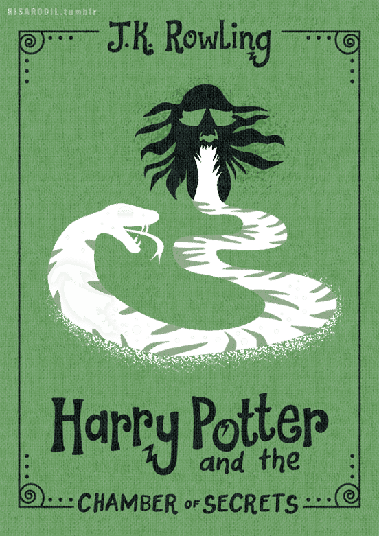
Harry Potter and the Chamber of Secrets
The hidden meaning behind this version of Harry Potter and the Chamber of Secrets is all about Slytherin, from the green color choice to the slytherin’ snake!
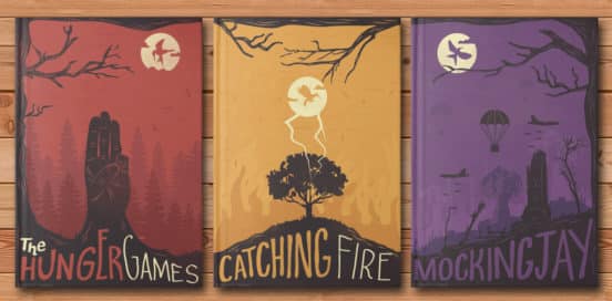
Hunger Games
The trilogy Hunger Games, which was made into a series of four movies starring Jennifer Lawrence, is given a new life by Rodill. The Hunger Games, Catching Fire and Mockingjay are highly symbolic, from their colors to their art.
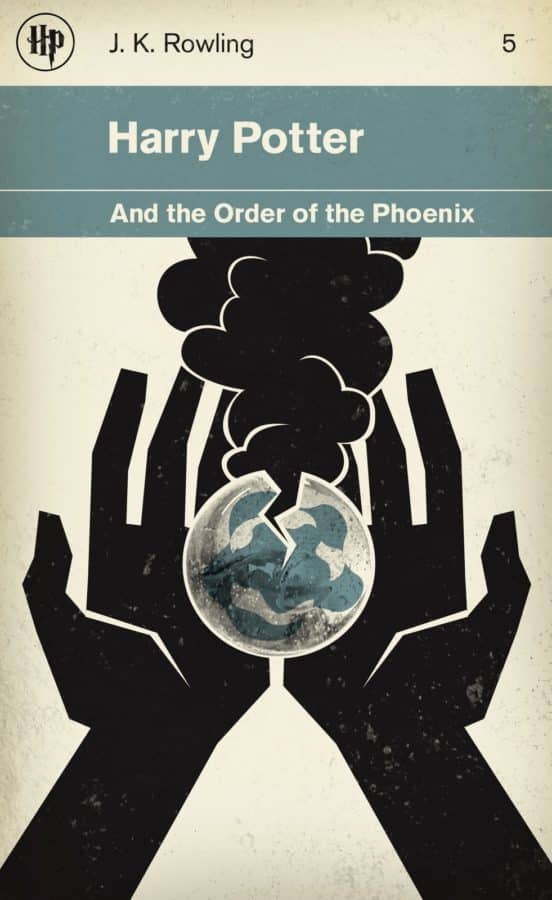
Harry Potter and the Order of the Phoenix
In this example, Rodill reimagines the book Order of the Phoenix to give it a mid-century modern feel, putting it on par with other excellent classics of the 1950s and 1960s like To Kill a Mockingbird.
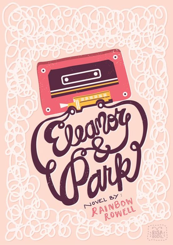
Eleanor and Park
Rainbow Rowell’s book Eleanor and Park is shown here with a mix tape, perfect for the setting of the novel.


