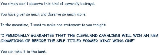
Dan Gilbert’s Comic Sans Break-Up Note to LeBron James
We all know that Comic Sans is a cruel joke meant to trap unsuspecting (meaning: dumb) individuals into using the font so that graphic designers can laugh. But still, the sheer number of people who use the font is nothing short of amazing. Dan Gilbert, the wealthy owner of the Cleveland Cavaliers, thought he was onto something when he wrote LeBron James a kiss-off letter after James left the team to play for Miami. The embarrassing mash-note declared that James was “narcissistic” and “cowardly” and that the team was bitterly disappointed over the breakup. Worst of all, like the saddest jilted lover, Gilbert wrote I PERSONALLY GUARANTEE THAT THE CAVALIERS WILL WIN AN NBA CHAMPIONSHIP BEFORE THE SELF-PROCLAIMED ‘KING’ WINS ONE.
Ugh. We all know how that panned out. The Cavaliers collapsed and James turned out to be the more mature person and he returned to Cleveland and won a title.When LeBron returned, he announced his decision in a magazine article that was not written in Comic Sans. LeBron 1, Gilbert 0.
James Cameron’s Love for Papyrus
There were few things more outrageous to designers than Comic Sans, but the generous use of Papyrus definitely is right up there with rage-inducement. Papyrus is supposed to mean “Ancient World.” It is a font that aims to look “old” but instead looks hokey and half-finished. It should come as no surprise the that the font was used by none other than old hokey guy James Cameron when he launched his over-budget blockbuster, Avatar. The man spent half a billion getting the effects right, but when it came time to do he movie poster, seemed to just go to the first font after Arial on the dropdown list and call it a day.
This experience was chronicled by the hilarious Saturday Night Live sketch starring Ryan Gosling as a tortured graphic designer who is so perplexed by Cameron’s decision that it is ruining his life.
Jurassic Park Loving Neuland More Than Dinosaurs
Neuland, and sometimes Neuland Inline, is very popular for the same reason that Papyrus won’t die: it’s shorthand for “Africa” or “exotic,” doing a lot of clumsy branding without any of the hard work of identifying the essence of what it purports to describe. This font was deployed extensively in the movies, such as on the poster for Jurassic Park. The weirdness and badness of the Jurassic Park poster isn’t limited to font. It also goes to scale – the words “Jurassic Park” are vastly larger than the dinosaurs that made the movie exciting in the first place, making this a design fail.
The Only Headline London 2012 Did Not Want Was About Its 2012 Headline
There was so much attention on the awful London 2012 Olympic logo that you might have forgotten all about the custom font, 2012 Headline. If so, consider yourself lucky. This clunky, jagged, and italicized font just screams Greek hieroglyphic. Although linking the 2012 games too the advent of the Olympics in Greece is a tried and true concept, the logo looked unsettling and strange, as if it was being pounded out from a cave somewhere.
This screen capture from the original website shows exactly how annoying and aggravating the script looks. Is this a ransom note written by a serial killer who loves calligraphy, or is it punching font for a sporting event? I think we know, and it was roundly and soundly ridiculed.
Florida Parks Appeal to Octogenarians With Brush Script
The conceit behind Brush Script – that it mirrors your handwriting or painting – fails straight away, when you realize that Brush doesn’t even come close to looking like actual handwriting. The font was made public in 1942 and was immediately used by the government for propaganda involving various war efforts. But that isn’t the disaster. We look at those choices as the product of another time, and the associated posters evoke nostalgia. The problem with using this overused font now is that it’s almost always invoked to give a feeling of yesteryear. That’s the problem with the State of Florida’s decision to use the font for its State Parks promotional materials. Old Florida tourism had a distinct style, which has been obliterated with the Disneyfication of the state. But the parks system should’ve opted for a custom font that synthesized old and new rather than use the Brush Script over a swimming hole. The nostalgia evoked here certainly won’t be getting kids excited about spending the day at the Suwannee River rather than at Disney World.


