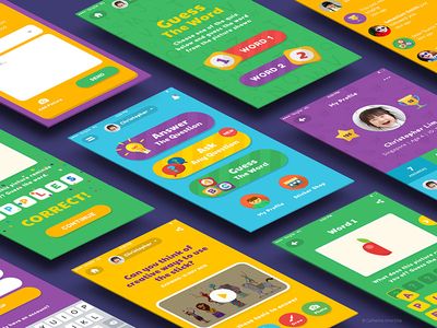
We are living in a digital age, where the age of Internet users is rapidly decreasing. Children become consumers of online content even earlier than they learn to speak. This poses a new challenge for resource owners: to create a UX design that meets the physical, social and cognitive needs of children of different ages.
But take your time. Understanding the key differences between a child’s and an adult’s user experience, as well as the results of research already done in this area, will help lead your project to success.
Decide on age categories
When designing a UX design, you need to understand and represent your audience. It is not possible to create a universal interface for children of different ages.
The user experience for adults is not so much dependent on age differences. 4 years of difference between a 34-year-old and a 38-year-old person is quite nominal, they have practically no impact on social development and perception of the world around them. While for children, the age difference is huge. A 4-year-old child will interact with a web resource in a very different way compared to an 8-year-old. You can easily test that. Usability specialists recommend dividing small Internet users into at least 3 age groups:
- 3-5 years old,
- 6-8 years old,
- 9-12 years old.
3-5 years old
The younger age group is characterized by less developed physical skills. This means that children will not be able to actively manipulate the mouse and consciously use the signs. Therefore, in UX design for 3-5 year olds, it is recommended to use large images to accentuate the child’s attention, as well as to connect sound and video.
6-8 years old
As a rule, children at this age are already quite well able to count, write and read. This must be taken into account to create a literate UX-design. A number of studies have shown that functions such as “Sign in to your account” and “Register” are clear to them. While the request to come up with a “Username” can cause confusion.
Specialists recommend simplifying such terms to make it more accessible for a child of primary school age. For example, instead of a username, just write “Name” or “Your nickname”. In principle, such a strategy is relevant not only in creating UX design for children. It is necessary to speak to all users in a language they understand.
9-12 years old
By the time they reach this age, children become already experienced users of the Internet and modern technologies. This means that they can easily scroll through pages, work with small touch panels and, at the level of intuition, understand where to click.
Ability to read also allows them to understand the content presented on the website and the essence even after a brief reading. However, some studies have shown that children aged 9-12 still cannot distinguish between information and advertising materials.
A designer is not the user
If you need to figure out how to optimize the site, it is assumed that you have to think like a child. The first “rule” of designers: you are not your user.
However, this does not mean that you need to exclude all the experience gained on other resources. It is necessary to approach individually to each project.


