Dashboard design is a tricky business. The challenge is to communicate the key numbers in a straightforward way, while allowing users to drill down into the specifics. It is about avoiding clutter, about catering for personalisation, and about the prioritisation of the right metrics. It’s difficult to get right, but I think many of these examples have lots of good things going for them.
We’ve brought together a showcase of innovative, stunningly beautiful dashboard concepts & designs to help inspire you. If you’re about to start a project that deals with data visualization, hopefully this collection will give you some inspiration into how you can show your information in a useful, simple and uncluttered way.
Panels Dashboard by Cosmin Capitanu
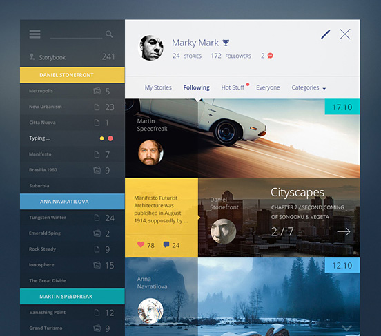
Story Book by Cosmin Capitanu
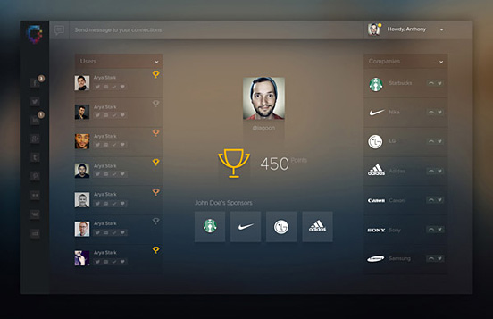
Ladderboard by Vivek
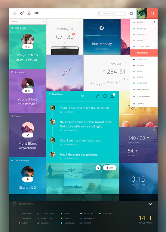
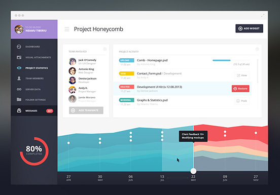
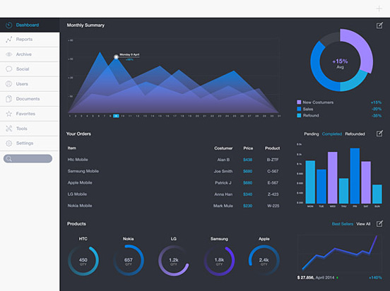
Main Trainer / Admin Dashboard by Vladimir Babić
Main Trainer / Admin Dashboard by Vladimir Babić
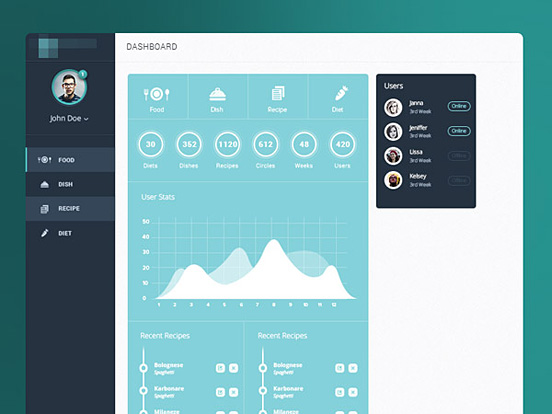
To-Do Dashboard
Spanish Flat Dashboard by Robin Marquez
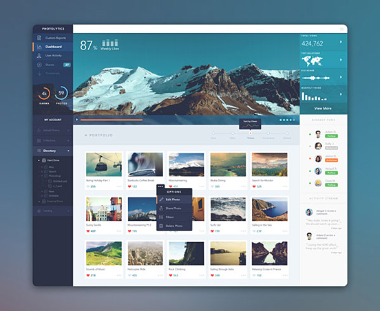
PhotoLytics Dashboard UI by Balraj Chana
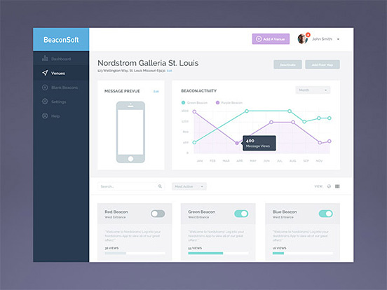
BeaconSoft Venue Page by Megan Fox
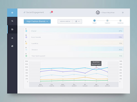
Social Engagement Dash by Rovane Durso
Dashboard by Olivier Zattoni
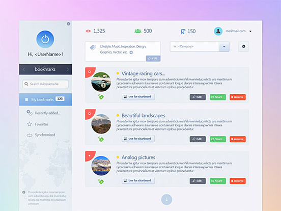
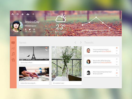
Personal Dashboard by Florent Legrand
Dashboard by Avinash Tripathi
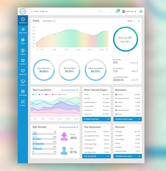
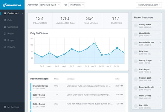
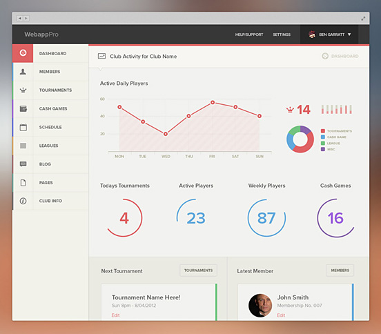
Web App Dashboard by Ben Garratt
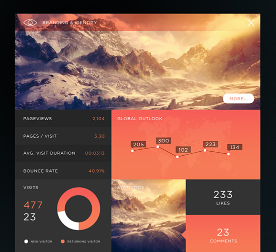
SJQHUBâ„¢ B&I Dashboard by Jonathan Quintin
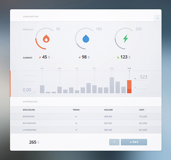
Bills Bills Bills by Cosmin Capitanu
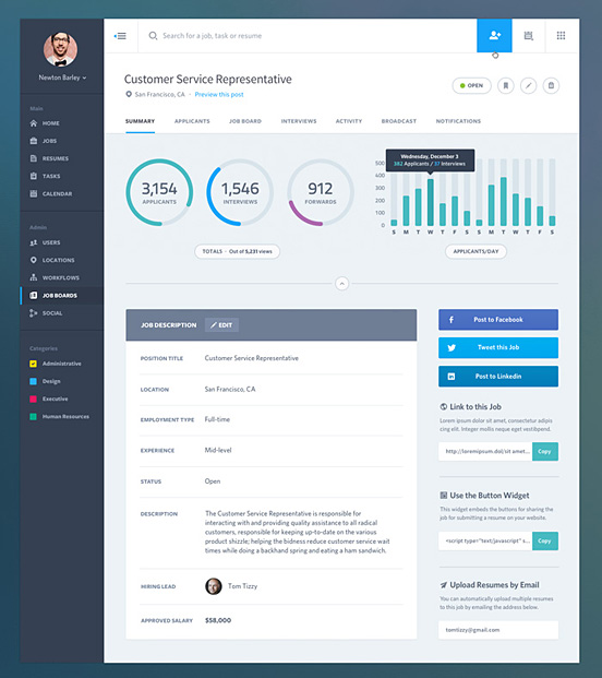
Dashboard Web App UI by Job Summary
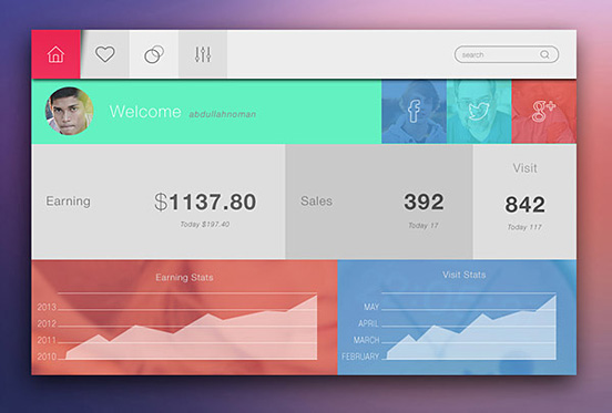
Dashboard Interface Design by Abdullah Noman
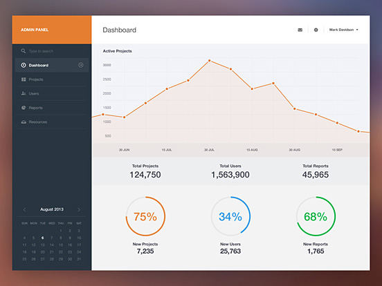
Dashboard by Piotr Kwiatkowski
iPad Dashboard by Davide Pacilio
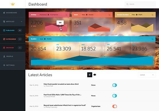
Dashboard for CMS by Lukas Horak
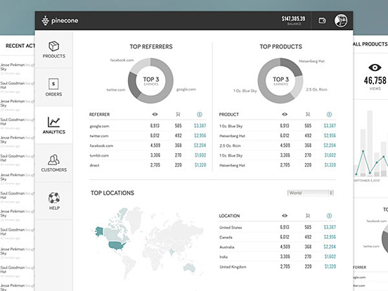
Pinecone Wireframes by Matt Bango
Dashboard by Aryo Pamungkas
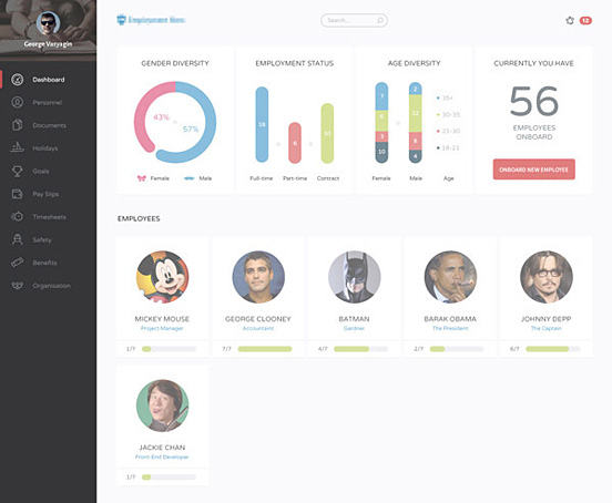
Flat Dashboard by George Vasyagin
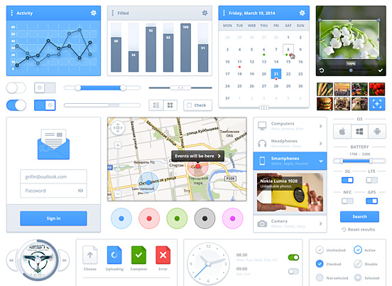
Modern UI Kit by Webiconset