People today have access to an overwhelming array of fonts, and many people fashion themselves a graphic designer of sorts, with opinions on the viability of certain fonts. As the hilarious sketch from Saturday Night Live shows, people are pretty well schooled on the idea that some fonts, like Papyrus or Comic Sans, are bad and should be banned. But is there more to the story? Douglas Thomas, who wrote a new book called Never Use Futura, thinks people are missing the bigger picture.
Thomas explores the history of Futura, and argues that Futura, like many fonts, gets a bad rap because of negative conversation. He told Huffington Post that he chose the title of his book into order to start a provocative conversation. It all starts with teaching laymen the most important thing in design: why they should use a typeface, rather than why they shouldn’t.

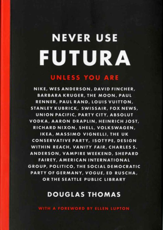
The full title of the book is actually Never Use Futura Unless You Are … followed by a surprising list of brands and people who actually do use the font and use it well. This includes such luminaries as Nike and Vanity Fair, and businesses as big as Fox News, Forever 21 and In-N-Out Burger. Today, Kate Spade, Vogue and Wes Anderson all remain fans of Futura.
Thomas suggests that in some sense, designers promote an anti-Futura stance because they’d prefer to see the font underused, so that they continue to use it for impact projects. Thomas points out that this is especially true of Futura, which “started out as this avant-garde idea. It was linked with some of the newest, most cutting-edge ideas in Europe.”
Futura was designed by Paul Renner, noted German Bauhaus designer. He hoped to reflect the optimistic modernism of the time, which was linked with a belief in the boundless future of humankind. The early connotations of future was that of revolution, democratization, equality and sometimes socialism. This meant that when Vanity Fair adopted Futura in 1929, they faced criticism from those who associated the font with rapidly shifting cultural mores.
However, over time, everyone adopted Futura, changing the way it was perceived. This radically altered what had previously been a radical font, draining it of its symbolic power. Thomas said the practical effect of font overuse results in graphic design schools and firms constantly searching for new fonts that aren’t already associated with themes and movements. There is an endless search for something original.
Thomas still doesn’t rule out use of Futura by regular people. He just thinks people should begin to be more thoughtful in why and how to use specific fonts. Thinking about the impact on the viewer of specific font choices is the end goal. Thomas noted that with Comic Sans, people convey the exact wrong tone when they use it for professional correspondence or communication.
“It just seems both completely inappropriate and maybe showing a lack of judgment, the same way we’d judge someone if they stepped out of their house naked. Maybe we’re all fine with people choosing how we want to dress, but there are,” Thomas said, “times and places for things.”
Thomas also says that Comic Sans itself is not inherently evil. It can work if it’s used in narrow contexts, like in a comic book.
Ultimately, all fonts have a purpose. Thomas told HuffPost that “every typeface has its own voice, speaks in its own language.Once you understand what that language is, you can use it in exceptionally insightful and beautiful ways.”