Now that a new year is upon us, it’s time to look forward to 2018 design trends. For graphic designers, it’s time to update some of the old favorites that have hung on over the past decades. Although designers won’t be breaking from minimalism anytime soon, the look is about to get refreshed with some new flourishes. More depth is also on the rise, as are themes from the 1980’s and 1990’s. Here are the top 2018 trends you can integrate into your next pitch.
1 – Return of the Gradient
The idea of gradients causes many designers to break out in hives, due to their close association with old school apps like PowerPoints. Gradients were everything in the early aughts, but in this decade, flat design start to reign supreme. But things are changing, as designers re-incorporate gradients – now called transitions or “flat design enhancements.” How do you know this is a trend? Because iOS re-incorporated them in their design and Instagram has added them as options.
2 – Shadows
Now that gradients are back, expect to see more shadow effects to add depth. When designers started to favor flat designs and banish realism, shadows and related concepts were put on the backburner. Two-dimensional design is finally weakening however, as designers recall how shadows can be used to improve the user experience.
The big moment was when Google Material Design added real shadows as an enhancement to their UI, influencing many other graphic designers to give it a try.
3 – Real, Natural Photography
The era of stock images is dead and buried. Now that apps like Instagram and SnapChat are surging in popularity, thanks in part to organically-captured moments, there is a demand for real photography. If you have to rely on stock images, look for those that seem natural rather than staged. Natural photos were a staple of 1990’s advertising, and most designers will be thrilled to stay away from staged pictures showing people posing for the camera.
4 – Responsive Logo Design
Responsive design changed everything online, and it is now the standard.The need for all websites to be optimized for mobile devices was the original impetus for designers and developers to change logos to respond better to the demands of users as they interact with websites. However, most companies were hesitant to start their design process from the perspective the user who will encounter logos online. This may be changing. Now that refreshed logos have been successful, designers are having more success at convincing companies to alter the logo for the purposes of online simplification.
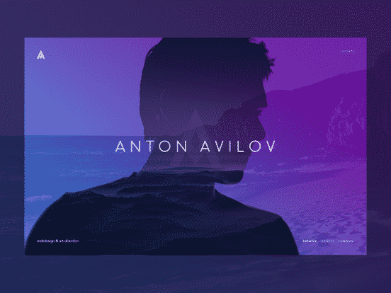
5 – Duotones
![]()
You can thank Spotify for the return of duotones. A duotone is a halftone reproduction of an image using the superimposition of one contrasting colour halftone, usually black, over another color halftone. This was a tried and true design scheme in the print era and it is finally possible to create slock duotones with imaging software. Again, this is another way to add some flair to flat design.
6 – Retro Pallets
Everything old eventually becomes new again, and that’s why 1990’s-inspired hues are back in a big way. The 1980’s are also back (and have returned repeatedly),but this is the first time you can expect a full-fledged love affair with 1990’s style. Since more designers were now born in the 1980’s or 1990’s, this trend is a can’t miss. Millennial18 pink is back (we hardly missed you) as are the neon colors of the late 20th century. Now that flat designs are being refreshed, there will be new opportunities for patterns, and many designers are already checking out the old patterns of the era.