Logos have been around for at least as long as written language. When the ancient Greeks used specific marks on pottery to designate the person who made it, they basically invented the concept of branding.

Starbucks as a brand was invented by Howard Schultz, but the original store was started by someone else in 1971. The chain is named after Starbuck, the first mate in the novel Moby Dick. The seafaring theme has been a part of the Starbucks logo design since its inception.
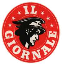
Schultz opened a competitor to the original Starbucks, called Il Giornale, after his offer to buy Starbucks was rebuffed. But in 1987, Schultz and his investors convinced Starbucks to sell the company to him. What happened next remade coffee shop history. In his book, Pour Your Heart Into It, Schultz described the process that resulted in the now iconic logo.
Il Giornale’s logo looked to the Roman God of Mercury to emphasize speed – Schultz’s original concept was to serve up delicious and fast espresso.
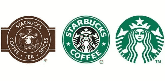
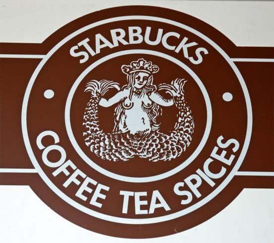
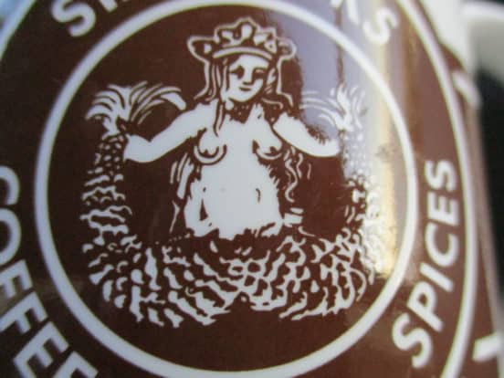
The first Starbucks logo was around from 1971 to 1987. Terry Heckler sought something that pulled on the maritime history of Seattle. He looked through “old marine books until he came up with a logo based on an old sixteenth-century Norse woodcut: a two-tailed mermaid, or siren, encircled by the store’s original name, Starbucks Coffee, Tea, and Spice. That early siren, bare-breasted and Rubenesque, was supposed to be as seductive as coffee itself.”
When the companies merged, Heckler created a logo that melded the two: “To symbolize the melding of the two companies [Il Giornarle and Starbucks] and two cultures, Terry [Heckler] came up with a design that merged the two logos. We kept the Starbucks siren with her starred crown, but made her more contemporary. We dropped the tradition-bound brown, and changed the logo’s color to Il Giornarle’s more affirming green.”
Obviously, the bare-breasted look wouldn’t play in Peoria, so they covered her up.
In 2008, Starbucks attempted a strange redesign that took Starbuck back to her origins. They dropped the now-iconic green and made it back. Starbuck herself now rises from a net, and the breasts are back.
The new design was rejected by consumers and Starbucks went back to the drawing board.
Beginning in 2011, Starbucks wanted to eliminate the words and just focus on imagery.
“This new evolution of the logo … embraces and respects our heritage and at the same time, evolves us to a point where we will feel it’s more suitable for the future. The new interpretation of the logo … gives us the freedom and flexibility to think beyond coffee but make no mistake … we will continue to be the world’s leading purveyor of the highest-quality coffee.”
![]()
The new logo was seen as risky at the time, since it removed the outer circle and dropped the name Starbucks. However, this redesign paid off. The company turned out to be right: people associated the green Siren with Starbucks so thoroughly that no reference to the name was even necessary.