


Design continues to get more sophisticated, but as 2017 showed, three is too much as a good thing. Facebook’s algorithms, for example, wound up serving up fake news to the masses. On the pure design front, digital advertising went totally over the top last year, with dozens of new ways to get you to view advertisements. In interior design, mid-century modern was everywhere, but for all the wrong reasons.
Here are three trends that are totally played out, and suggestions for how to make them come alive again.
Mid-Century Modern Design
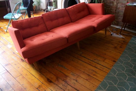
The dominance of mid-century modern interior design should be a good thing. The style was created with several things in mind: simple lines, affordable, and sturdy furniture. These are great values, but in the 21st century rush to mass-produce 1960’s knock off furniture, the actual purpose of the craze has been lost. The Peggy Sofa from West Elm made big headlines this year for all the wrong reasons. The fantastic-looking sofa becomes a dilapidated mess after very light use, inspiring an essay in the Awl that immediately went viral. There will always be a place in design for well-made furniture that harken to the Mad Men era, but people won’t cointune to buy things that break easily and aren’t meant to last.
New Trend: Furniture designers who are committed to the principles of mid-century designs should apply the principles of the past to the materials of the future. No more plywood coated in cheap upholstery.
Video Pop Up Ads and Notifications
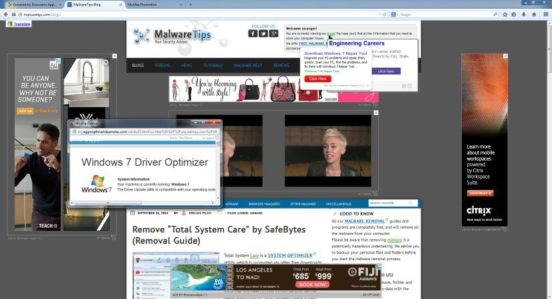
Once upon a time, the goal with advertisements was to make them as unobtrusive as possible. Of course that era did not last long, since the very purpose of ads is to get your attention and hold it, not to let you skip the commercials. In the online world, websites are routinely taken over by pop up adds, automatic videos and sponsored ads. Video ads interrupt your workflow, turn up the volume and are hard to close out. They often have users closing out of the website entirely rather than deal with cumbersome ads.
New Trend: A better idea is to let the product take over the website to engage users in fun and creative ways. Showtime’s marketing plans for Twin Peaks were handcuffed after David Lynch refused to allow any hints about what was in store for the show’s reboot. This turned out to be a blessing in disguise for Showtime, who was forced to get creative by relying on the show’s original mythology. Twin Peaks’ takeover of websites like Vulture, which ran pithy articles about the town’s landmarks, was a welcome break from ads.
Retail Design as Town Squares
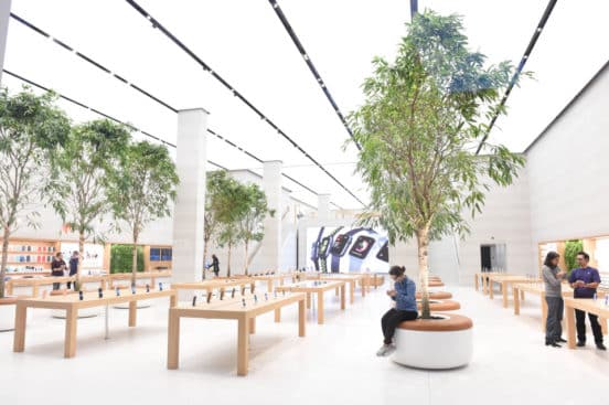
Everywhere you looked in 2017 was a major retailer announcing plans to build town squares, also known as “Stores.” Apple led the way with this framing, declaring that they would henceforth call their stores “town squares.” The idea is to make consumers feel like they have entered a quasi-public space, where they can interact with each other, learn new skills, meet new people and just hang out. There’s just one problem with this model: the true purpose is still to get consumers to buy products. No one has done a better job at creating interactive spaces than Apple, whose stores encourage users to experience the products up close and personal.
Now, however, Apple and other retailers are trying to obscure the purpose of a store by repackaging it as a town. Nike is following suit, announcing a new flagship town square where people can hang out, get advice about shoes, play around with lockers, and so on. Nike and Apple are missing the mark with this approach. People don’t need another place to hang out and meet up. When people want to buy a computer or a pair of shoes… they just want a store, not an experience.
New Trend: Retailers who receive enormous tax breaks could give back by creating public spaces that do not include the opportunity to buy a product. Google, Apple and Facebook could donate free internet to certain communities. Nike could donate free shoes to more schools and sponsor free sports camps for kids. Consumers don’t need another faux-coffee shop space.


