The Cleveland Indians and Major League Baseball have announced that the team will stop using its controversial Chief Wahoo logo on its jerseys and hats, starting in 2019. MLB and the Indians will continue to sell licensed merchandise bearing the smiling Indian. The logo has been a topic of controversy for decades, since it is offensive to many Native Americans, who liken the logo to the racist imagery of Little Black Sambo. The Indians already use the block C on its caps, but the logo is fairly basic. Logos give your brand a character, and an identity for others to recognize. Therefore, it is high time you hire a good graphic design services for your logo design.
The decision opens up a great opportunity for the club to redesign its logo. Designers and fans of the team are already coming up with some great alternatives. Let’s take a look.
Indians + Feather
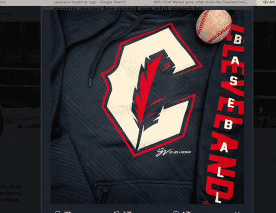
Local artist GV Art + Apparel has proposed a very popular new design for the uniform which incorporates Indians tradition with a feather, but minus the negative stereotyping of Native Americans. Fans have rallied to this idea, particularly since it would give a local company a big boost.
Cleveland Spiders
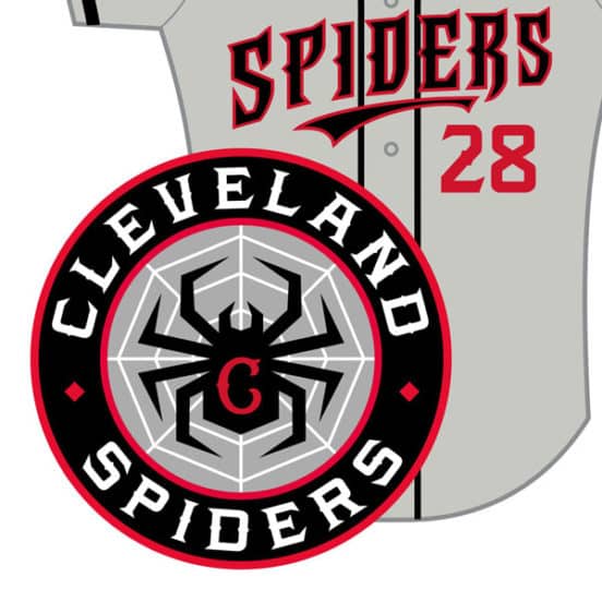
One option for the Indians is to drop the name altogether and return to its original team, the Cleveland Spiders, who played in the American Association starting in 1887. Eventually the club moved to the National League in 1889. The Spiders once had Cy Young on their pitching staff, and the idea of the Spiders nickname has remained popular in the Cleveland area. Fans have designed their own spiders gear for years.
Cleveland Bluebirds
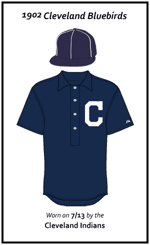
A less well-known team also played in Cleveland in the early 20th century, the Bluebirds. This team came to Cleveland in 1901 in the American League. It was also called the Cleveland Blues and the Cleveland Lakeshores. The logo, like others from the area, was just a simple woodblock of the word Cleveland. Designers could certainly freshen this concept up. Bluebirds are notoriously nasty, so maybe it would give the Major League-identified team a new attitude.
Cleveland Guardians
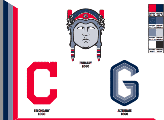
The Cleveland Scene held a contest in 2016 to redesign the logo. The fan winner was The Cleveland Guardians, by Tim Schlife, which was inspired by the art deco masterpieces the Guardians of Transportation. As he explains, “the Guardians of Transportation on the Lorain-Carnegie Bridge have been a source of strength and civic pride since 1932–one year after the completion of Municipal Stadium, baseball’s home on the North Coast for over 60 years. e bridge, finally, terminates at the world-famous “Corner of Carnegie & Ontario,” only a few hundred yards from home plate. is subtle change to the name would retain continuity among the current fan base, and provide ultimate respect to the heritage of both our fair city, and the proud Native Americans who live here.”
44th & Goal Redesign
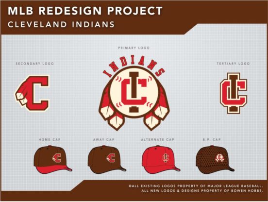
Sports Design firm 44th & Goal is an advertising firm which also runs a blog dedicated to the design of pro sports. Designer Bowen Hobbs created MLB redesigns for several teams, including the Indians. Hobs explained his objective: “My main goal was to bring a level of dignity to the brand. To accomplish this, I decided to rely on abstract symbols of Native American culture, such as the feather and dream catcher. It was also important to not paint the team as warriors, since they are not specifically named after warriors, like the Braves. Baseball has a long tradition of not necessarily using fierce or intimidating mascot (read: Cubs, Orioles, Rays), so the more peaceful iconography isn’t out of place. The color palette is brown and red to avoid the overuse of navy and red that currently plagues MLB.”