Over fifteen percent of the population is over 65 years, and over the next 30 years that number is expected to double, to more than 66 million people comprising almost 30 percent of the population. As people age, their physical attributes change. Sensory, motor and cognitive abilities change. A question for designers is whether and how to change typography in order to cater to older people who may have vision problems. Studies have shown that with advancing age, vision declines. This is due to the way that the pupil shrinks over time, which causes specific problems reading in low light conditions.
The population is rapidly aging and becoming a larger share of the marketplace. Thirteen percent of the population is currently over 65 years old. In 30 years that group will double to 66 million people. People change as they age. Sensory, cognitive and motor abilities decline. The built environment is not typically created with the needs of the aging population in mind. How does the choice of typeface in signage systems, for example, impact the older viewer who is experiencing vision problems typical to that age group? Are certain typefaces more suitable to the aging eye?
The image below shows what this looks like at age 20, 60 and 75.

Loss of focus is the most common issue for people as they change, since the eye’s lense loses its elasticity. This results in images looking blurry. More serious problems arise for some people, like central field loss and peripheral field loss. This is especially common for people with neurological conditions or diabetes. Peripheral field loss is the ability to see directly ahead, but not on the margins. Central field loss can’t see what is in front of them, but do see the periphery.og
Designers should consider these limitations when designing typography for signage. The Americans with Disabilities Act (ADA) contains Typographic standards for signage body-width to height and stroke-width to height ratios for the use of appropriate typefaces in signage systems. These standards are meant to direct designers to more uniformity, decreasing reliance on condensed or overly thick or thin strokes, which are harder to perceive for the aging eye.
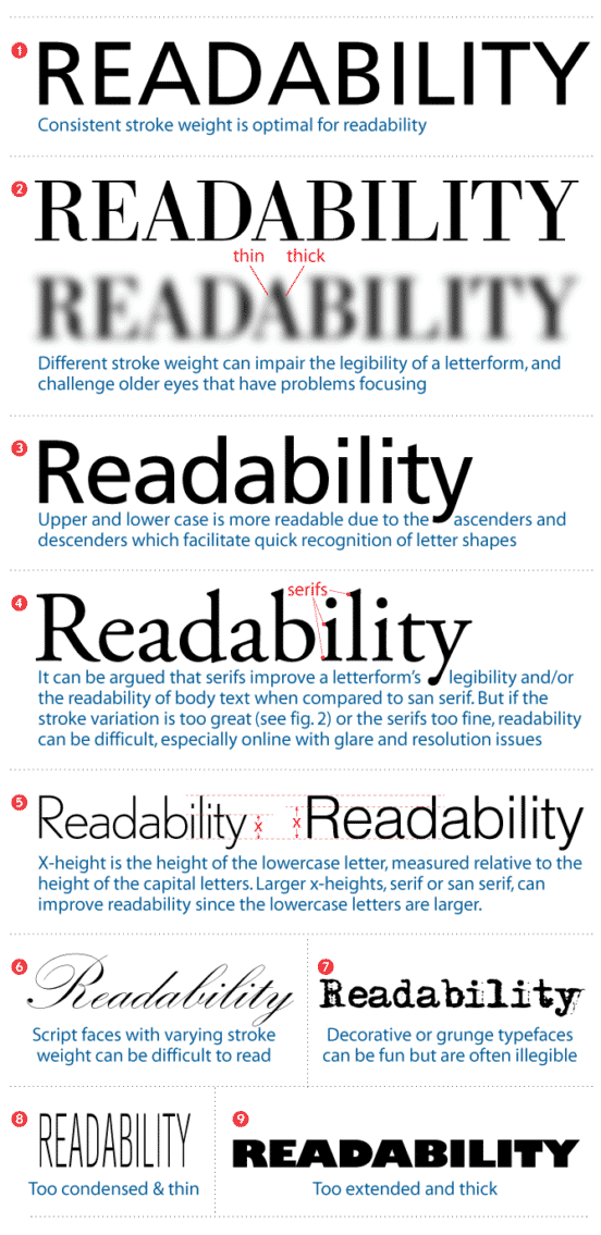
What makes a good typeface for older people? Consistent stroke width, pronounced ascenders and descenders, open counterforms, wider proportions horizontally, and more distinct forms for each character.
The following notes on common typefaces should be considered when designing signage.
Bodoni Book
The thin strokes of Bodoni Book make this a non-starter for older eyes. The characters will break apart for those who have low vision conditions.
Times Roman
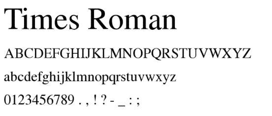
With its bigger x-height and moderate stroke areas make it more readable than many other fonts. However, the proportion is somewhat condensed, which can cause closed counterforms in low vision conditions. This can be seen mostly with the letters “E” and “A”.
Century Schoolbook
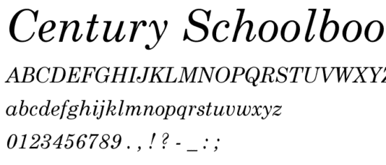
Century schoolbook is a viable alternative to Times Roman, since it has a wider proportion which helps the counterforms in “E” and “A” to close less. It also has a more consistent stroke weight. It also has a larger
Futura Heavy

Another good alternative is Futura Heavy, with its circular forms. These have been shown to do well in the low vision conditions. However, the “T” can be blurry or faded thanks to its short crossbar.
Helvetica Bold
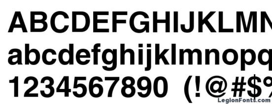
Helvetica’s larger x-height and wide proportions are good for readability in all conditions. The shorter ascenders and descenders, however, can pose some problems.