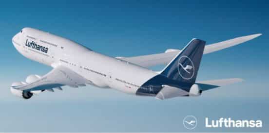
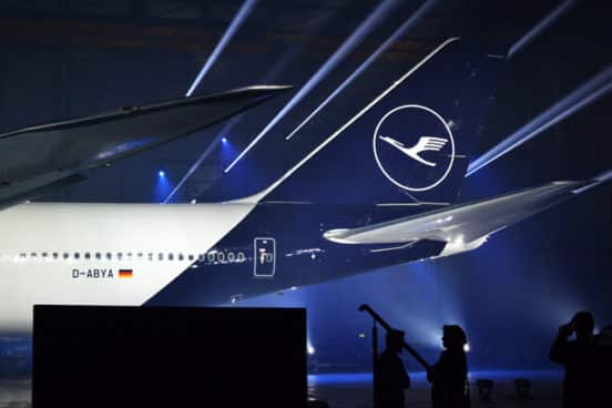
Lufthansa – which had the oldest logo in the airline industry – has ended weeks of speculation and rumor by officially unveiling its new look. The Frankfort ceremony showed off new livery, which dumps the old school yellow crane that has been perched on the tailfin of every Lufthansa airplane for as long as the company has been in business. The new color scheme goes with navy blue and white.
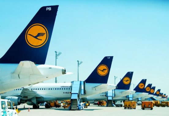
Lufthansa’s Old Livery Design
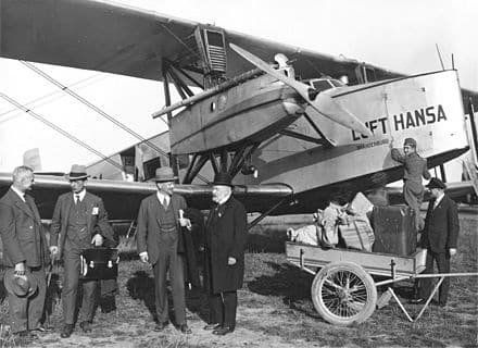
Lufthansa noted that it was celebrating two special anniversaries: 100 years of its famous crane and what was officially their best year in 2017. Lufthansa packaged its new livery as the beginning of a new era for the five-star airline. The old logo was designed by designer an architect Otto Firle in 1918. Firle’s effort marked the first time that an architect was used to build a corporate brand. Firle had an aviation background, having served as a member of the German flight corp in World War I.
The crane will still be part of the revamped brand, but it will be removed from the aircraft. The yellow of the crane will now be glimpsed on the boarding door, with the remaining airplane designed in blue and white. This is a dramatic departure for Lufthansa, which uses the color yellow in almost everything associated with its brand. The design team said that they plan to use the color more sparingly, which will make it stand out more.
Lufthansa is pivoting to place more emphasis on its brand as a luxury airline. This is a risky move, since this is an era where discount airlines rule the day in North America and Europe. Lufthansa notes that it had already been upgrading its fleet technology, utilizing new airplanes (like the Boeing 747-81 and Airbus A380-800), and upgrading its seats and cabins. The company is also upgrading its digitization.
Some have praised the company for opting for modernization. The last time the airline revamped its branding was in 1980 and it was clearly time to infuse the brand with new blood. At the same time, some believe that its digitization process was the true impetus behind the switch. Yellow is not a color that is widely used on digital platforms except as an accent color.
Although Lufthansa said it never considered yellow the dominant color, it does believe the color is central to its overall history and modern update. At the press conference, spokespersons said the yellow signage was a good example of how the brand stood out from the crowd, and that the yellow crane and color was also an emotional signifier for airline customers, especially Germans.
The yellow (RAL 1028) will be used in passenger interfaces rather than on the livery. Customers will notice little difference on the tickets and signage, while the crew uniforms and cabins will bring in more of the color.
Eurowings, a discount airliner that is also owned by the Lufthansa Group, also had a similar look with yellow on the aircraft. The move to a sleeker dark blue with white distinguishes the airline from the low-cost carriers.
Lufthansa’s main competitors in the premium airline space are SWISS, Austrian and Brussels Airlines.


