From Facebook to Twitter to Instagram to e-commerce websites, every company should have a strong digital presence. That makes solid graphic design more important than ever. If you run a small business, the best thing you can do to create a consistent and memorable message is invest in hiring a professional designer to make sure your logo, signs and online presence are consistent, eye-catching, and optimized for mobile devices. But if you can’t afford a designer, there are some tweaks you can do yourself – provided you know the basics.
In this article, we review the basic tips for great graphic design. Even if you plan to hire a graphic designer, knowing these tips will help you communicate effectively.
What is Graphic Design?
According to the professional association AIGA: “Graphic design, also known as communication design, is the
art and practice of planning and projecting ideas and experiences with visual and textual content. The form it takes can be physical or virtual and can include images, words, or graphics.” The goal of graphic design is to visually communicate messages.
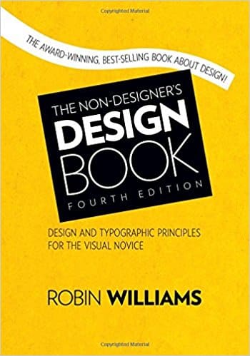
In her book “The Non-Designer’s Design Book,” Robin Williams recommends that people consider design as C.R.A.P. This acronym represents four key concepts: contrast, repetition, alignment and proximity. If you follow these four principles, you have the foundation of great design.
What is Contrast?
Contrast is all about catching the eye of the viewer. It may seem like graphic designers is simple, just combining images with text. In reality, much thought goes into how to create visual interest, even for the smallest advertisement, logo, or sign.
Contrast is also meant to direct the viewer through the entirety of your message. This can be demonstrated in photographs, headlines, quotes, or infographics. There are an endless number of ways to incorporate strong contrast in your marketing. Designers consider things like fonts, color, weight, shapes, sizes and more.
What is Repetition?
Once you have considered contrast, you need to evaluate how strong the message is. You want to use visual design to repeat and emphasize your message. This may be accomplished by repeating fonts, colors, textures, or in many other ways. If you are creating a full-page ad, repetition will help make your advertisement memorable.
What is Alignment?
Alignment can be a struggle for a non-designer. We’ve all seen examples of bad graphic design, with too many fonts, contrasting colors, and conflicting messages. The point of alignment is to make sure the design elements are in harmony with each other, creating a balanced visual. Adding text and images randomly creates chaos and drives people away from, rather than to, your message.
What is Proximity?
Proximity is a basic concept: it is the process of ensuring related design elements are placed together. Objects that are unrelated to each other should not be grouped together. Graphic designers use white space to create clean messages that are not overcrowded. The most common mistake made by non-designers is to cram too many objects into a space, resulting in a jumbled mess. Any good graphic designer will advise you to embrace white space to make the message stand out.


