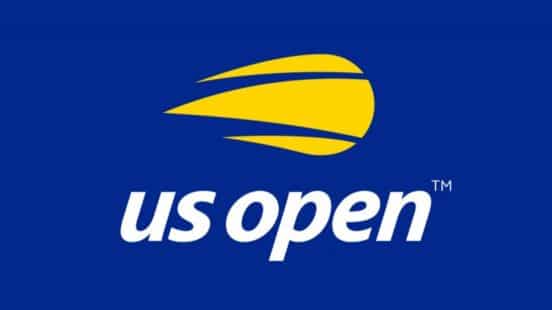
The United States Open, America’s premier tennis championship, got a logo redesign. The U.S. Open has long used a flaming tennis ball to promote its championship, as well as the U.S. Open-affiliated tennis tournaments, the U.S. Open Series. Now, thanks to a design refresher by the agency Chermayeff & Geismar & Haviv, the tournament has a new logo to coincide with the 50th anniversary of open tennis.
The U.S. Open is one of four Grand Slam tennis tournaments (the others are Wimbledon, the French Open and the Australian Open). The tournament has taken place in New York since 1881. The 50th Anniversary marks the year when the tournament ended amateurism, opening the draw to professionals in 1968, and offering prize money.
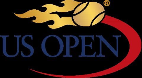
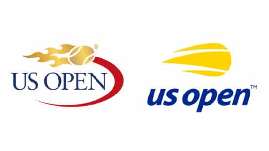
The U.S. Open updated its brand identity for the first time in 20 years. Like other brands, the tournament was concerned that its old logo did not work well with digital platforms. The old logo used a red swoosh, flames and a serif typeface. According to the USTA, which runs the U.S. Open, the old logo was too complicated.
Chermayeff designers kept the flames but rather than showing them chasing the ball, the flames become the ball itself. This is paired with a new italic, sans-serif typography. According to the design team, the words “U.S. Open” are now also linked together by a flipped round “u” and “n” – although the type is so subtle that you hardly notice it.
“The result expresses the energy, spirit, and velocity of the flaming tennis ball and the US Open itself,” says Chermayeff & Geismar & Haviv in a press release, “while modernising the look, providing a more youthful appeal, and optimising the identity for applications on everything from apps and Instagram to billboards, print ads, and swag.”
The more minimal effort was underwhelming to tennis fans, who are resistant to change. Fan approval of the update was not the U.S. Open’s priority. Like many brands who are initially criticized for updating a logo, the U.S. Open was focusing on the reality of digital advertising. Logos have been redesigned to emphasize readability on mobile devices. As Chermayeff explained, “The mark that had been used for 20 years — an illustration of a flaming ball paired with thin serif type and a red swoosh — was a complicated image that had challenges in digital media and did not represent the tournament well as a premium sporting and entertainment brand.”
However, some fans praised the change, since the three yellow shapes are pointed at one end and rounded at the other, showing both the flight of the tennis ball and its shape. The design firm wanted this result, stating “While the rendition of the mark posed challenges, the core concept of a flaming tennis ball still captures many of the attributes of the US Open – energy, excitement, movement.”
Chermayeff is responsible for iconic logos like NBC’s peacock and the legendary globe for Pan Am. The U.S. Open is following the lead of several major brands who have simplified their logos, including Lufthansa, MasterCard, and the English Premier League soccer association.