There is nothing as strong as a great first impression, which is why business cards remain important even in the digital age. Too many designers and artists take the same approach as lawyers, doctors and other professionals: sticking with the same business card style for years or even decades. While this approach is not recommended for any profession, no matter how conservative, it is even worse for designers and artists, who need to demonstrate creativity and style. A business card is a key part of your branding. It needs to be memorable and communicate what how you can help a potential client or contact.
Ultra Thick Cardstock
Ultra thick cardstock is making a big impact in 2018. Smooth to the touch, thick cardstock leaves an impression of luxury. By using smooth, bright, heavy paper and clear text, the card will create a sharp contrast that stands out, especially compared to the flimsier light cardstock. 24-point cardstock is increasingly popular.
Go Minimal
The advent of online business card outlets like Vistaprint has led to an explosion of interesting business card templates and styles. All too often, however, these designs are very busy and colorful, forgetting that the business card is only a two inch calling card that must communicate specific information, not serve as a mini-mural. That’s one reason that minimalism has returned to business cards. Conveying the name and contact information need not be boring on a minimalist card. You can change it up by using a bold color choice, like a black or red background.
Oversize Fonts
White space is a key part of minimalism, but one mistake people make is using type size that is simply too small. You want to avoid using Arial or Courier 8-point on a business card. The last thing you want is for your prospective customer to feel like they need a magnifying glass in order to read the text. Although card experts generally recommend 10 or 11-point size, people are increasingly making the bold choice to go with an oversize font. This can be used for your name or the business’ slogan. This choice emphasizes that you are decisive and a leader.
Mirror Your Brand Design
Integration is increasingly important today, so don’t choose a business card that isn’t in the same font, color, and style as your other brand cues. Everything you choose to represent you should be consistent. A good rule of thumb is to consider your website style and tie it in to your business card format. This is especially true as companies are simplifying their digital presence with streamlined logos and typefaces. Make sure your card mirrors your logo and font style.
This card, for a digital design firm based in Sydney, Australia, emphasizes the style cues of the designers and simultaneously links to the look and feel of the website.
Change the Shape
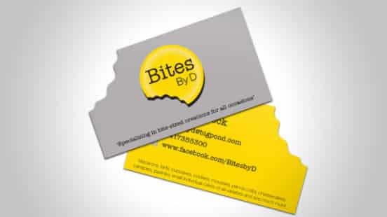
For people in creative industries, it’s a good bet to go outside the box and change the shape of the card. A custom die-cut card suitable for your industry will be memorable and fun. The example card was created for a new business that wanted a simple and clean line style, as well as a logo. This card integrated the bite-logo with the actual shape of the card.