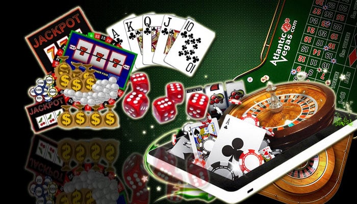
There is simply no denying that going into business for yourself is truly exciting. This is especially true if you are venturing into the gaming market. Not only is the gaming market currently at an all-time high, but it is only forecasted to continue growing. Needless to say, the industry is a lucrative one and it looks like it will only get more and more lucrative as time goes on. Of course, just because the industry is vast and lucrative it doesn’t necessarily mean that you can jump right in and rise to the top of the ranks. In fact, you probably won’t.
It will not only take hard work, but it will take dedication and knowledge. Did you know that the art that you choose to display on your site could make all the difference in the world? Did you know that it could be the difference between bringing customers back and having them go elsewhere? It could be, and below, you are going to learn how to pick the very best art and illustrations to make your site a success.
Color Can Make A Difference
When people are designing sites, especially gaming sites, it is the color that they get caught up in. It doesn’t matter if you know anything about design or art, you probably already have the assumption that the color is going to make all the difference in the world. Well, you are right, but this doesn’t mean that you need to get caught up in the decision. The reason that most people get caught up in the color is that they know that it is important and they try to choose a color that matches the rest of the site’s design. That being said, there is no set rule that says you have to match your art with the rest of the site. Sure, this is an acceptable way of choosing the right art and illustrations, but there are other ways that you can go about the process.
You could even choose the exact opposite of what you already have. Heck, you can even choose something that is as plain and simple as black and white. The main thing to remember is that you really want to choose something that compliments the space where you are putting it.
Size And Space
Size and space are two critical aspects when it comes to choosing art for your website. Not only will the size and space affect how people view the site, but it might affect how they are able to view it. If the art is too big for the space then it might not look right, but it might not also load right. The idea is that you want the art and illustrations to be in the background. The most important things on your site are going to be the content and the games. These are the things that will draw your customers in and make your business money. Make sure that your art simply stays in the background and doesn’t overwhelm the activities that are there for the customers.
Consider Mixing New And Old
You can ask anyone from the ultra-popular gaming site sbobet and they are all going to tell you the same thing. They are going to tell you that it is the contrast that makes all the difference in a space. Contrast is something that stands out while making a statement. What you might have to do is consider art or illustration that are different from the rest of the page. For instance, if your homepage is meant to get a modern or traditional feel then you might want to load it down with older works to create striking focal points.
Even throwing in some contemporary works could go a long way. Whatever the situation is, you will find that it can be fun as well as entertaining to mix and match different colors and styles. Spend a little time playing around, but do not get too caught up in the project because there will be lots more to do.
Summary
The art that you choose for your website will play an important role in how others view your site. Not only this, but it could also affect the overall performance of the site as well. In a world where performance and convenience are everything, you simply do not want to put your customers in a situation where they are left staring at a spinning hourglass.


