Photo by Michal Dolnik on Unsplash
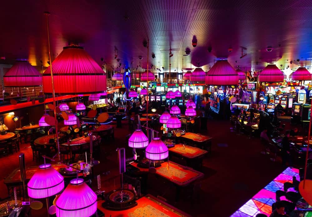
Casinos have some of the most instantly recognisable branding of any business. Neon lights, red carpets, gold accents – it’s safe to assume that most casinos will make use of these classic design trends to create that environment we all know and love.
We associate these trends so closely with casinos that online offerings often recreate them in their own branding, from gold lettering to arcade music playing in the background of their games. But as online casinos have become increasingly popular, we’ve seen a number of design developments which have arisen as a result of continued market study.
In this post, we’ll be exploring some of the top design trends that are used and loved by casinos. Whether you’re a loyal member of your local bricks-and-mortar casino, or a devotee of Caxino online, we’ll analyse casinos both online and off to see how design can shape our play.
What are the top casino design trends?
Ever since the world’s first casino, Casino di Venezia, opened in 1638, we’ve seen a number of key design trends which have ultimately created the casinos we’re familiar with today.
1.Luxury interiors
There’s a huge range of casinos out there, from backstreet gambling houses to huge, luxury multiplexes. When it comes to design, it’ll come as no surprise to learn which one of these extremes is more successful.
According to Roger Thomas, an interior designer who has shaped some of Las Vegas’s top casinos, the best casinos should have a sense of grandeur. Why? “Because people tend to take on the characteristics of a room. They feel glamorous in a glamorous space and rich in a rich space. And who doesn’t want to feel rich?”
2.Maze-like layout
Former gambling enthusiast turned casino management advisor, Bill Friedman, has a different approach from Thomas. In his book ‘Designing Casinos to Dominate the Competition’, he advises low ceilings, disorientating carpet designs, and maze-like layouts.
These design trends, which are widely used to this day, help to suck visitors into the world of slot machines and table games. Combined with a lack of windows and clocks, they can make punters feel inclined to stay – and the longer they stay, the more money they’re likely to spend.
3.Dark graphics
Online casinos may not have to worry about the height of their ceilings or the number of their windows, but they do have to consider a range of web-specific design problems. Just as Bill Friedman recommends designing a physical casino to keep customers inside as long as possible, online casinos have developed various design trends to keep visitors from clicking away from their site.
One of these trends is the use of dark graphics and themes. The deep grey or black backgrounds which you’ll find on many online casino websites isn’t just a way of making the neon graphics stand out – it’s also much gentler on the eyes than other colours.
This means that visitors can stay on the site for hours at a time, without factors such as eye strain alerting them to the length of time they’ve been playing. It’s the digital equivalent of having no clocks on the walls! Check out bacc6666 for a great experience.
Next time you visit your favourite casino, keep an eye out for these top design trends. By understanding their impact, you can become a savvier gambler!


