Do you want your newsletters to stay ahead of the above the curve every year? It’s very essential to keep up with the new design dynamics and trends as well. While the copy and subject lines have to be prioritized, the design can’t be left out. The 2020 newsletter design trends are an amazing combination of technological advancements and a flawless visual appeal. Using the right newsletter design layout will increase responses from your email marketing campaigns.
Email designers constantly focus on bringing a unique experience to the subscribers. Design trends keep changing from year to year and in this article we’ve discussed some of the best email design trends to consider this year.
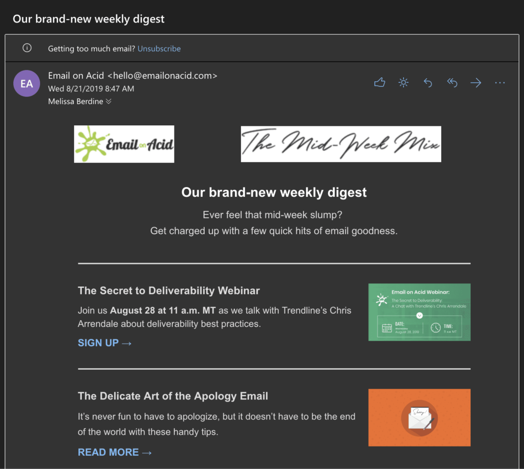
Incorporate Dark mode design
Dark design changes the palette color of the email interface in such a way that it presents high contrast on a light foreground and dark background. This makes the email more accessible and eliminates the blue light. For the individuals who work in night shifts or have light sensitivity issues find it very easy to read using this dark mode.
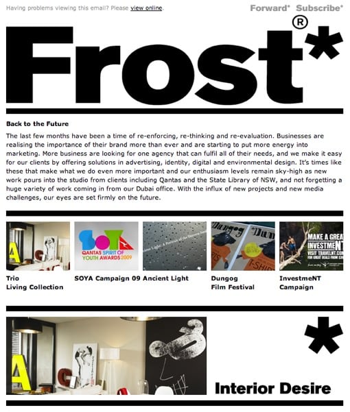
Play With Typography
Most emails have been in Arial fonts for long. It is time to opt for something new! In your newsletter, you can spice up the typography in two ways: the GetResponse’s new email creator that enables you to bring any Google Font into your newsletter design. Design is the other way. The other way is by the design. Utilize the modern fonts within your graphics then consider uploading them into your email newsletters.
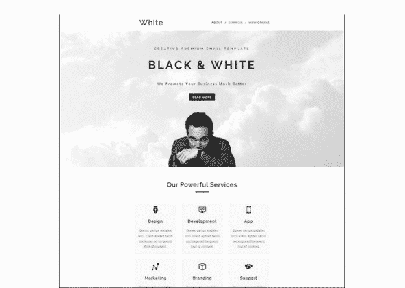
Minimalistic, Clean, and Simple Designs
In design, less tends to be always more. It’s not necessary that you fill up your newsletters with texts, photos, and also maximally use the margin space. Every newsletter should focus on a single topic, service, or product. Consider dedicating more white space to your design as possible. This makes it very easy to read, clearly conveys the email purpose, and prompts the reader to the next action without any distracting design features.
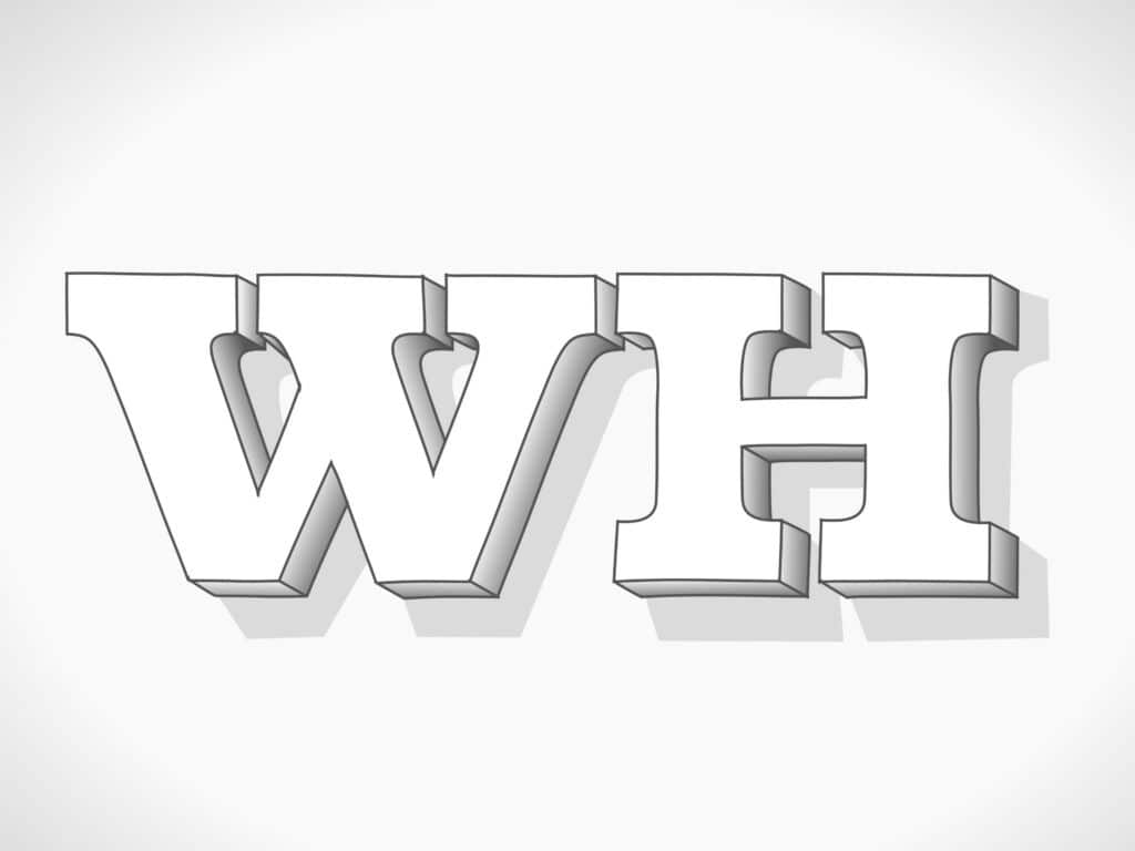
3D Images and Infographics
Of late, 3D imagery has gained popularity and is being used almost in all new website designs and they have also made their way to email design. The use of 3D images helps in creating better emails that lead to enhanced subscriber engagements. It not only conveys the message more effectively but also facilitates the decision-making process by building confidence in the mind of the subscriber. Generally, to create 3D imagery is labor-intensive and it does not appear in email designs often but when it does it is incredibly awesome! Consider using fun visuals such as infographic formats and adding in data visualizations when sharing numbers and statistics. You can choose piecharts, maps, percentage visuals, and bar graphs from the graphic design software such as Visme.
Seamless Designs and APNG Animations
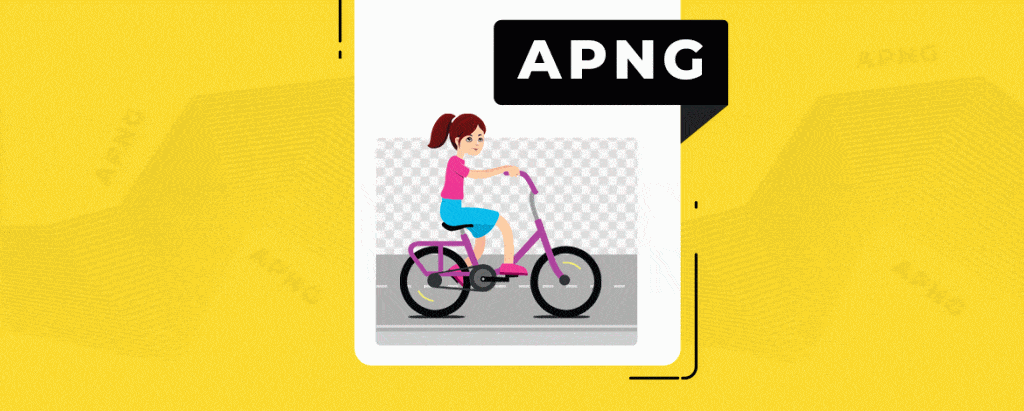
Seamless designs refer to emails that occupy the entire screen such that there is no space for distractions. An email should have a normal width ideally but with a seamless design. Moreover, there is this hot email design trend known as gifs. Animated PNGs are more popular because they are widely supported than CSS animation across email clients. In comparison with gifs, APNGs are more transparent and allow more color. Gifs are the alternatives to go for if your email platform doesn’t support APNGs. These animations help grab the reader’s attention in the inbox. They greatly work with lightweight emails that do not have other more other images or texts because they’ve large loaded weight. For the best results, try to compress the gifs.
Video In Emails
This is another trend making a strong leap into the email design trends. Short-form videos can increase the click and open rates. Most platforms such as outlook, yahoo, and Gmail don’t support video playback within the email so do not include a video in the email. Instead, generate a thumbnail image with a clickable link to direct the user to the video particularly to your websites. This tends to boost conversion rates and also get more subscribers in just clicks from your emails to your websites. Focus on making the clickable play button easy to see and large enough to maximize the tap or click actions
Get Interactive
Interactivity strategy is another great email design trend in 2020. You can incorporate interactivity in your email design by adding some valuable links such as add-to-cart buttons, clickable menus, etc in your entire email. The futuristic emails reduce the unsubscribe rates with a delightful subscriber experience as they have interactive features that need no subscriber activity. Also, you can add polls and gamification interactive features in your email.
By considering the above ideas, you can just easily incorporate all the best email design trends in 2020 ranging from dark mode incorporation to interactivity. This is the time for you to put these awesome design trends to the test! Create an animated email, try different fonts, add in videos or animations, and go 3D.


