Pictures on websites are a good thing. They break up long passages of text. They help us to illustrate the point that we’re trying to make. They bring color and life to websites that would otherwise lack it. Human beings are aesthetic creatures – they’re naturally drawn to the things that they consider to be beautiful. It’s hard to make a website look pretty without using a few pictures to help you, and so you’ll rarely see a new website built without at least a few helpful accompanying photographs or drawings.
As with anything in life, though, it’s possible to have too much of a good thing. Stuff your page with too many pictures, and you’ll slow down the loading time. If your page takes too long to load, you’ll be penalized by Google in terms of your placement in search results, and that defeats the whole point. It’s no good to have an attractive website if nobody’s ever going to see it. That’s why it’s important to know when it’s appropriate to use pictures, how many to use, and when it’s better to show restraint and stick with text.
Usually, you’ll get the hang of when and where to post pictures with a little trial and error, but if you’re setting up a site for a brand new business or hobby, you can’t afford to get it wrong. It will take you weeks or even months to recover from the damage that a badly-designed or poorly-optimized web page can do, and time equals money in the world of e-commerce. Follow the steps we’ve outlined for you below, though, and you’ll stay on the right track.
Illustrate Products, Not Backgrounds
Some products and services are visual by their very nature, and therefore they don’t need to be accompanied by other photographs in order to get their point across. Having a visual product means that you’ll already be using a lot of pictures on your homepage and elsewhere on your site, so anything additional you add to them will just slow your site down further. To get a handle on this, try looking at a good online slots website. These days the best of those websites cluster several hundred online slots games together on the same site, and all of them come with their own promotional image. To make their job easier, the images are kept to thumbnails, and aside from those thumbnails, list of UK slot games and perhaps the online slots website’s logo, you won’t find any other visual content on there. Let your products speak for themselves if they have to be photographed or illustrated. Don’t distract from them with even more image content.
Avoid Stock Images
Nobody likes stock photos. Not even the people who appear in stock photos like stock photos. They’re so obviously fake that they turn viewers off whatever it is you’re trying to sell to them. The actors never look convincing, and the images are always too sanitized and idealized. If you want to use an office image as the background of your website, use your real office. If you want an image of a customer looking happy with your service, use a real customer. Authenticity will resonate with your audience. Pictures of places that obviously aren’t where you work, or people who’ve never heard of your business, will not. If using real pictures isn’t an option, it’s better to use none at all and focus on graphs or logos instead.
Use Logos As Menus
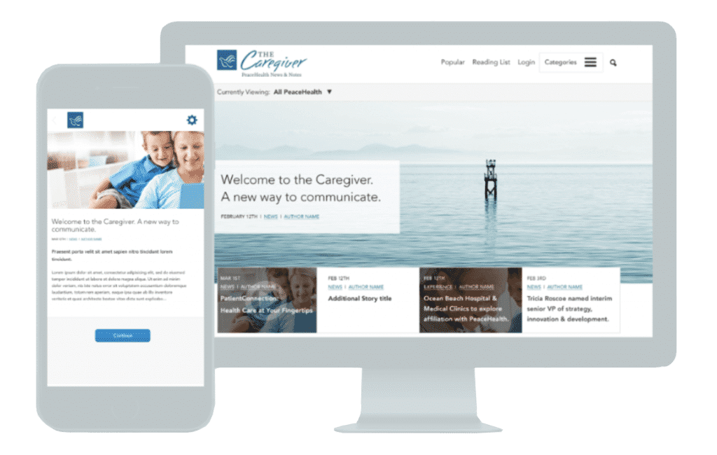
To borrow an old phrase, you can kill two birds with one stone here. You’ll almost certainly have a business or personal logo that you want to use on your website, and the logo counts as image content. If you intend to communicate with your audience efficiently, you’ll want to avoid clutter on your pages so that all of the important information is easy to see. That’s why your logo can become a menu button. Position it in one of the top corners of your website, and have all of your menu options appear when it’s clicked on. This avoids the need for messy side or top banners and leaves more room for white space. The fewer distractions there are around the core content of your site, the easier it is for your reader to focus on it.
Think About The Fold
The homepage of your website has a ‘fold’ in exactly the same way as a newspaper does – it’s just a digital fold as opposed to a piece of paper. The ‘fold’ is at the bottom of your page when your customer first loads it. To go beyond the fold, they have to scroll down. Not every single visitor who arrives on your website will take the time to scroll down and find out what else is there. They’ll look at what’s above the digital fold, and from there, they’ll make a decision about whether they want to stay on your website and find out more about you. That makes the top half of your homepage the most valuable part of your whole site. If you waste all of that space on a large image, you’re not doing yourself any favors. This is the space that you should use to get your key messages across, and so the majority of it should be text. Use a supporting image to help viewers understand the message if you want to, but the image should take up less than half of the space available.
Background Images Are A Mixed Bag
Instead of using multiple different images on a site, you might prefer to use one background image that sits subtly behind your text. This is a sound idea when it comes to avoiding clutter, and will probably make your site load a little faster, too. Choosing the right background image is difficult, though. If it’s too faded, it will look washed out, and your site will look boring, but if it’s too bold, it will become difficult for your text to remain legible on the average screen. The color of the image is also important. Every color has connotations; purple or gold suggests opulence, and red suggests danger. You need to ensure that the color of the image is consistent with the theme of your website and that the picture doesn’t obscure your text. If in doubt, use a white background.
Getting it right with images doesn’t have to be difficult so long as you know the basics, and you exercise common sense. Stick to the guidelines we’ve provided you with above, and you’ll have a website that’s more likely to hold the interest of your audience and therefore attract better conversion rates!