Building affiliate websites is a bit of a different ballgame than building websites for businesses. With the UX design of affiliate sites, you’ll need to think specifically about how you are going to get the website visitor to click on the affiliate links – and design around that.
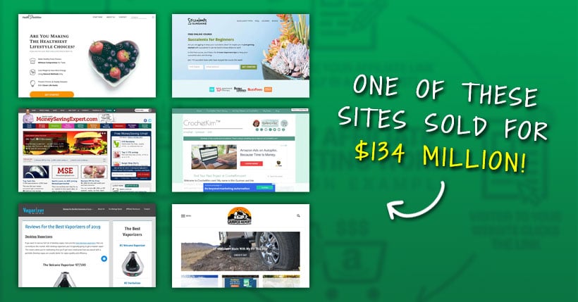
Yes, affiliates sites can be worth a fortune
Remember your target audience
What are the affiliate products or services that you are trying to sell? Is it travel gear? Office accessories? Online workouts? To determine the UX of the site, think of the demographics of the target audience. Serious travel-heads might be around 30-50 and fairly savvy at finding the right travel gear online, so you’ll need to make your page stand out. Online workouts may be targeted towards stay at home moms, or they could be for remote workers. Always keep target audience in mind – and design for them.
Make it responsive
According to statistics from StatCounter.com, over the period from March 2019 to March 2020, there is now more mobile usage than desktop usage worldwide – 52.03% vs 45.32%. What this may mean for your website is that more visitors may be coming to your site using their mobile phone rather than a laptop. This is essential to keep in mind for design. Rather than designing UX with a desktop-first approach, you may want to go the opposite and go with a mobile-first design approach. Start with your mobile layout and work your way back instead.
Do you really need to serve ads on your website, too?
While it can be tempting to serve ads on your site as another revenue stream to add to your affiliate links, do think before putting them in. People don’t like having strips of ads to wade through, they prefer sites without. If you can manage without having ads on your site then it’s better to leave them off. Put the extra effort into your SEO so you can gain more visitors and hopefully get them clicking on those affiliate links instead.
Have affiliate links only one level of depth away from your homepage
When we’re talking depth of affiliate sites, it’s good practice to have a depth of only two – your homepage, then links from there. While you can go deeper, this can be when you expand the site, rather than straight from the get-go. It’s a good idea to put affiliate links on the front page if you can manage it. Here is an example of affiliate site design for online casinos, where you can see the clear affiliates on the front page, as well as quick navigation links to take you that one step deeper.
Put affiliate links in multiple places / with multiple modalities
With affiliate links, there is no reason you would just have to put it in one place on one page. Instead, you can have perhaps, a hyperlink in your text, a link on a icon, and even links on other images. Putting these links in multiple places gives the user a greater chance of clicking on the link and getting those affiliate dollars. So, if you have a page dedicated to one product in particular, you can link a few times throughout the page – as well as reference it on other pages too (particularly in lists).
Make affiliate links playable/useable within your site if possible
Depending on the product or service that you are an affiliate of, you may be able to embed widgets that allow a one click purchase of an item, or playing through a game, etc., on your website. This is handy because it removes that extra step of visiting another site. With every extra step someone needs to take to purchase something, the more changes are you have at losing them along the way.
Too many pop ups suck
Pop ups are annoying! Don’t be that person. Make sure that your website has – at the very maximum – one pop up on entering (if you have something amazing to say) and one pop up for when people are thinking about exiting. While you might think it’s a great way to capture attention it can also be a real turn off. That’s why pop up blockers are a thing – there are plenty available for all browsers, like Poper Blocker for Chrome, which people often use. Remember than on-page pop ups are just as annoying as pop ups that open in a new window. You want to capture the attention and delight of the site visitor, not succeed in turning them off!