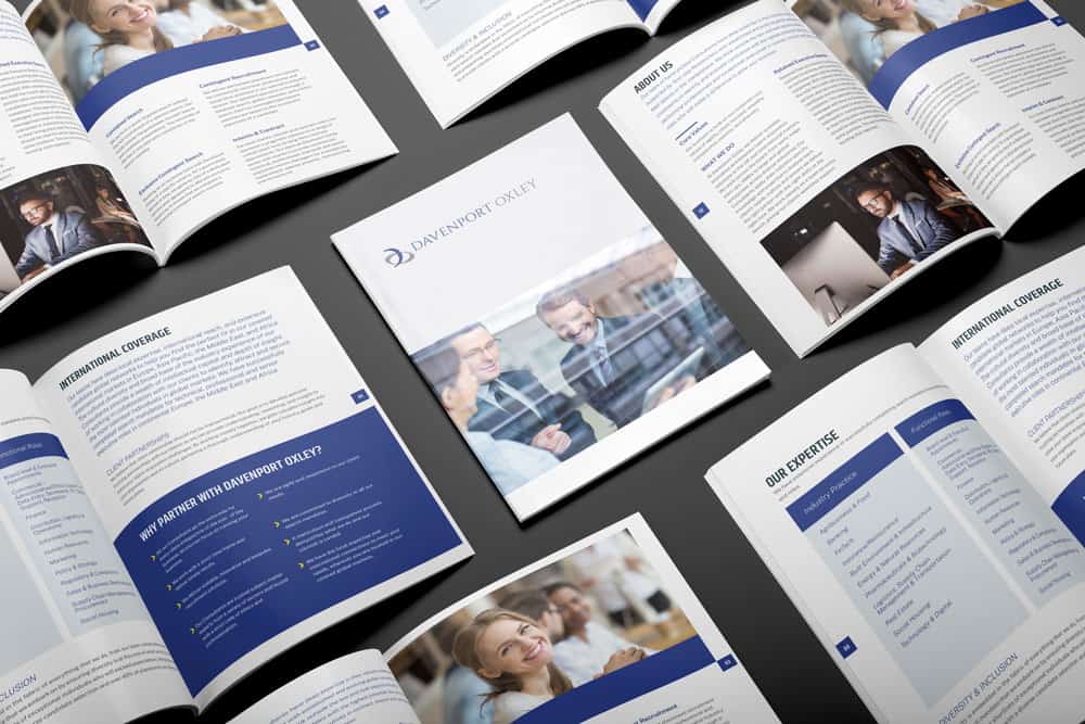
If you’re making a brochure, the last thing you want is for it to be ignored and quickly thrown away. To avoid that, it’s vital that your brochure is eye catching, making it stand out from the crowd — but how do you ensure that? What are the principles of good brochure design?
Decide on Your Aim
What are you trying to achieve with your brochure? The answer you give to that question should underpin all the choices you make to ensure a good brochure design for the project.
Specific questions you need to answer include:
- Which segment of your market are you targeting?
- What method are you going to use for distribution?
- What will be a successful outcome in the reader’s response to your brochure?
Plan How You Want Your Brochure Folded
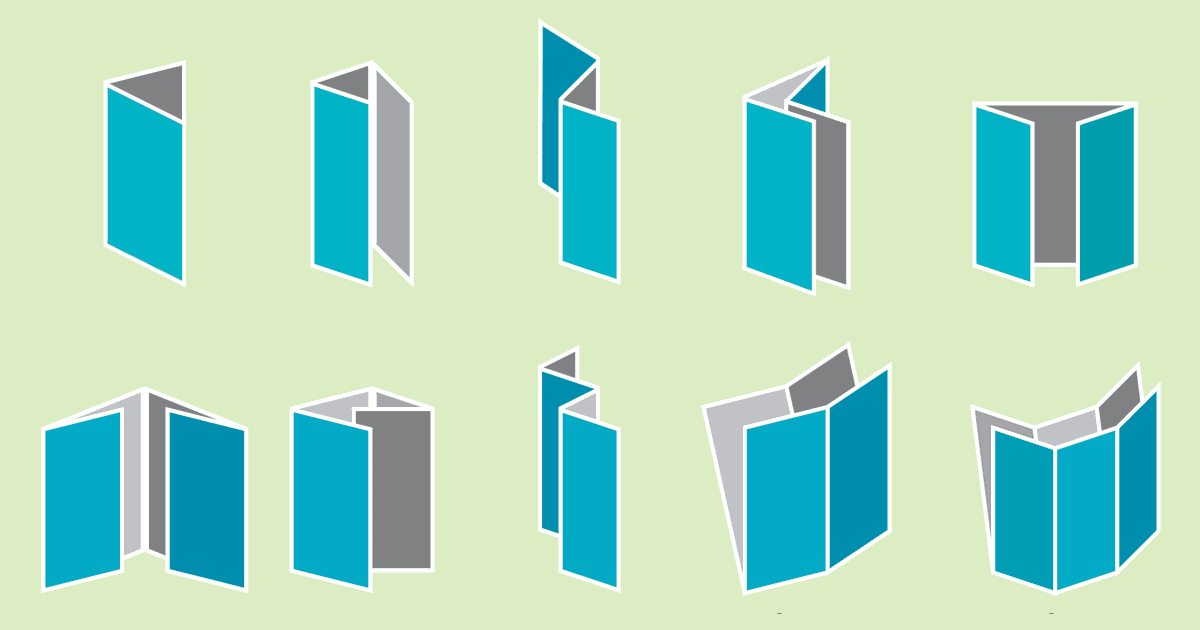
There are numerous ways of folding a brochure, from simple designs like half-fold and trifold to more complex options like a double gatefold. Your choice isn’t just a matter of aesthetics, however.
How many steps do you need to take your reader through? This will determine how many folds you need, while the relationships between the steps will affect how the various elements need to interconnect.
Integrate Your Written Content
The written content of a brochure is crucial, but it doesn’t work in isolation from other elements. While you obviously need to get in all the information you want to convey, that won’t work if the text is overwhelming the images, so make sure your content is concise.
Besides ensuring you have exactly the right amount of written content for good brochure design, you also need to plan carefully how it’s going to interact with the brochure design as a whole.
Get the Fonts Right
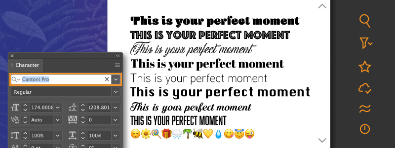
The fonts you choose for your brochure affect both its readability and the visual impact it makes. It can be tempting to go mad with lots of unusual fonts, but that’s very rarely going to work.
In general, it’s best to stick to three fonts, for headings, subheadings and text, and to use fonts that are simple and appealing, unless you have a good reason to get more complex. Most importantly, though, is to treat your fonts as an integral part of the design, not just as a vehicle for the copy.
Choose the Right Paper
You might think the choice of paper isn’t a matter of design, but it’s closely connected. Heavy stock with a gloss or matte coating can make your colours clearer and more vibrant, so the customer sees your brochure as you intended.
Besides this, it will give your brochure a more upmarket feel, and that can be vital to leave the reader with a positive impression of your company.
Make Your Photos High Resolution
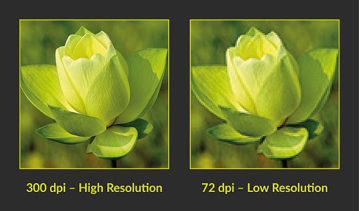
There’s no point putting effort into designing your brochure if you’re going to use blurred, lo-res photos. They need to come over as equally professional and high quality as everything in designing a brochure.
As well as hi-res, you need photos that are both well composed and placed to create maximum impact. If at all possible, it’s a worthwhile expense to hire a professional photographer, rather than trying to do it yourself.
Don’t Bury Your Call to Action
In the end, the call to action is the most important part of your brochure. Whether or not readers follow it will be the measure of your campaign’s success or failure.
The message must be clear and attractive, of course, but so must the placement and design of the call to action. Make it stand out, for example by using a larger font or surrounding it with white space.
Get in touch with us if your want to know more about what makes a good brochure design.