Web design, so we’re always told, is a very visual business. People are drawn in by the things they first see when they load your page, and so we’re trained to think that means pictures. We go ‘big’ on images and illustrations, draining the stock image banks of the world dry as we make sure that every page is peppered with plenty of visual stimulation. Some web designers make a lot of money that way, and we’re not saying there’s anything wrong with that approach. We do, however, suspect that things could be made better if you paid just as much attention to the font you were using.
While it’s true that people do notice the first image they see when they load a website, it’s not the only thing they notice. It might not even be the most important thing they notice – especially if it’s a stock image. People are getting savvy about what is and what isn’t a stock photo now, and they’ve trained themselves to ignore pictures that clearly don’t come from your workplace. Aside from that, using stock photos can be a great way to get sued even if you think you’ve done everything right when it comes to copyright and ownership. Use real pictures again, and pair them with a font that sends the right message.
Fonts and Messaging
Some of you will be wondering what we mean about a font ‘sending the right message.’ After all, the message is in whatever words are typed in the font, right? Actually, wrong. Tone is just as important as message, and fonts allow us to set the tone of a passage of text on the internet. A font is a subtle cue that we pick up on even if we’re not necessarily aware of doing so. Consider the difference between reading a message from a friend that says, “I really need to talk to you!” and one that says, “I really need to talk to you.” One sounds excited, and one sounds somber. You’d look forward to the conversation that was suggested by the message that came with the exclamation mark. You’d probably dread the other one. The words are the same, but the presence of the exclamation mark changes the tone. Fonts are capable of the same tone communication.
On a basic level, we’re all aware of this already. We know, for example, that Comic Sans is the most hated font in the world. It doesn’t deserve that reputation; the font was designed to be accessible for children, but a glut of businesses using it to either appear friendly or quirky over-exposed it and then led us to view it as synthetic and insincere. Comic Sans, rather than conveying the childish sense of innocence it was designed to transmit, now conveys idiocy and thoughtlessness. A website written in Comic Sans is a website that isn’t worth paying attention to, no matter how beautiful the sentences it contains might be. With that in mind, what might other fonts say about you, and which should you consider using for your business?
The Meaning of Fonts
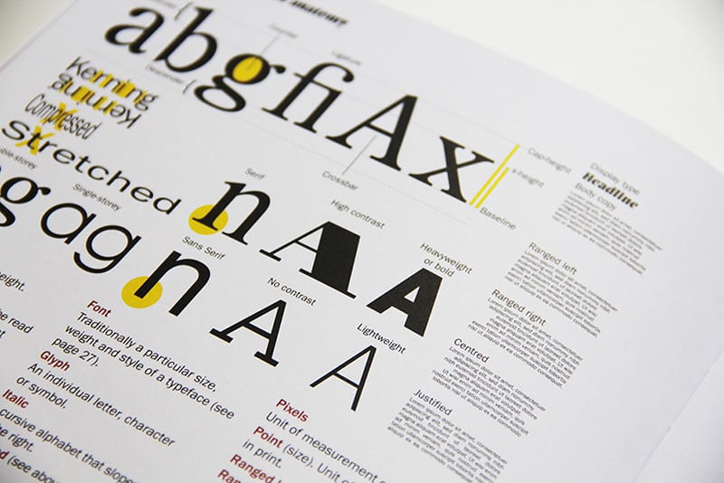
For the main part, fonts can be broken down into five groups. Those groups are Serif, Sans Serif, Script, Modern, and Display. Each of those groups has associations that go with it, which we’ll break down for you now.
Serif fonts are traditional. They’re the ones you’ll have read business letters in, or encountered in textbooks and legal documents. Most newspapers are written in serif fonts. Times New Roman – arguably the most-used font on the internet – is a serif font. You can include Garamond and Georgia in the ‘Serif’ group as well. When you write the content of your website in a Serif font, you’re telling the world you’re reliable, secure, and trustworthy. Google’s logo is designed in a Serif font.
Sans Serif fonts are still trustworthy and reliable, but they have a more creative edge. In both intent and design, sans serif fonts tend to be cleaner and less flamboyant than Serif fonts. They’re minimalist, and because of that, they’re modern. Arial, which is second only to Times New Roman when it comes to popularity of use, is a Sans Serif font. Helvetica is a Sans Serif font, as is Calibri. By using a Sans Serif font, you’re communicating that you’re easy to deal with, and you belong to the here and now. Sans Serif fonts are uncomplicated, and so are the businesses that use them. The logos of both Facebook and LinkedIn are in Sans Serif.
You probably know what Script fonts convey already. They’re elegant and stylish. They’re the type of font you’d probably send your wedding invitation in. Script fonts look and feel more personal than Serif or Sans Serif fonts, and they can often express creativity. You almost never see them used in web design, though, because they’re difficult to read. Even the best-known Script fonts, like Pacifico and Allura, are barely known outside of the people who use them. Cadillac’s logo is a Script font, but it’s one that was designed by Cadillac itself. Aside from logos design, you’ll probably want to ignore Script fonts when it comes to website design.
When you’re looking for a Serif font, and Helvetica won’t do, perhaps you should consider a more modern take on the classic format like Helvetica Now. In truth, there isn’t a huge difference between Sans Serif and Modern fonts, but you can make a big statement by using them. Companies that use this new generation of typefaces are seen as progressive and stylish. Tech companies should always use modern fonts. Bodoni goes down well, as does Ellington and Walbaum. If you’ve ever seen the logo of the TV company Hulu, you’ve seen a Modern font in action. If you’re dealing with the internet, technology, or anything creative, Modern is the way to go.
The name “Display font” is confusing, as all fonts are on display the moment you upload them to the internet. These fonts are different, though; they have a decorative feel. The Disney font is a Design font, and that might tell you all you ought to know about them. Allegro, Banco, Astur, Forte, and Umbra are all Display fonts, and all convey the same sense of uniqueness that Display fonts are known for. If you’re going for the personal touch, a Display font might be the way to go. It’s perfect for an art or design company, but probably too whimsical for anything serious.
You may sometimes want to combine different fonts in your headlines and your body text. Consider, for example, online slots websites. The first thing any prospective customer wants to know when they land on a website that they’re going to be depositing significant sums of money into is that the site is reliable, and so online slots websites often use Serif fonts to establish this sense of trust in their primary content text. For the headline fonts, though, it’s more likely that they’ll go with a Modern or Display font to put across the message that their online slots website is cooler, more up-to-date, and more fun to play with than their biggest rival’s site. Online Slots UK have become industry leaders when it comes to persuading people to spend money online, and most designers can learn a lot from the design of such websites. A sports website, on the other hand, might opt for the solid-yet-modern feel of a Sans Serif font instead.
If you’re making or revamping your website, we hope you’ve found this brief insight into the psychology of fonts useful. Thanks for stopping by!