A movie poster has an essential purpose: it needs to tell the premise of a movie. We often see movie posters full of explosions or a cluster of celebrities, but what about making movie posters more simple? That’s the method behind the genius that is minimalistic movie posters. These works of art reflect the essence of the movie with just a few images and well-placed pieces of text showing that you don’t need to have a lot of clutter.
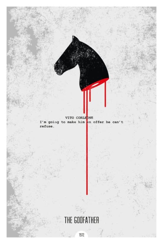
Juxtaposed over a script page with one of the more iconic lines of The Godfather is a horse head referencing an infamous scene from The Godfather book and film. This art is one of a series by Dope Prints.
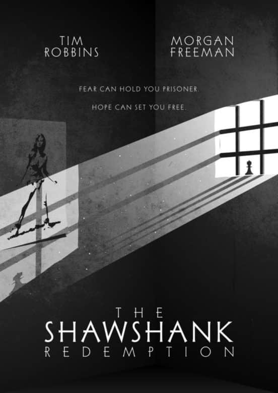
It could be hard to boil The Shawshank Rendition down to something that’s not cliche but the artist uses the prison bar motif perfectly here. The light shines on the poster that plays a major role in the film and sets it all up.
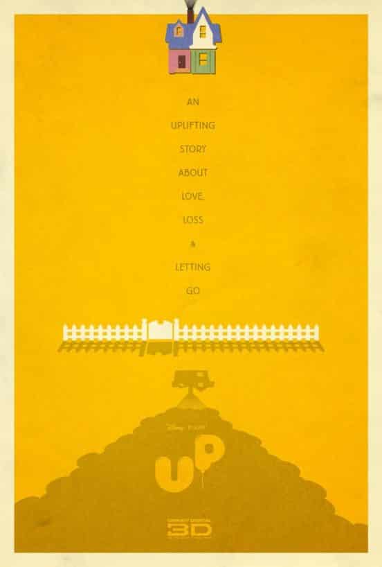
Up is a heartfelt film that has plenty of memorable images, but the artist Adam Rablais chose the balloon house and a mountain.
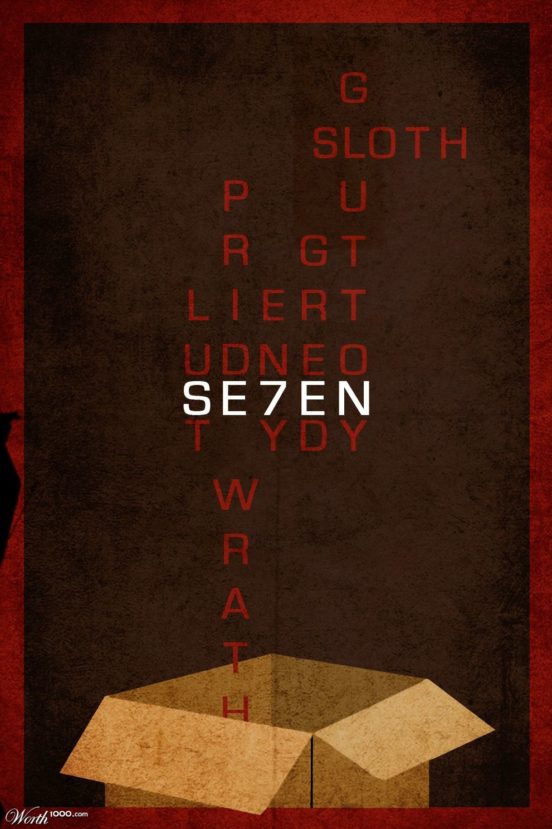
Seven’s biggest question is “What’s in the box?” and this poster teases it but also uses another element of the movie.
Spinal Tap’s minimalism movie poster needs one thing: it goes to 11. This is just one of designer Pete Majarich’s 365 posters created in 2016.
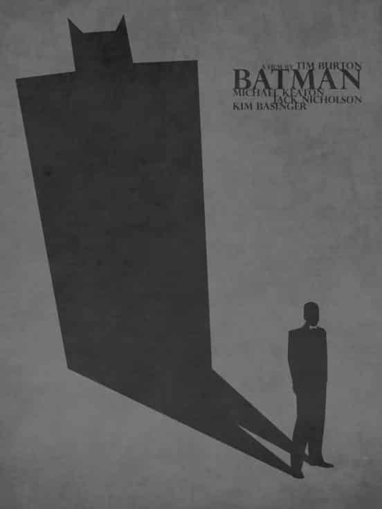
Inside Bruce Wayne is the bat in this Batman poster by lafar88 at DeviantArt.
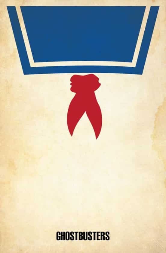
Ghostbusters features the monstrous Stay Puff Man so of course he’s center stage in this movie poster.
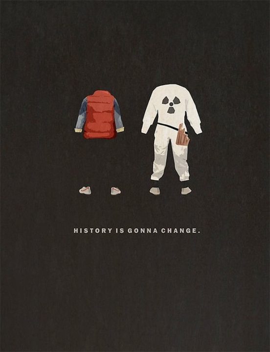
Avoiding the ever-present DeLorean, the artist of this Back to the Future minimalist movie poster went for the theme of time and the effects of changing the past.
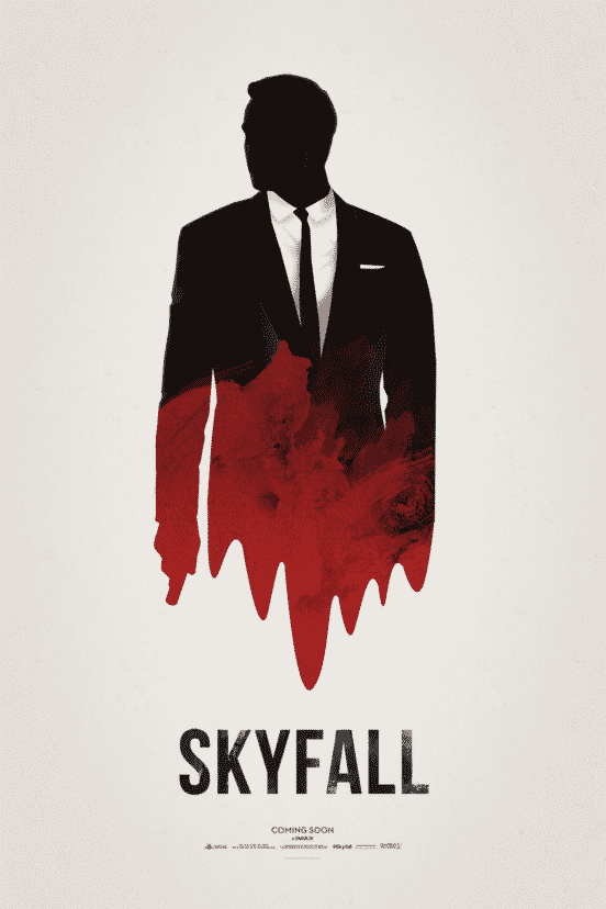
The James Bond film Skyfall has plenty of the elements you’d expect from a Bond picture, but this movie poster takes the old Bond color scheme, blood, the outline of 007, and a gun to combine them into a mesmerizing image.
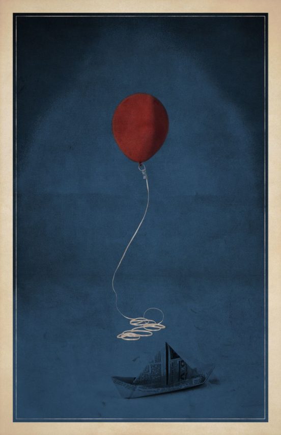
The recently-released IT reboot has a few iconic elements, most of all a red balloon, a paper boat and a yellow slicker. The artist of this IT movie poster took two of those to create an eerie setting.
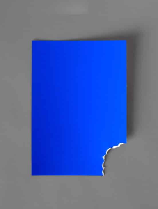
There’s no need to add a stark on this Jaws movie poster, the bite mark says it all. There are many minimalistic interpretations of this classic movie, but this one is definitely an interesting take because it has zero text.
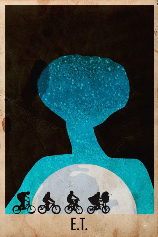
The artist Harshness uses a dreamy blue texture to evoke the skies of E.T. but instead of having the characters fly across the moon, they include an image of all of the children in the race to save E.T. In the background, the shadow of E.T. looms.
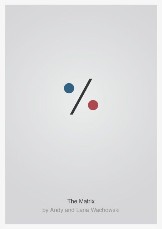
The Matrix has plenty of sci-fi imagery in a movie poster, but when it comes down to it, the theme is reality vs synthetic reality. The unknown artist behind this poster uses that element with the “red pill” “blue pill” theme.
SaveSaveSaveSave
SaveSave


