Anyone can design their own website these days, thanks to the range of tools around that allow even beginners to easily build their own site from scratch. However, this doesn’t mean that it will be a great website that has a user-friendly design which will covert users.
There are plenty of examples of great website both from professional website designers, and those that have been made in-house. There are also plenty of websites in both categories that fall a little, or a lot short of the mark.
Here are 6 examples of websites that perfectly demonstrate the key do’s and don’ts of website design.
Examples of Great Websites
1. Medium
Medium is a highly popular online magazine with quality, user driven content. Their website features high volumes of articles written by anyone who has an account. This content is curated by editors who then select articles to be featured on the home and category pages.
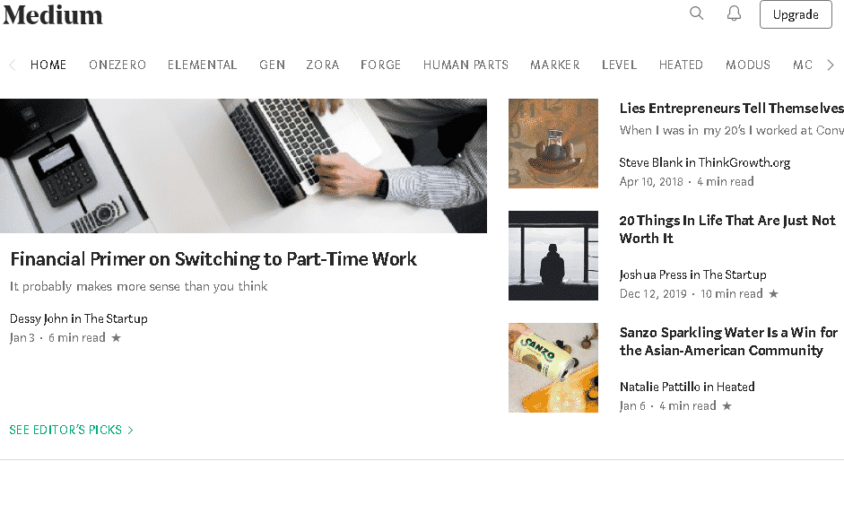
What makes this website great: this site’s minimalist design allows it to showcase a large amount of content without looking messy or overwhelming. The design elements are extremely simple and colour is kept to a minimum for a very minimalist effect.
2. Airbnb
Airbnb has grown from humble beginnings to be a major force in the accommodation and tourism industry. Their website is a key part of their business model, allowing users to search for and book accommodation, tours and other “experiences”. Users can also use the platform to advertise their accommodation or activities to other users.
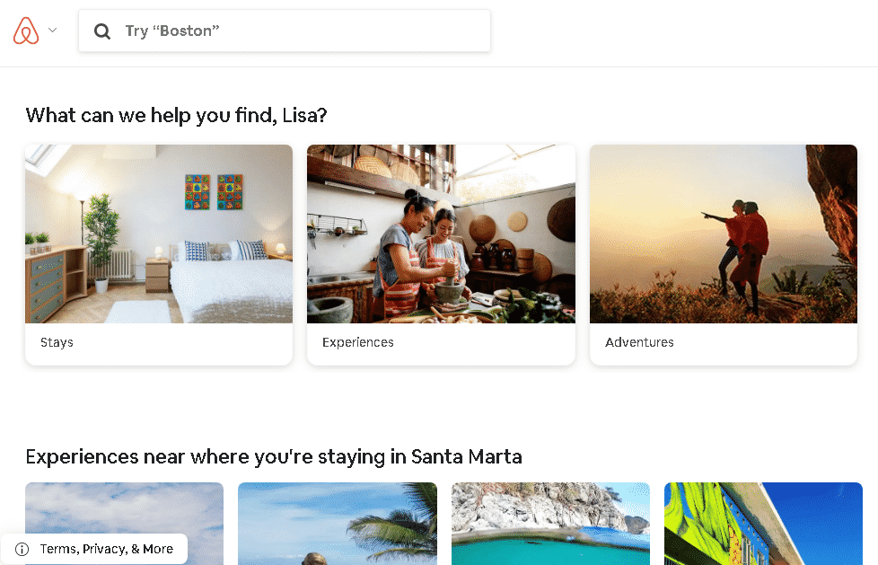
What makes this website great: As well as being well designed, Airbnb’s site takes personalised to the max. For registered users, the homepage addresses the user by name as well as suggesting experiences based on the user’s history. The site also does a great job at presenting their different products in a small amount of space.
3. Yoga With Adriene
Adriene Mischler has the top yoga channel on YouTube is well-known for her accessible yoga videos and strong online community. Her Yoga with Adriene site has an extremely clean, minimalist design that refers users to her YouTube videos as well as gently encouraging them to a paid members’ area or buy merchandise.
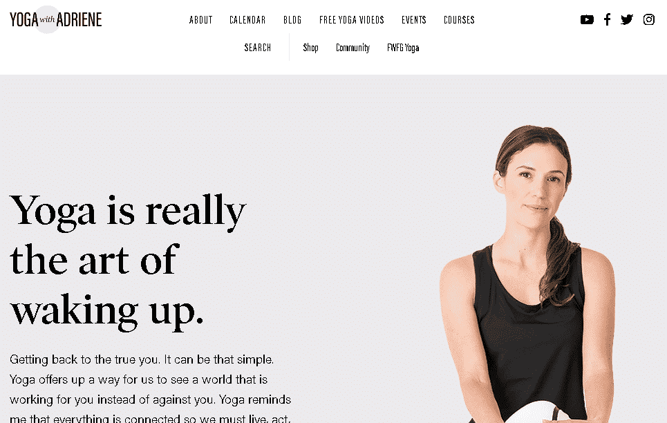
What makes this website great: one of the great things about this site is that it is exceptionally on-brand. From the minimal design and gentle colors to the approachable and easy-going copy, strong branding elements shine through on every inch of this site.
4. Asana
Asana is one of the world’s leading project and team management tools. Although they are very popular, this is a very competitive sector with a large range of software and tools available for teams and individuals to manage and track their work online. For non-users, Asana’s site must showcase the product and convince them to sign up.
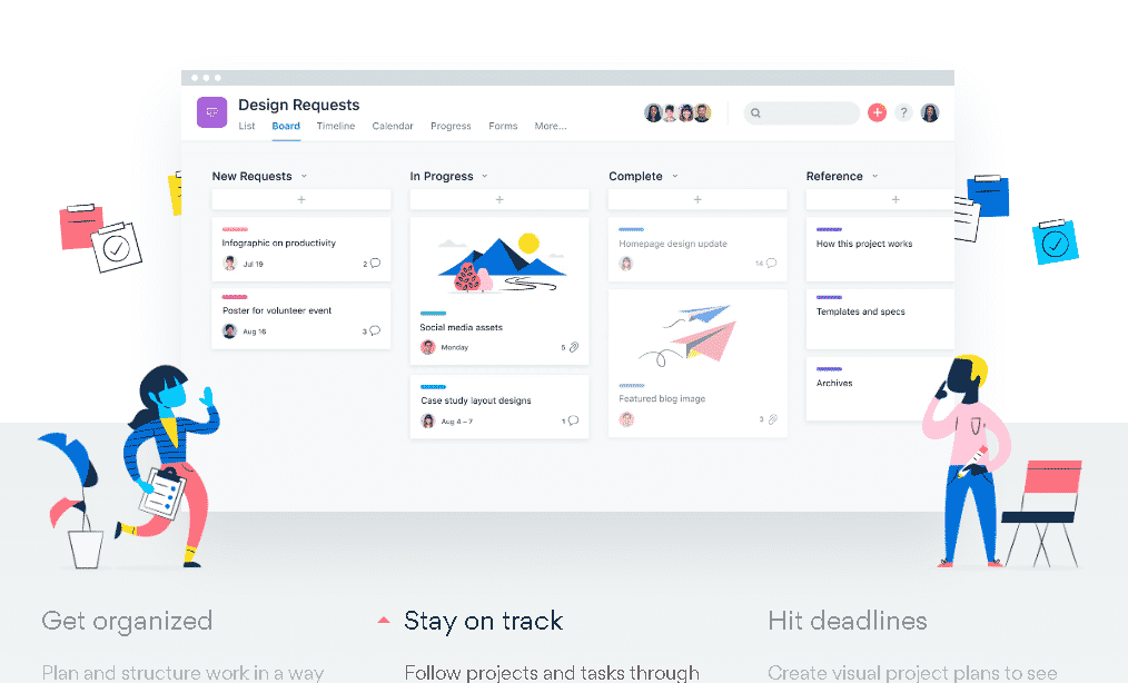
What makes this website great: Asana’s site ticks all the boxes in terms of being user-friendly, communicating the company’s products and services, and encouraging users to sign up. But what really makes this site stand out is its cool and funky custom graphics. These colourful graphics make completing tasks and managing projects look like so much fun that it’s impossible not to want to get started!
Examples of Bad Websites
5. Yale School of Art
You would expect any school within of one of the world’s leading universities, let alone the Yale School of Art to have a well-designed, professional looking website. However the school’s official website leaves a lot to be desired in terms of design, usability and features.
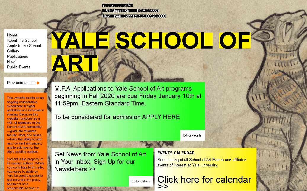
What makes this website bad: everything about this website makes it look like it was made in 1997. This is an extremely out-dated design which not only reflects badly on the institution as a school within the visual and design sector, but makes it very difficult to use especially for students who have grown up with slick sites.
6. CheapOair
CheapOair is an online platform that helps travellers compare fares and shop around for the best deal on the site. Although their site offers a very useful service, their messy, crowded site design may put users off and discourage them from spending too much time on the site. This is particularly a problem when your site itself is your service offering!
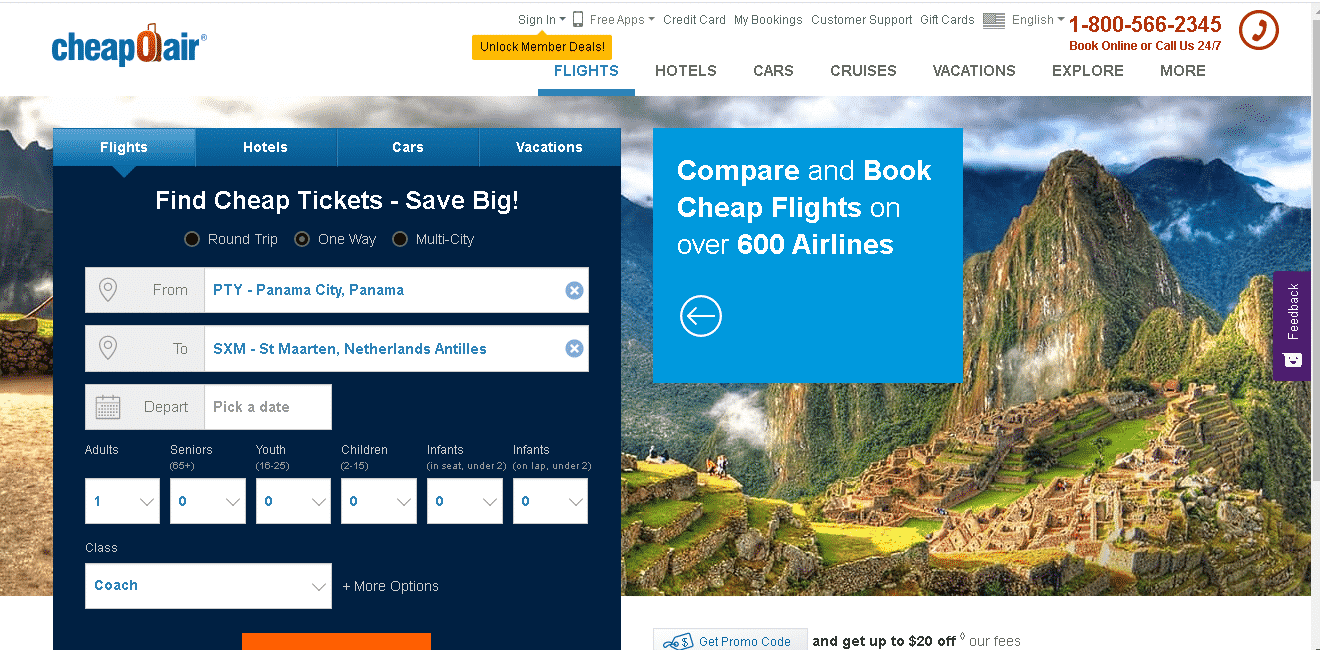
What makes this website bad: this homepage has way too much going on, especially the multi-layered top bar, with extra fields in the corners and flags. The overall appearance is not cohesive with many different colours and fonts and nothing to tie them together. The search section could be more streamlined also.