Stickers are becoming increasingly popular with businesses and organizations looking to promote their brand. They can be a very effective marketing tool: great stickers are an excellent way to build brand awareness, engage with your audience, and show your brand’s personality.
In order for stickers to be effective, however, they must be well designed. Here is how to go about creating beautiful sticker designs for marketing.
Preparing to Design Your Stickers
Before you can start the design process, it is important to define your audience. Having a clear picture of who you are trying to reach with your stickers will not only determine your design, but other aspects of your stickers. For example, if your audience values sustainability, consider biodegradable stickers like these one from Stickerit.
By sure to also keep in mind the reason you are creating your stickers. Is it to promote your brand in general, to promote a particular product or event, or to convey a certain message? This will guide you strongly in developing your sticker design.
Tips for Great Sticker Design
Keep it Simple
One of the most important rules in sticker design is to keep it simple. On a small item like a sticker, it is easy for the design to become overwhelmed if you use too many elements. Exercise restraint in terms of shapes and images, and your final design will be cleaner, more cohesive, and more impactful.
Some of the most powerful stickers are those that seem to say the least, such as a basic cut out of your brand’s logo in a single color. Think of the hugely successful logo cut-out stickers from Apple, for example. Communicating your message as simply as possible is the best way to use stickers.
Consider the Shape of Your Sticker
One of the great opportunities of sticker design is that you are not limited to a rectangular or square (or even circular) canvas. Thanks to die-cut technology, you can have your stickers in pretty much any shape that you want. The shape of your sticker will influence your design, and vice-versa.
In the early stages of the design process, decide what shape your sticker will be. The shape of the sticker will be largely influenced by how you want your audience to use it, as well as your overall design. Your budget may also be a factor here, as the simplest shapes are the cheapest to produce.
Choose the Right Fonts
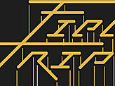
Font is one of the major elements of sticker design, so it is critical that you choose the right font. Be as creative as you can with the font: steer clear of over-used fonts and use something more interesting. Try a variety of fonts until you find one that works with your layout. Be sure to choose fonts that reflect your brand and your message.
You also don’t need to limit yourself to one font only. Using two fonts with high contrast can be very effective and make for a striking design. As with choosing one font, try different combinations to see what works best. Generally, pairing two fonts that are highly contrasting makes for dynamic, striking sticker designs.
Don’t Over-Saturate with Text
Some text on stickers is usually necessary, and as we’ve seen, using the right font can greatly contribute to the effectiveness of the design. However, a sticker shouldn’t have too much text on it, otherwise it will quickly look over-crowded and lose the impact of the design.
Remember, stickers are not meant to tell customers every feature of your brand or every product you offer – you have other forms of communication for that! Rather, stickers should have very brief text, or no text at all. Sometimes text is important to convey a message, attract attention, or reinforce your brand name. On the other hand, some very effective stickers have the brand logo only, and let the design speak for itself.
Stick to a Few Colors
Color on stickers, whether featured in graphics, the background, or text, can be a great way to attract attention, as well as conveying certain feelings and emotions. However, be wary of using too many colors in your sticker designs: usually two to four complimentary colors is best.
This will often be your brand’s colors as defined in your style guide. However, if you don’t have established brand colors, or want to diverge from them in this design for some reason, you should take your time to choose the best shades. Think about how the colors portray your brand, and what emotions they evoke. It helps to familiarize yourself with color psychology and how colors make people feel.