
It seems like everyone has a website nowadays. Websites for their store, their blog, or even for their cat! It’s not a bad thing, as websites can offer a range of services to the creator and the viewer. Even so, web design agencies have begun growing more and more in recent years due to everyone wanting to have an internet footprint.
It just seems more reasonable for you to have a website for whatever you want. If it’s to share your ideas, pictures you take, development of a business, or just a portfolio of your work. Web design agencies seek to make the building of your website easier and stress-free. You don’t have to worry about all the coding or sourcing of images, while still getting the site you desire!
Regardless if you get a company to build the site for you or if you handcraft it yourself by learning how to code, there are great ways to make your website more intuitive and easier to use.
For giving you motivation just visit Ithire.com and you will see how many freelancers work and be sure that one day you can do the same as they do.
Easy To Use Interface
When you first get to a new website there is a lot of information coming at you. Often it is a bunch of buttons or welcoming messages. A lot of that can deter the viewer from wanting to stay or view more.
Take for instance the Google homepage. All it is is the name of the website, followed by a search bar, and possibly with other buttons depending on how you have customized it. It is simple to use, easy to understand, and not complex at all. Due to this, people all over the world use it as their search engine of choice, because it is easy and simple.
You want the viewer to be able to understand what everything does, and what it’s meant for. The easier it is to use and understand the better it is for the user. Don’t get it wrong, complexity has its perks as well. But subtle and simple are flawless when beginning to make a website.
Learn Coding
A pretty simple and straightforward one, learn to code. Websites are often made up of code that is written in different languages. The most common website code is HTML followed by CSS and JavaScript. These languages allow you to develop your own website with basic access to a computer and allow you to redesign multiple times before throwing it onto an actual website.
If you’ve ever hit inspect on a website and saw all those weird writings pop up on the side of your computer screen, that’s HTML coding. Every website is written using HTML as a base, CSS to style it and make it look the way it does, and JavaScript to enhance it further.
Learning to code and messing with designing a website personally can help you make a great design that is easy to use. However, this one often takes longer and why many people opt to have an agency or company design websites for them with professional help.
Works For All Platforms

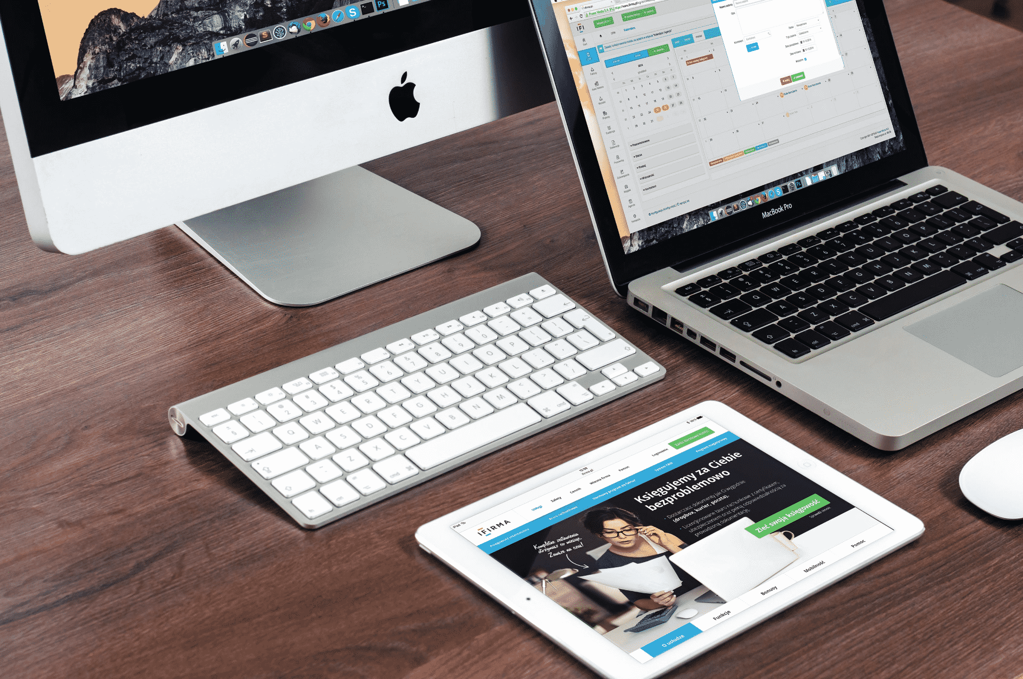
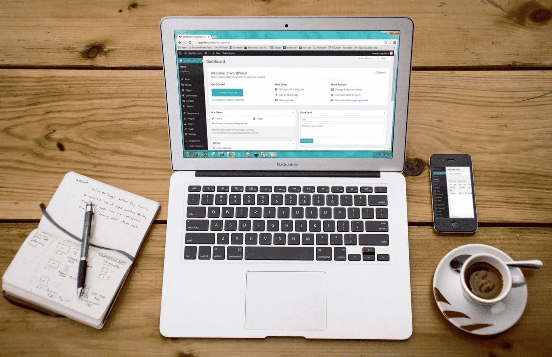
Another important way to create a great design is to ensure your website is viable on all platforms. Before smartphones were popular the only way to access the web was through a computer. Now, a little more than half of the web traffic comes from mobile devices.
This means that your viewers will come from more than just a personal computer, and more often in the shape of a phone or tablet. Due to this, you should design your website to be suitable for all platforms. It may seem like a simple idea, but sometimes when creating a website via a computer you’re only seeing what the computer sees, not what other platforms will see.
It’s important to test the site on all platforms to ensure it will look correct and attractive to all users. If you design a website just in the view of a computer and disregard the mobile users, you run the risk of losing half of the traffic you could have.
Know Who You’re Designing For
Think of who or what you’re designing your website for. If you’re making a blog, look at other popular blog sites to see how they operate. Know who you’re making it for. If you’re making a fitness blog, think of the stuff fitness nuts want to see!
Naturally, when you design a website you put all the things you’d want to see or use. You make the website your ideal desire. Meaning you’re putting yourself first and designing it for yourself! However, this is where the hindrance comes into play.
Not everyone is going to think like you, understand what you understand, or know what you know. Intuitiness comes from the individual. Meaning each person will state how intuitive they think a website or program is. Of course, you’re going to think a website you designed with all the bells and whistles you wanted is going to be intuitive! But to others… probably not.
The goal is to make the site intuitive for everyone. Or at least a majority rather than a minority of users. With this in mind, you should have others test your website to see if it runs the same way you think it would but while in the hands of others.
Having A Clear Strong Brand And Message
The site’s name is essentially its brand. Now, starting out you may be a nobody that no one has heard of. But by making a clear message with what you stand for or what the website is meant for can really help raise attraction.
The name of your site is the first thing people see about your site and brand. You can choose to make it unique and catchy or clear and concise. Either way, you want to make sure it represents your brand and the information that your site provides.
The second key component is your message. The message clarifies what your brand stands for and what your site is going to deal with. The tone of your content should be clear, strong, and make an impression. With a consistent message across all of your site’s pages, you create a seamless and more intuitive experience.
In Closing

Websites are only becoming more and more popular are the years go by. And with new technologies websites are booming to the where it seems like everyone has a website! The challenge that comes is trying to make an intuitive yet creative website that people will want to use or view.
There are many options that come when making a website, starting with if you want to have a professional web design agency craft the site for you or if you want to make it yourself. Leading to what to make the site look like, who you want the site to be for, and how simple or complex you want it to be. Either way, making it intuitive and user-friendly will drive the traffic and keep users coming back for more.


