

Choosing the perfect font for your image-building company logo almost sounds like an easy task — but these little letters can be troublesome creatures. You know what you want to say with your logo, and you know how it should look, but do you choose a classic serif typeface or go with something more contemporary and stylish? What if you want to be playful with your type? And what about those pesky global typography rules you’ve heard about?
To make things a little easier, we’ve put together some general tips on choosing fonts for logos, as well as a handy guide to the most popular typefaces used by businesses around the world. So whether you’re after a serious, professional look or something a little more fun and funky, we’ve got you covered.
1. Keep It Simple
t’s important to remember that your logo should be instantly recognizable, so try to avoid using too many different fonts, typefaces, or styles. You want people to be able to see your logo from a distance and know instantly what it is.
2. Choose a Font That Represents Your Business
When you’re choosing a font for your logo, think about the image you want to project. If you’re a serious business, a traditional serif typeface might be more appropriate, while fun, fancy fonts could be perfect for a more creative company.
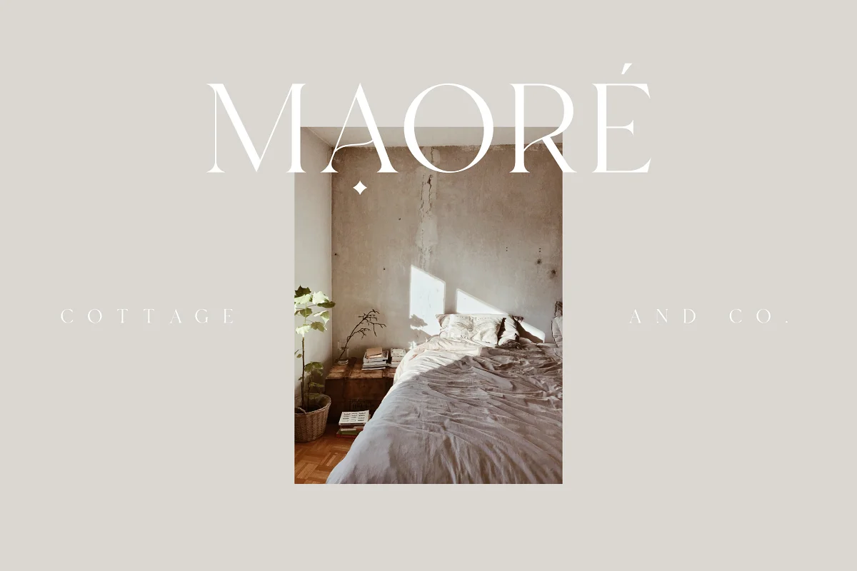
Source: CreativeMarket
3. Consider the Global Market
If you’re planning to expand your business into other countries, it’s important to consider the global market and choose text fonts that will be universally recognizable. For example, fonts like Helvetica and Arial are commonly used in logos around the world, while other fonts are much more specific to certain countries.
If you need a source of fonts for a wide range of audiences, CreativeMarket is the place for you.
4. Be Distinctive
Fonts are very memorable, so when you choose one for your logo, use it only in the context of your company name. Nobody will remember what your logo looks like if they can’t identify it with your business name or product. Also, be careful not to infringe on any trademarks or copyrights.
5. Be Flexible
Your company logo will most likely need to be adapted for different applications, such as stationery, signage, and advertising. So choose a font that’s flexible enough to be used in a range of different contexts.
6. Keep it Professional
While there’s definitely a place for aesthetic fonts in logo design, it’s important to maintain a professional look overall. Your company is serious about its image, so your logo should be too.

Source: Alexas_Fotos
7. Have Fun!
A company logo can be both professional, and at the same time give off a sense of fun if it is the kind of company that’s meant to do that. If you want to inject a bit of personality into your business, why not choose fun alphabet fonts?
Font Suggestions For Your Company Logo
Now that you know the basics, let’s take a look at some of the most popular typefaces used in company logos around the world.
1. Helvetica
Helvetica is a sans-serif typeface that falls into the same category as Arial and Verdana. It’s clean, modern, and simple — just like your business image should be. This font is classed as non-proprietary software by Adobe, so it can be used legally in all kinds of graphic design for both public and private use.
2. Arial
Arial is another popular sans-serif typeface that’s often used in logos. It’s simple, legible, and easy to reproduce at any size.
3. Verdana
Verdana is another Microsoft font that’s been designed for on-screen reading. It’s Sans Serif, like Helvetica and Arial, and is perfect for logos as it’s extremely legible in small sizes.
4. Times New Roman
Times New Roman is a classic serif typeface that’s been used in logos for years. It’s sophisticated and timeless, making it the perfect choice for businesses with a more traditional image.
5. Garamond
Garamond is another popular serif typeface that’s often used in logos. It’s stylish and elegant, perfect for businesses with a more high-end image.
6. Trebuchet
Trebuchet is a sans-serif font that was created by Microsoft specifically for web use. It’s clean and modern, perfect for companies that want a contemporary look.
7. Comic Sans
Comic Sans is a popular font for children’s logos, as it has a fun and playful feel. It’s also been used by a number of businesses in more creative industries, such as advertising and graphic design.
8. Brush Script
Brush Script is an informal typeface that’s often used in logos for creative companies. It’s child-like and playful, lending a sense of liveliness to any company that uses it.
9. Mistral
Mistral is another informal typeface that suits the same kinds of companies as brush script does. It has an organic feel, which can be useful if you want your brand to appear natural and down-to-earth.
In Conclusion
A logo is often the first thing people see when they think of a company, and it’s important that your logo is memorable and looks great. One of the most important decisions you’ll make when designing your logo is what fonts to use. With these tips and suggestions, you’ll be able to choose the right fonts for your company logo.


