It’s a smart move – buying kitchen cabinets online is both convenient and cost effective, and can help give your kitchen an entirely new look. But before making the purchase, it’s critical to consider web design: how the website looks and functions will have a major impact on your overall satisfaction with the shopping experience.
Today, we’ll explore how web design can influence buying kitchen cabinets online – from ensuring there are plenty of technical details available to guiding customers through their search for the perfect piece for their remodel. We’ll also provide tips on what to watch out for as you navigate various websites in order to find exactly what you need!
How Web Design Makes Buying Online Cabinets Effortless
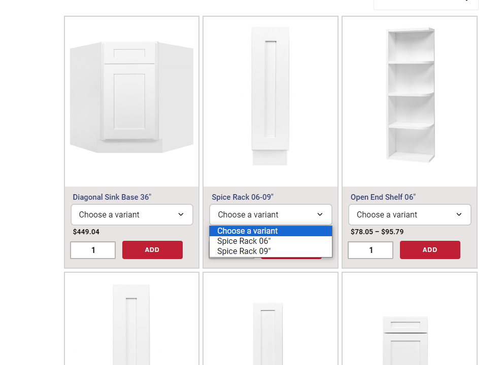
When you visit a well-designed online cabinet store, you’ll immediately encounter an intuitive layout that simplifies your browsing experience. The navigation menu is strategically organized, enabling quick access to different cabinet categories, styles, and features. This smooth movement guarantees less time searching and more time exploring cabinets that match your preferences.

Visualizing how various cabinet options may appear in your space is a vital part of the shopping process. Web design enhances this aspect by integrating interactive visualizers that allow you to experiment with different cabinet styles, colors, and configurations. These tools grant you the freedom to customize cabinets to your space, helping you make well-informed decisions that align with your design vision.
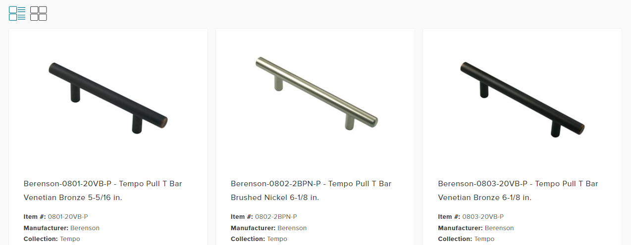
Another way web design streamlines cabinet shopping is through efficient filtering and sorting options. You can effortlessly narrow down your choices based on dimensions, styles, materials, and more. With just a few clicks, you can refine your search, ensuring you’re presented with cabinets closely suited to your requirements.
Moreover, the responsiveness of web design guarantees the exploration of cabinet options across different devices. Whether browsing on a desktop computer, tablet, or smartphone, the website seamlessly adapts to provide a consistent and user-friendly experience. This mobile accessibility enables you to browse cabinets on the go, making decisions whenever inspiration strikes.
Traits of Exceptional vs. Mediocre Design
In the world of design, each visual choice plays a crucial role in shaping our perception and interaction with the surrounding environment. When evaluating design, there is a clear distinction between what captures our attention and what leaves us feeling unimpressed. Let’s explore the characteristics that set exceptional design apart from mediocre ones.

Clarity and Simplicity
Exceptional design effectively communicates a message or idea with clarity and simplicity. It avoids overwhelming the viewer with unnecessary elements and instead efficiently conveys its purpose. On the other hand, mediocre design often suffers from clutter, making it difficult for the audience to interpret the intended message.
Purposeful Visual Hierarchy
Great design guides our eyes through a deliberate visual hierarchy, ensuring that important elements stand out while maintaining a cohesive flow. This hierarchy helps users navigate content effortlessly. Conversely, mediocre design lacks this organization, leading to confusion or missed information.
Thoughtful Typography
Exceptional design pays close attention to typography, selecting fonts that enhance readability and convey the desired tone. Mediocre design may neglect typography choices, resulting in text that is hard to read or doesn’t harmonize with the overall aesthetic.
Harmonious Color Palette
Well-executed design utilizes a harmonious color palette that evokes emotions, reinforces branding, and maintains visual balance. In contrast, mediocre design may display disjointed color choices that create confusion or undermine the intended mood.
Intuitive Navigation
Superior design prioritizes the user experience by providing intuitive navigation that seamlessly leads users through content or interfaces. Mediocre design can lead to frustration due to confusing or convoluted navigation paths.
Consistency in Branding
Exceptional design maintains consistent branding elements, including logos and color schemes, across various materials. Mediocre design lacks this consistency, resulting in disjointed branding that fails to make a lasting impression.
Attention to Detail
Great design is meticulous, leaving no detail unattended. This attention to detail enhances the overall quality and professionalism of the visual concept. Mediocre design often overlooks these finer points, contributing to a lackluster final product.
Websites Role in Educating Buyers
In today’s digitally-driven shopping landscape, making well-informed decisions is crucial, especially when it comes to significant purchases like cabinets. Websites have become indispensable educational resources that empower buyers to navigate through the purchasing journey.
Nelson Cabinetry sets itself apart as an excellent example of a website that goes beyond a traditional storefront. With a dedicated blog section, they demonstrate their dedication to not just selling products, but also enlightening potential buyers. Blogs serve as a powerful platform for sharing insightful articles, guides, and tips related to cabinet selection, installation, maintenance, and design considerations.
The educational role of websites goes beyond blogs. Interactive visualizers, virtual tours, and detailed product descriptions contribute to buyers’ understanding of available options. Moreover, videos showcasing the cabinets’ functionality and installation processes have a vital role in educating buyers about the products they are considering.
Final Thoughts
The visual appeal of a website, its user-friendly navigation, and the incorporation of valuable resources all come together to establish an environment where buyers can freely explore, experiment, and envision their perfect spaces. From mobile adaptability to tailored personalization, web design serves as the crucial link connecting buyers to their dream kitchens.


