Photography principles are techniques that can be applied to take better photographs. Often, these techniques can also be adapted for use in design work. Learning some of the most important principles used in photography will help you become a more skilled designer overall.
5 Photography Principles That Can Make You a Better Designer
1. Framing
You may not realize it, but you frame your shots when using a camera. Photographers call the framing of the shot “composition.” Composition is how elements are arranged within the frame to create an arrangement that is pleasing to the eye. A good composition will draw attention to what matters in the photo and distract from elements that are not important. Here’s another great article on composition in art.
When designing an image, you frame the shot in a similar way, but instead of using a frame, you use white space. By placing your most important content in the center of the design and leaving lots of room around it for other elements to fill out the picture, you can make your work more pleasing to look at.
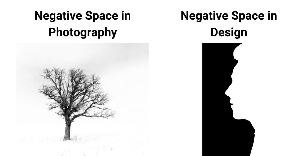
2. Don’t Be Afraid of Negative Space
Negative space is the term used for the empty space in a design that surrounds an object or objects. Just like in photography, negative space serves to define what is important and can help guide your viewer’s eye through the work. It also makes images feel more open and easy to look at.
Negative space is often a controversial topic among photographers because it can make images feel less thought-out or well-planned. The key to successfully using negative space is keeping the surrounding elements simple, clear, and complementary to what they surround. If you want your design to convey that you are a pro, be sure to use negative space sparingly.

3. Fill Your Frame
You may think that filling the frame with your subject will make for a more interesting photo, but sometimes it’s not what you include in the frame that matters…it’s what you leave out. Photographers know this well. By cropping out part of the scene that surrounds their subject, they can draw more attention to what matters.
A similar strategy can be used when designing images for print or web use. Sometimes you only want the most important content in your design to be seen, but filling your frame with text or other low-impact content will not get you the effect you are looking for. You can include more important content by featuring it prominently in the design and relegating other elements to the sides or background of your design, where they will be less distracting.
4. Learn When to Back Away
If you want to take great photos, you need to know when to back away from your subject. By getting too close to your subject, you lose the context that helps viewers understand what is going on in the photo. Sometimes what’s happening outside of the shot is just as important as what’s happening inside it, so it behooves photographers to snap pictures from a distance rather than up close.
Designers sometimes face a similar problem: If you place too much emphasis on the individual elements in your design, you lose sight of how those elements come together as a whole. One way to solve this issue is to take a break from working on your design temporarily and coming back later to see if it still holds up when viewed from afar. This will give you a new perspective on your work and allow you to add or remove elements that may have been getting in the way of conveying your design concept.
5. Find New Angles
The single most important part of photography is the ability to look at something and observe it in a different way than everyone else has before. For example, this image of skyscrapers from a low to high angle:

Photographers call this skill “seeing” and it’s how great photos are made. There are many ways to view an object or scene, so experiment until you find a perspective that allows you to stand out from the crowd.
Designers have this same ability when it comes to their work, so try looking at your design from different angles and in different contexts until something clicks. Zoom in on your design and view it at a high level, looking for small details that may need attention. Zoom in even closer and look at your design in context with the rest of a website or the items near it to make sure it meshes well with the other elements on the page. Every designer has their own unique ability to “see,” so take advantage of this talent when creating designs.
Final Thoughts
Both photographers and designers can learn a lot by comparing their work to each other, so be sure to try out these tips next time you are working!


