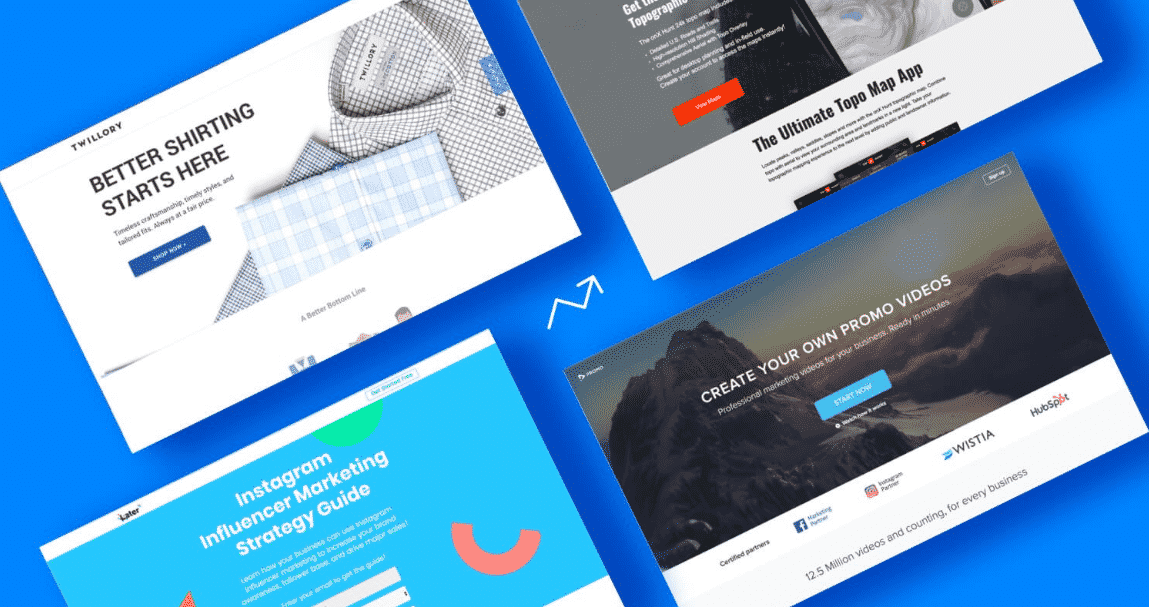

Creating a high converting landing page is a big challenge for all businesses. It can be hard to know where to start, with so much conflicting advice out there.
Jeremy from Dogslots gives us a tip on how to design high converting landing page: “Make sure to put key elements above the fold and be straightforward with value proposition.”
Here are five elements that should feature prominently on all high converting landing pages.
Great images
Most people might think the text on their websites is the most important thing. But while the copy has to be top notch in order to produce conversions, do not forget about great images too.
The main image used on a landing page can be considered as a second headline. Users who can relate to the image are far more likely to become customers in the long run.
Sometimes it makes sense to cut costs with the use of a stock image, but this will simply fade into the background on most landing pages.
Instead, do not be afraid to make a substantial investment in quality images for a landing page.
One theory for landing pages suggests it pays off to have an image where a person’s eyes are directed towards the call to action. Many businesses have found this to be very successful.
A captivating headline
Before visitors even see the image on a page, the headline is likely to be the first thing they notice when arriving on a website for the first time.
The headline has to do a few different jobs in order to push conversions. It has to be captivating, as well as concise and clear. The message has to be obvious – it does not usually pay off to be too cute and clever when writing headlines for landing pages.
If there is a need for more detail and information to be added at the top of the page, a subtitle can be a good way to do this.
Most people who read the headline on a page will also check out the CTA, so a short headline that gives the main point necessary is an absolute must.
Copy that sings
The headline is probably the most important text on the page, but the body copy must be great.
First of all, choose a font and text size that makes the copy easy to read. There is not much point in investing in quality copy for a landing page if visitors have to strain to read it.
The copy, like the headline, should be clear and concise. But it also needs to be compelling.
Landing page copy has to tread a fine line between being overly sales-y, but still pushing the message of the business and working hard to convert website visitors into customers.
Also think about how the text is laid out on the page. Large chunks of copy can be off-putting for a lot of users. Breaking it up into short, sharp sentences and paragraphs is just the start.
Instead, consider innovative ways to display the compelling copy on the site’s landing page.
An engaging video
Images can help landing pages to convert, but videos might just be even better.
It is becoming increasingly popular for websites to use videos on their landing page and this is for an obvious reason – it works.
The old saying goes that a picture can be worth a thousand words, but a video is arguably worth even more.
According to research conducted by the Aberdeen Group, those who use video in their campaigns have conversion rates that are 34 per cent higher.
Now could therefore be a great time to create a video that adds value to a landing page.
Call to action
No landing page has a hope of converting customers without a fantastic call to action.
The CTA should often be one of the first things to be decided when creating a landing page. The CTA, after all, informs everything else on the page, from the headline to the images to the copy.
A great CTA is tailored to the target audience and should be short, sharp and impactful. Examples of CTA copy that is proven to work include “download now” and “sign up here”.
Without a CTA that convinces customers to purchase the product or service in question, no landing page has a chance of converting at a high level.
The above five elements are a must for anyone creating a high converting landing page.


