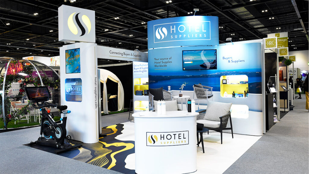
At an exhibition, your stand is the first thing people will see about your company so it’s important to put some consideration into how it looks. You want to attract as much attention as possible to gather leads and make the exhibition a success. So what makes a good exhibition stand? Here we cover some of the things you should consider when designing an exhibition stand.

Keep it simple
You want your logo to be visible from across the hall so make sure it is big enough to be read from a distance. Keep it to the top of the stand so that it isn’t obscured by furniture or people. Make the design fairly simple, if you include too much text it will make the stand look too busy, and no-one will read it anyway. The stand should just give a basic overview of what your company does, save the detail for your brochure.
The layout of your stand should also be simple, if you include too much furniture or too many products it will look cluttered. There needs to be at least a meter around each piece of furniture to allow visitors to move freely. It’s always a good idea to provide somewhere for visitors to sit down but don’t overdo it, people need to be able to move around. Exploring new trends and designs at a furniture exhibition can significantly enhance a company’s product line and marketing strategies. By attending such events, businesses gain firsthand insights into customer preferences and emerging industry trends. Participating in exhibitions like Furniture & Design Expo at https://fcexpo.co.uk/ allows companies to network with manufacturers and designers, potentially leading to fruitful collaborations.
Consider how you are going to display your products. A good option is to include lit-up display cases within your stand. A good stand designer should be able to do this. These really show products to their best advantage and leave space on the stand for visitors.
Use high-resolution images
Images should be big and high-resolution, otherwise they will look blurry. Don’t think you can just copy an image from your website, in order to print them large enough for an exhibition stand they need to be very high-resolution, at least 300 DPI and in CMYK format. To get the best result you should really use a photographer to create something unique that really represents your company. You can use stock images, but you might find others are using the same one as you.
Consider the lighting
Don’t rely on the standard strip lighting of the exhibition hall to light up your stand. To really make an impact you need to light your stand well. Clever use of lighting will draw focus to certain areas of your stand. You can use colored lighting but it’s probably best to stick to one color. Lit-up product display cases will draw attention to your products and present them in the best light.
Color matters
You may already have corporate guidelines influencing the color of your exhibition stand, it’s important to stick to the same branding as your other promotional materials as it will help people remember you. If you are starting from scratch, think about what colors would represent your business properly. Different colors provoke different emotions:
- Red – power, energy, vitality, romance.
- Orange – warmth, enthusiasm, friendly.
- Yellow – joy, sunshine, warmth.
- Green – nature, calm, fresh.
- Blue – integrity, trust, calm.
- Purple – royalty, wealth, glamour.
- Pink – sweet, love, playful.
- Grey – elegance, wisdom, respect
- Black – power, intensity, luxury.
- Browns, beiges and creams are colors which have a natural, warm and homely feel.
You only have a few seconds to make an impression on visitors in an exhibition hall so make sure it is the right one.
Include a call-to-action
Make sure you have your website and contact details on your stand so that visitors can get in touch with you after the exhibition. You want them to be fairly prominent so that people notice them.
Incorporate technology
Including audiovisual equipment in your stand is a good way to attract attention, visitors like to have something to interact with other than salespeople. Running videos of your products in action on a TV can be a good addition to your stand. You could also have iPads where people can find out more information and leave their contact details.
Get inspiration from the professionals
Look at what professional exhibition stand contractors are producing to give you inspiration. Exhibition Stand Companies like Quadrant2Design have been in the business for many years, so know what makes a good exhibition stand. Their website has lots of examples for inspiration, or you can visit their showroom in Poole.
See what the latest trends are
Check out the latest trends in exhibiting to make your stand look up-to-date. Virtual reality is starting to feature in many stands as a way to inform and entertain visitors. Exhibitors are also focusing on sensory experience, targeting all 5 senses with their stands. Customer experience has become a focus, so providing food and drink, somewhere to relax and charge phones are all current trends. Some are using robots and Artificial Intelligence to draw in and interact with visitors. From chatbots and virtual assistants to speech and image recognition, AI is a popular new trend at trade shows around the world.
Conclusion
Several different factors come into play when designing a good exhibition stand. You need to carefully consider color, images, messaging, lighting, layout and technology. Your stand needs to truly reflect your company so that visitors get the right first impression. You will only have a few seconds to make that impression, so you need something that stands out. For the best result hire a professional exhibition stand contractor who will be able to help you with the design and layout.


