

Logos, or logotypes to give them their official title, have been used by humans for thousands of years. Archaeologists have discovered logos on cylinder seals dating back to 2300 BC and on coins from 600 BC. The word logotype comes from two Ancient Greek words for “speech” and “mark or imprint,” but these days a logo is often synonymous with a company’s brand or trademark.
Research suggests that the average person sees up to 5,000 brand messages per day on the television, the internet, printed materials, and billboards. Logo designers are often tasked with creating a clean, unique one that invokes a response from the consumer, is memorable, and most importantly, represents the brand. Get the logo design correct, and potential customers will see your brand stand out from the crowd. However, a poorly designed logo can see the brand disappear into the ether.
Bass Brewery’s logo was the world’s first trademarked logo. It features a red triangle atop the italicized word “Bass.” The company trademarked it in 1876. Beer brewing giant Anheuser-Busch InBev bought Bass in 2000 and still uses the same design. Logos displaying a company name are popular because consumers instantly know what the logo represents. Think along the lines of the famous IBM logo or that of the BetUS online sportsbook. People see these logos and have no doubts about what they see or which company is behind them.
Others feature an ideogram that exemplifies a well-known emblem, so an accompanying name is not required. The International Red Cross or the Red Crescent Movement are perfect examples. Almost everyone on the planet instantly recognizes the following trio of logos. Their designers ticked all the boxes, and you will undoubtedly see these very same logos for decades to come.
Apple
Ronald Wayne designed Apple’s first logo in 1976, but it did not last long. The original Apple logo featured a quote from English poet William Wordsworth on the frame. It read, “Newton…a mind forever voyaging through strange seas of thought.”
The late Steve Jobs was not a fan of the logo because he believed it was too old-fashioned and difficult to reproduce in a small size. Jobs hired graphic designer Rob Janoff in 1977 and tasked him with creating a new, simpler logo.
Janoff settled on the bitten apple that is so recognizable today. It represents a symbol of lust and knowledge, doffing its cap to the forbidden fruit in the bible. In addition, it plays on bite/byte, which is great for a tech company.
The Apple symbols have gone through numerous color and size changes, but the shape and the bite remain the same.
Coca-Cola
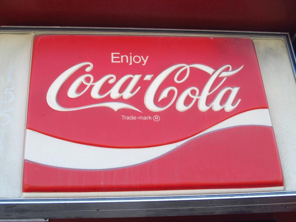
Coca-Cola is one of the biggest, richest brands globally, with annual revenues tipping the scales at more than $31 billion. While Dr. John S Pemberton created the formula for the world-famous beverage, his bookkeeper, Frank M Robinson, settled on both the name and the logo. Robinson suggested the two C’s would look well in advertising, and boy was he right.
Robinson used flowing-text written in Spencerian Script, popular in the late 1800s. Although slightly altered over the years, the same writing remains very much the same as that original concept. The company even used the exact text when it launched the Share a Coke campaign, where people’s names adorned the iconic red logo.
The beauty of keeping the same text, style, and layout for almost 150 years is that it is easily distinguishable in various languages. Find an image of Coca-Cola written in Cyrillic, for example, and you instantly know what it is.
McDonald’s
McDonald’s has a logo that is so recognizable that its customers use it to describe the brand. How often have you heard someone say they are going to the Golden Arches?
Patrick McDonald opened a drive-in restaurant on Route 66 in 1937, which he called “The Airdome.” His sons, Richard and Maurice, relocated the restaurant to San Bernadino in 1940 and rebranded it to McDonald’s. They hired Stanley Clark Meston to design the architecture of the building, and his design featured. Those golden arches soon became the company’s logo in the shape of an “M” for McDonald’s.
Ray Kroc purchased the company from the McDonald’s brothers for $2.7 million, a massive sum in 1961. However, Kroc’s vision of having a global empire meant he saw a ridiculous return thanks to expanding the company into more than 100 countries, with each outlet sporting the famous golden arches logo.


