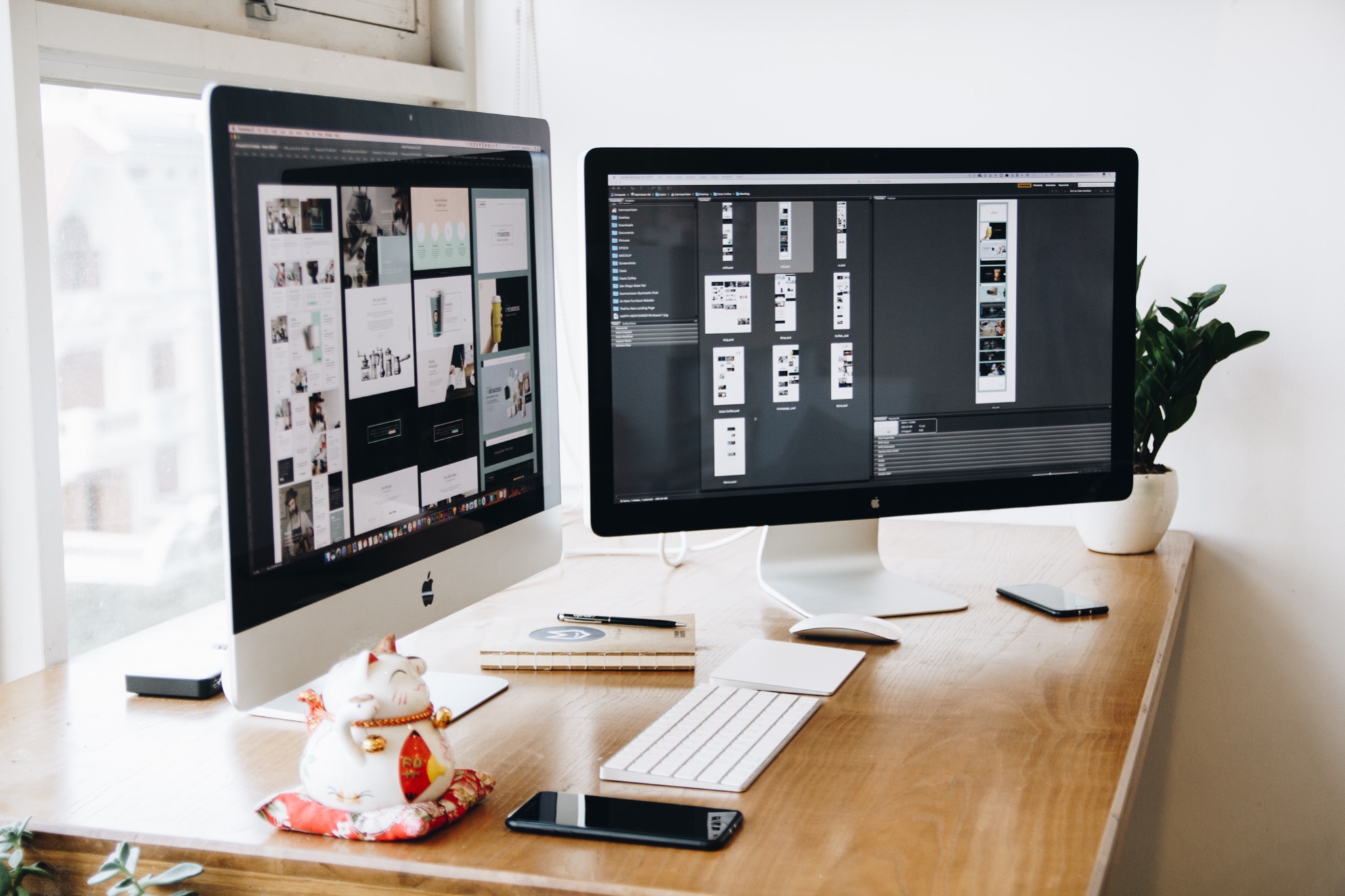

Web design is a field that covers a number of disciplines around creating and maintaining websites. Its main focus areas are: Web Graphic Design, User Interfaces and User Experience.
If you’re eager to learn about the world of web design or become a web designer, there are a few ways you can go about it. Nowadays the most popular resources for learning web design are online learning platforms. There are many options out there, which makes it challenging to make the right choice. Students often find websites like onlinecourses.info helpful, as they provide online learning platform reviews and online course recommendations of the best choices available.
Now, let’s take a closer look at the creative side of the above mentioned process that is web design.
What is Web Design?
Simply said, web design is the process of putting together the visual interface of a website. It doesn’t just include the layout of the website, but its functionality and structure as well.
Moreover in professional terms, every website has User Interface and User Experience. And based on these two, we can usually tell whether the website is good or not within seconds.
To make it even more clear for you, we’ll dig a little deeper and explain every important aspect of Web Design.
First things first — Inspiration
Typically, you’ll find inspiration in other people’s designs, at the beginning preferably the ones that you find closer to your creative senses. This way it will be easier for you to create new designs and be in your comfort zone, but don’t stay there for long!
Design is all around us, so analyzing why something works or not could be a great advantage to your improvement as a web designer. By looking at websites, book covers, billboards, and kiosks you’re unconsciously creating opinions on designs and therefore new ideas of how you’d implement them if you were to create them.
User Experience (UX Design) basis
A website is not just floating text in a framespace. It’s not just the content, layout, typography and the color schemes, but how all of these things combined feel while using. The main focus of UX Design is understanding your audience. Basically, looking at the website you’re creating through the eyes of your users.
UX Design Principles
Important UX Design principles to keep in mind while building a website:
- Simplicity and easily intuitive
- Don’t overuse skills on the expense of usability
- Usability testing
- Accessibility testing
- Less is more
- Consistency
User Interface (UI Design) basics
UI Design is the process of building interfaces in devices that contain software. The main focus is on the looks and style implemented in the creation of interfaces. The interface design should be easy to understand and use, and it should communicate the brand values and make the users trust you.
Aside from Graphical User Interfaces (GUIs) that we use on digital control planes, there are two more formats:
- Voice User interfaces (VUIs) – interaction through voice (i.e. Siri, Alexa, Google Assistant, etc.)
- Gesture-based interfaces – interaction with 3D spaces through bodily motion (i.e. VR games)
UI Design Principles
Important UI Design principles to keep in mind while designing an interface:
- User Control
- Clarity
- Negative space
- Flexibility and efficiency
- Familiarity
- Hierarchy
- Aesthetic and minimalist design
- Error prevention
Principles of Design
There are certain principles worth understanding when it comes to web design. To improve your web design skills it’s best to hold on to the standard practices that will ease your work process.
Layout
A good and minimal layout is a key to a quality design. At the beginning, focus on a few elements and their placement. Now, an important term to remember when designing a layout is grid.
Grid is a network of rows and columns with the sole purpose to locate and place elements more easily. To create the perfect layout first you must resonate what exactly do you want to present to your audience and in what order. When you figure this out, you can start creating the layout of your website and present your product in a modern and attractive way.
There are 2 ways in which users perceive the content on the web:
- F-Pattern – with this pattern the users will pay attention down the left side of the layout until something catches their eyes and they start to read left to right.
- Z-Pattern – this pattern is not associated with heavy text designs and is mainly used in layouts on landing pages. It’s simple and easily navigated, so the usability is a strong side to this pattern.
Colors
When designing a website, choosing the color palette is really important. You might be asking your self, why does it matter that much? – Well it matters because colors have meanings.
For example, the warm colors (red, yellow and orange) are symbolizing passion and positivity. Cool colors (blue, green and purple) are considered to be the colors of water, nature and night and are symbolizing calmness. Hence, this is why you need to make sure that your color palette is aligned with the content you’re displaying to your users.
Typography
For every occasion – there is a right font! And it is important to choose an appropriate one, because fonts inform tone. If you’re designing a website that is associated with news, forums, portfolios, entertainment, etc., you can use more playful fonts. But if you’re designing a professional website, you should consider using more serious fonts.
Most common mistake between new designers is the mix up of serif and non-serif fonts. So, beware how you’re implementing your fonts!


