

In order to be a successful company, you need an iconic logo that people will instantly recognize. Think of the golden arches for McDonalds. Some of these logos actually have hidden meanings that are important to the company’s message and history. Were you aware of the hidden meanings in these famous company logos?
FedEx
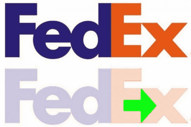
FedEx is a delivery service that makes sure we receive our online orders and packages from loved ones. Well, you may notice that the white space between the E and X is actually an arrow!
FedEx (Arabic)
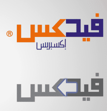
Graphic designers for FedEx’s logo in Arabic were also able to incorporate the hidden arrow. Notice how it points to the left because Arabic is read from right to left rather than left to right.
Wendy’s
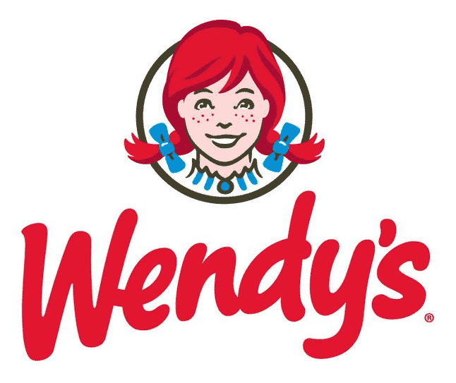
We all know the red headed girl in Wendy’s logo. However, if you take a closer look at her collar, you’ll notice the word “mom.” This may suggest that their food is different from other fast food chains because it’s fresh and similar to a mother’s home cooking.
Pittsburgh Zoo
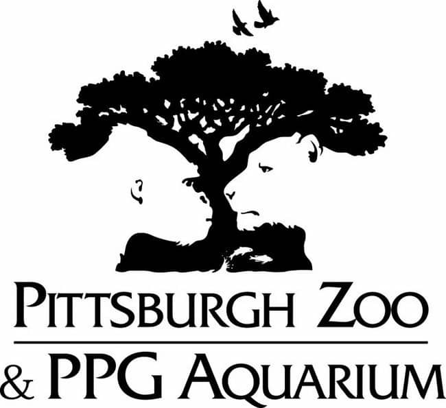
The logo for Pittsburgh Zoo is almost like an optical illusion. At first you probably notice the black tree with birds flying around it. However, if you look at the white space on each side, you’ll notice a gorilla and lion staring at each other.
Chick-fil-A
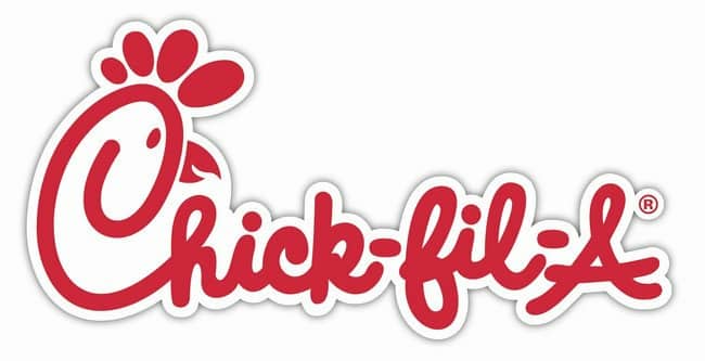
Chick-fil-a is a favorite fast food chain amongst Americans. While the meaning isn’t extremely hidden, you will notice that the “C” in the beginning is actually a chicken. Very clever!
NBC
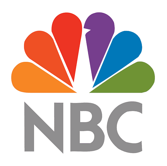
The logo for the giant television network NBC is actually a peacock. While this is clearly noticeable, you’ll be interested to learn that each feather actually represents the divisions of the network.
Amazon
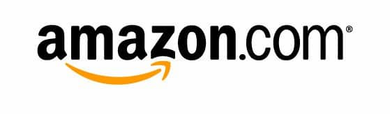
Amazon is one of the largest companies in the world, so it’s no wonder their logo is so recognizable. Of course, you’ve noticed the yellow arrow that represents a smile under the name. However, did you notice that it points from A to Z, meaning that the company sells everything you can imagine.
Baskin Robbins
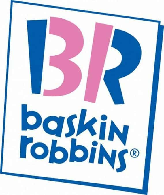
Baskin Robbins is famous for serving 31 different flavors of ice cream. Well, they incorporated this into their logo! If you notice the second half of the B and beginning of the R are numbers that make up 31.
Formula 1
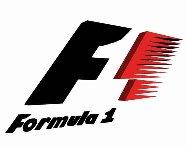
It seems like companies like to hide things in the white space of their logos. In Formula 1’s logo, you’ll notice that there is a hidden number one between the F and the red symbol.
Tostitos
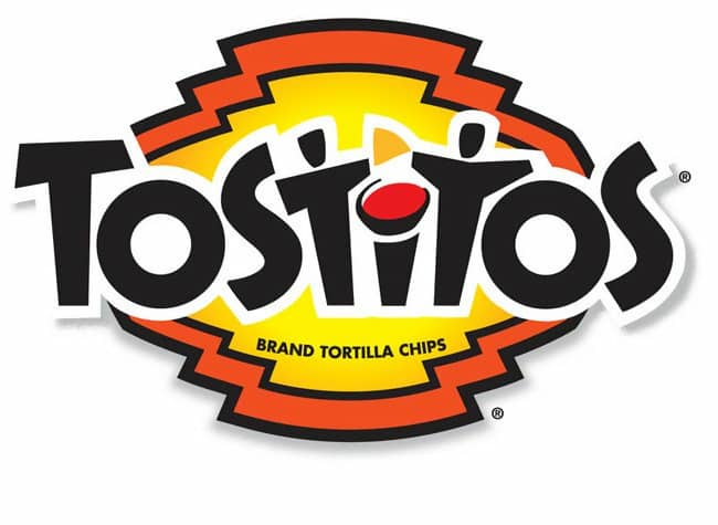
Who doesn’t love snacking on chips and salsa? Tostitos designed their logo to show just how much fun it is to share the snack with friends. If you look at the two T’s and the I, you’ll see two people sharing chips with a bowl of salsa between them.
Atlanta Falcons
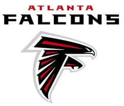
The Atlanta Falcons logo is more than just an angry looking bird. The bird is also in the shape of an F to represent the team’s name.
Goodwill
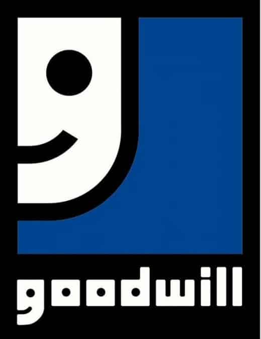
It sure does feel good to donate unwanted clothes and items to Goodwill rather than just throwing them out. The logo represents the happiness people feel in their G. It looks like half of a smiling face when zoomed in.
Sun Microsystems
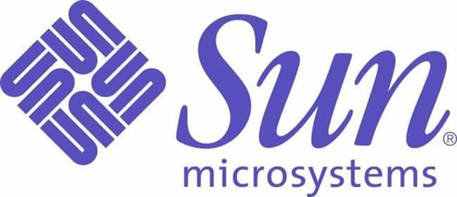
You never want to look right at the sun, unless it’s the logo of Sun Microsystems. You’ll notice that the diamond logo actually as the word “sun” in it on all sides.
Le Tour De France
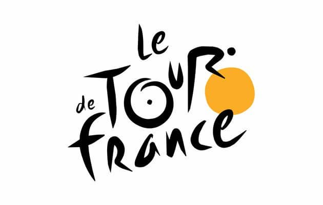
Le Tour de France is a famous cycling race that takes place each year. When you look at the logo, you’ll notice that the O, U, and R actually look like a person riding a bicycle.
Hershey Kiss
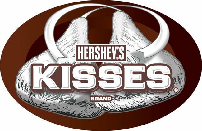
Hershey Kisses are the perfect little snack if you’re craving some chocolate. You’ll notice that between the K and I there is a little sideways Hershey Kiss in the logo.

Pinterest is basically a digital corkboard where people can save recipes, ideas, and links for later. You’ll notice that the P at the beginning of the logo looks like an actual pin.
VAIO
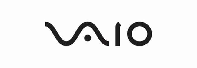
Sony’s VAIO logo may be hard to read at first, but there is a hidden meaning behind it. The first two letters are actually an analog signal while the I and O represent the 1 and 0 when it comes to digital code.
Hartford Whalers
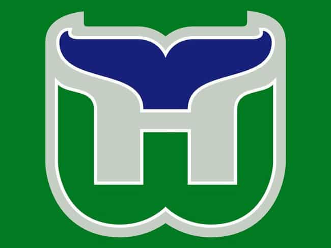
The NHL team Hartford Whalers no longer exist, but their logo was legendary with its hidden meaning. You will notice that the blue color above the H is actually a whale’s tale!
Toblerone
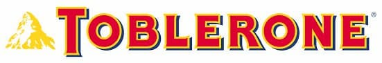
There is no better chocolate snack than Toblerone. When you take a closer look at the mountain, which represents Matterhorn mountain, you will see an image of a bear in it.
McDonald’s

The most iconic logo of all time is probably the McDonald’s golden arches. Well, it stands for more than just the M. It also represents the crispy golden French fries they serve with all of their meals.
The Bronx Zoo
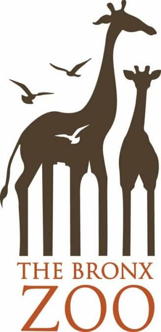
The Bronx Zoo is one of the most famous zoos in the world. Located in NYC, the logo takes advantage of the space where the giraffe’s legs stand and uses it to create the New York skyline.
Beats by Dre
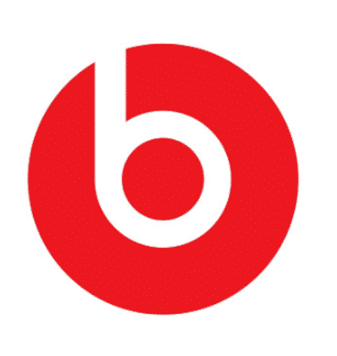
This simple logo is actually extremely clever. The headphones brand logo is actually a profile of a cartoon head wearing the headphones!
Unilever
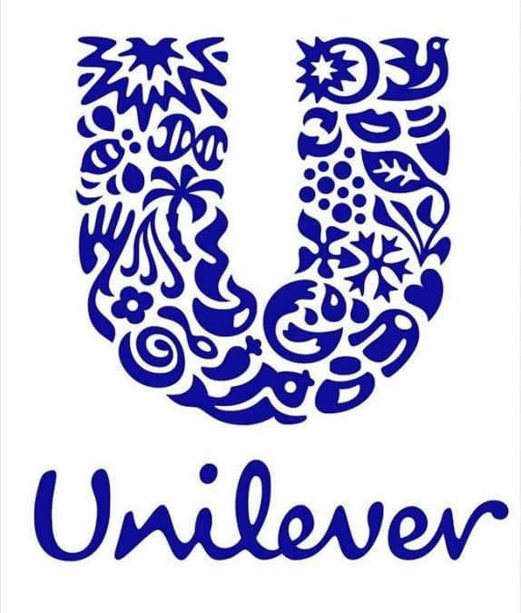
Unilever is one of those companies that produces and sells just about everything under the sun. To help you remember what they sell, they incorporated some of their products into their logo.
Northwest Airlines
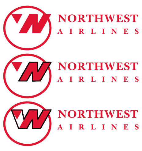
There is a lot going on in the Northwest Airlines logo. Firs, we have the N, which represents north. But, when you pair it with the triangle in the left corner, you’ll notice it makes a W, which represents west. Lastly, that little triangle points in the direction of northwest.
Kölner Zoo
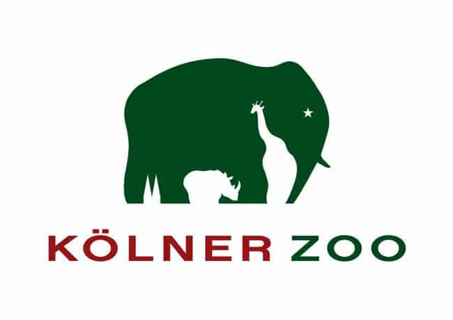
At first, you’ll notice the green elephant in the Kölner Zoo’s logo. When you look at the white space, though, you’ll se a rhino and a giraffe. Take a closer look to the left and you’ll also notice the outline of the Cologne Cathedral in Germany, where the zoo is located.
Coca-Cola
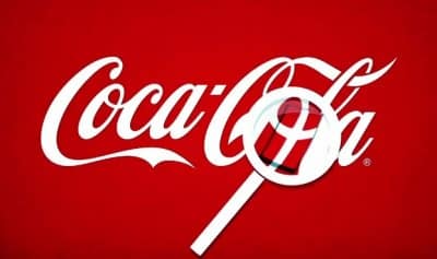
This hidden message in the Coca-Cola logo goes unnoticed by many Americans. If you look closely between the O and L, you’ll notice the flag of Denmark. The company took advantage of this and welcomed travelers to Denmark’s airport with flags.
Guild of Food Writers
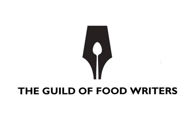
This clever logo is simple, but says a lot. At first, it looks like the tip of a fountain pen. But take a closer look at the white space and you’ll notice that it’s a spoon. It’s the perfect combination for food writers!
Hyundai
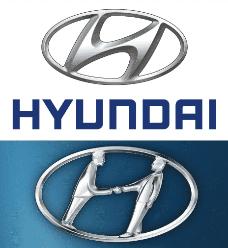
The Hyundai logo is more than just an italic H. It’s actually two men shaking hands to represent a car dealer and a customer making a sale.
Subaru
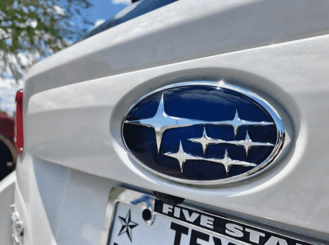
Subaru is a Japanese company, so they incorporated the legend of The Seven Sisters into their logo. You’ll notice stars in the logo because “Subaru” is also the name for the Pleiades star cluster, also referred to as the Seven Sisters. However, you’ll noticed that there are only six stars because the seventh sister is supposedly invisible.
Galeries Lafayette
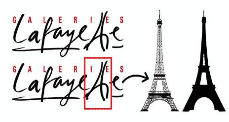
This French company incorporates a pretty iconic structure into their logo and you’ve probably already guessed what it is. It’s the Eiffel Tower! Take a look at the two T’s and you’ll see the famous building.
Gillette
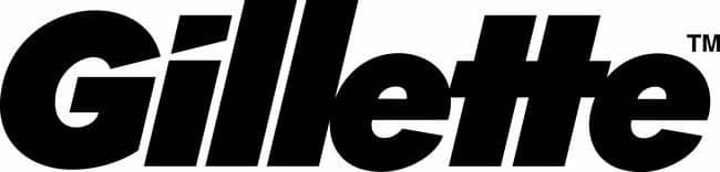
The razor brand Gillette uses their logo to show just how sharp their razor blades are. If you look at the I, you’ll notice the sharp slice cut out of it.
Milwaukee Brewers
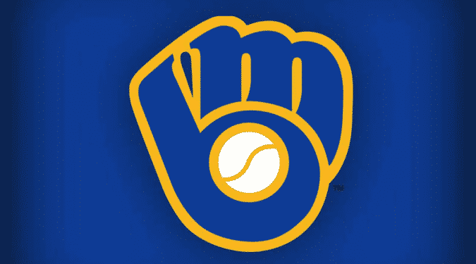
While this logo is no longer used by the baseball team, it is pretty clever. You’ll see that it looks like a baseball mitt at first, but a closer look and you’ll see the fingers represent an M and the thumb and palm are a B.
Quiksilver
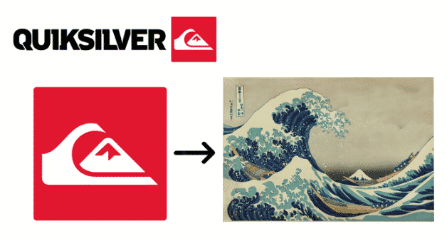
The Quiksilver logo is actually a representation of the painting “The Great Wave Off Kanagawa.” Most people won’t notice the direct relation at first, though.
Roxy
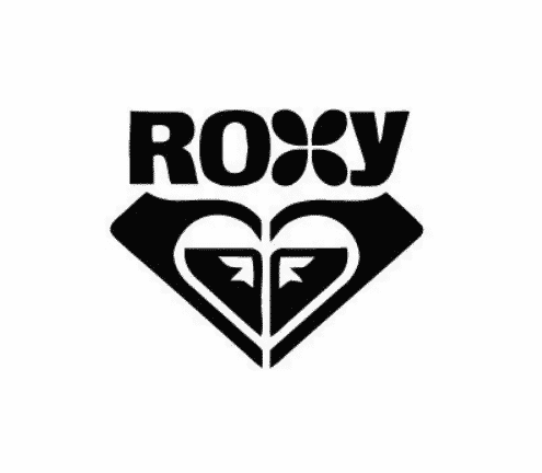
Roxy is another logo that incorporates the famous painting into their logo. Although, there are two versions of the painting, one is just flipped and they are facing each other.
London Symphony Orchestra
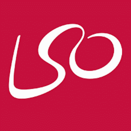
This logo may take some time to fully understand. At first you see a simple L, S, and O, which stands for the London Symphony Orchestra. With a closer look you’ll notice that it’s actually a conductor with his hands up.
LG
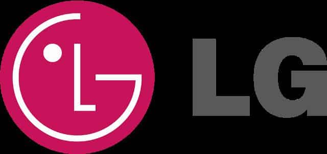
LG took a stylistic note from Pac-Man while creating their logo. If you tilt the winking face to the right a little and then move the nose, you’ll have your own little Pac-Man!
Elefont
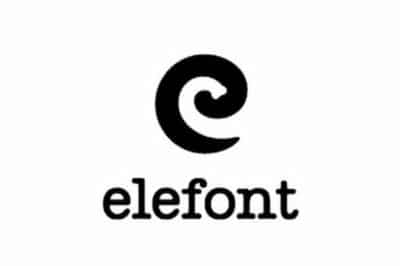
Elefont sounds a lot like elephant, right? Well, the logo incorporates an elephant’s trunk in the whitespace that makes up the E!


