


Even the most experienced business owners can make the mistake of believing that their brand identity consists of nothing more than a name and logo. In truth, however, a brand is so much more than that. Your company’s brand communicates who your company is, what it does and how it does it, and establishes trust and credibility with both your customers and stakeholders.
An effective brand identity is crucial, but it doesn’t and shouldn’t remain static. As your company evolves, your key messaging needs to evolve with it.
What is Rebranding?
Rebranding is essentially the process of giving your company’s brand identity an overhaul. This can cover things like developing a new company logo, revamping marketing materials and advertising campaigns, launching an updated website, or even changing a company name entirely.
Rebranding can completely transform any ailing business, especially one that is experiencing difficulties differentiating from the competition, or struggling to modernise and improve their reputation.
Why do businesses Rebrand?
As briefly touched on above, brand identity isn’t static, it needs to shift and grow as the business shifts and grows. Even the world’s most established companies will go through numerous brand overhauls as they attempt to reach new demographics or launch new products and services.
The key aim behind any rebrand is, first and foremost, to stay competitive, but there can be many reasons why a business will choose to overhaul key messaging (sometimes multiple times) during its lifecycle including:
- Outgrowing its name or existing marketing strategy
- Outgrowing its original mission
- Wanting to improve a poor reputation
- Market repositioning
- Differentiation
Brand overhauls done right in 2020
In the 21st century alone, countless businesses have undertaken a complete brand rehaul, many of which have completely transformed their success. Did you know, for example, that Google was once called BackRub? It’s hard to imagine BackRub becoming one of the world’s most profitable and ubiquitous tech companies! Then, there have been subtle market repositionings, perfectly demonstrated by luxury brand Burberry as it rescued itself from chav culture with the addition of Christopher Bailey and Kate Moss.
More recently the following companies have shown just how to get a brand overhaul right:
GoDaddy
The ubiquitous domain registrar and web hosting company has been a key fixture on the web since the late 90s. And their previous logo really made that clear. With two different fonts, five different colours, and a ginger-haired mascot who bared more than a passing resemblance to 90s Grunge kid Seth Green, it was, quite frankly, a bit of a mess.
Their new logo, however, is much more fresh and appealing and is instantly recognisable for both desktop and mobile users. Consisting of an intertwined G & D shaped into a heart – what the company has nicknamed its “GO” logo – this new identity is sleek and to the point, and combined with a new advertising campaign that puts ‘everyday entrepreneurs’ at the heart the messaging hits home.
PokerStars
One of the early pioneers of online real money gaming, PokerStars is a multinational gaming company that has been associated with online poker since the turn of the century. Although it is one of the most successful gaming platforms in existence, at the start of the new decade the company wants to move “beyond product” and evolve into “an entertainment titan”.
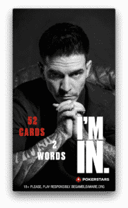
Source: PokerStars/Used with Permission
Working in partnership with Anomaly, PokerStars’ fresh new brand approach is supported by a multi-channel marketing campaign, including TV and digital ads. It positions the company as a relevant and exciting name in the world of digital entertainment while ensuring that its commitment to Responsible Gaming is conveyed through key messaging.
BMW
There are certain businesses that will always remain relevant, as their decades-long prestigious reputations will do a lot of the work for them. But, even these companies need a brand overhaul now and again to ensure that they truly represent contemporary life. Case in point, BMW.
Firmly entrenched in popular culture, luxury vehicle manufacturers Bayerische Motoren Werke (BMW) need very little introduction, but in well-timed attempt to stay modern and relevant to today’s consumer the company recently updated its logo.
The new ‘flat’ logo maintains the blue and white of the existing logo (which pay homage to the state of Bavaria, where BMW was founded and still has its HQ), but gone are the 3D shadows that surrounded it. It a simplification of the 1997 logo, but it’s impeccably done and welcomes in the company’s Electric Era.


